

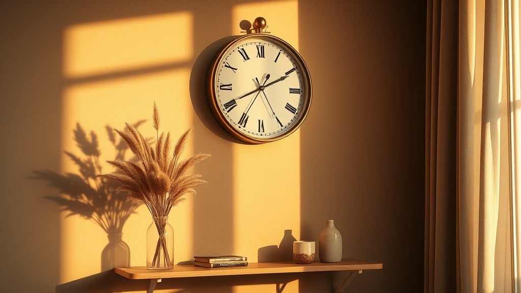
Some finishes go out of style within a season. Brass isn't one of them. A wall clock with brass finish has been showing up in the best-designed homes for decades, and the reason isn't nostalgia. It's because warm metallic tones interact with light in ways that cooler finishes simply can't replicate. The way a brass clock face catches afternoon sun, or glows under the soft warmth of a floor lamp at dusk, creates a moment on your wall that you actually notice.
That said, brass can go very wrong if you treat it as a trend accessory. The homes that get it right understand something important: brass works because of contrast, context, and scale. Pick the right piece for the right wall, and it becomes a reference point the whole room orbits around. Still on the fence about which style suits your space? Our complete guide to choosing a wall clock is a good place to start building your eye.
À retenir
- Brass finish reads as warm gold with brown undertones, making it more versatile than polished chrome or matte black.
- It complements mid-century modern, industrial, Art Deco, and transitional interiors particularly well.
- Brushed brass suits relaxed, lived-in spaces; polished brass suits formal or maximalist rooms.
- Scale matters more than style: a brass clock too small for its wall disappears entirely.
- Brass pairs beautifully with warm wood tones, terracotta, deep navy, and forest green.
Why Brass Reads Differently Than Gold or Chrome
Brass reads differently from gold and chrome because its copper undertones pull the color toward amber and honey, giving it a depth that feels grounded rather than flashy, and a warmth that cooler metals simply cannot match. There's a reason designers reach for brass before any other metallic finish. Pure gold is too flashy for everyday interiors. Chrome and nickel run cold and clinical. Brass sits in a uniquely comfortable middle ground: it has depth without being garish, warmth without being saccharine.
The undertones tell the story. Brass contains copper, which pulls the color toward amber and honey rather than lemon yellow. On a clock face or frame, those undertones mirror the natural warmth of wood grain, leather, aged ceramics, and linen. The result is a finish that feels grounded rather than decorative for its own sake.
There are also practical reasons to appreciate brass in clock design. The finish ages gracefully, developing a gentle patina over time that makes it look more intentional, not less. A well-made gold and brass-toned wall clock from five years ago can look better today precisely because it has lived in your space.

Did you know?
Brass has been used in clockmaking since the 16th century, when it replaced iron as the preferred material for clock plates and gear trains. Its resistance to rust, its machinability, and its visual warmth made it the standard in European clock workshops for over 300 years. The aesthetic we associate with "classic clockmaking" is almost entirely defined by brass.
The Interior Styles Where a Brass-Finish Clock Feels at Home
A brass-finish clock feels at home in mid-century modern, industrial, Art Deco, transitional, and Scandinavian interiors, working in each one for different reasons rooted in its warm, adaptable undertones. Brass isn't a one-trick finish. It shows up in wildly different interiors and works in each one for different reasons. Here's where it genuinely shines:
Mid-Century Modern
This is arguably the most natural home for brass hardware of any kind. Mid-century interiors lean on walnut, teak, and warm-toned fabrics. A brass clock on the wall becomes the metallic counterpoint to all that organic warmth. It catches the eye without competing with the furniture. The geometry of a round clock face also echoes the circular forms that define mid-century design: sunburst mirrors, tulip chairs, curved sofas. If you're already exploring that aesthetic, you might also enjoy our roundup of the best mid-century modern wall clocks.
Industrial Loft Style
Industrial interiors tend toward cooler, harder materials: exposed concrete, raw steel, reclaimed timber. A vintage brass-finish wall clock with Roman numerals or exposed gear details adds something these spaces often lack: a reference to craft and human scale. It says something was made carefully, not just assembled. Brushed or aged brass works better here than polished, because it fits the worn, utilitarian narrative of the space.
Art Deco and Maximalist
Art Deco was practically built on polished brass. The geometric boldness of the style, its love of high contrast and rich color, makes a gleaming brass clock face feel absolutely correct. Pair it with deep jewel-tone walls (emerald, navy, burgundy) and the clock transforms into something genuinely theatrical. This is the one context where oversized and ornate is the right answer, not a compromise.
Transitional and Contemporary
Transitional interiors (the comfortable middle ground between traditional and modern) are where brass clocks do quiet, steady work. These rooms don't have a strong style identity, which means a well-chosen brass clock can provide one. It acts as a warm anchor that ties together disparate furniture pieces and makes the room feel considered rather than assembled by accident.
Scandinavian and Minimalist
Here's one that surprises people. Scandinavian design prioritizes natural materials, clean lines, and functional beauty. A brushed-brass clock with a pared-back dial (no numerals, or clean Arabic figures) sits perfectly within that philosophy. The brass reads as a natural material accent alongside pale oak floors, linen textiles, and white walls. The trick is restraint: one brass clock as a considered focal point, not three competing metallic objects on the same wall.

Brushed Brass vs. Polished Brass: Choosing the Right Finish Tone
Brushed brass suits relaxed, lived-in spaces with matte hardware, while polished brass belongs in formal or dramatic rooms where high shine and contrast are the whole point. Neither finish is better. The question is what your room already has. If your hardware (door handles, curtain rods, light fixtures) runs matte, brushed brass keeps the register consistent. If you're building a room around drama and contrast, polished brass earns its place. And if fingerprints are a genuine concern (think high-traffic hallways or homes with young children), brushed brass is the practical winner without question.
| Criterion | Brushed Brass | Polished Brass |
|---|---|---|
| Visual texture | Soft, matte-adjacent, low reflectivity | High shine, mirror-like reflectivity |
| Best room types | Living rooms, bedrooms, home offices | Formal dining rooms, Art Deco, entryways |
| Hides fingerprints? | Yes, very well | No, shows contact easily |
| Patinas over time? | Subtle, adds character | More visible, may need occasional buffing |
| Interior personality | Relaxed, warm, lived-in | Formal, dramatic, statement-making |
Where to Hang a Brass Clock: Room-by-Room Logic
The best placement for a brass clock depends on the room: living rooms call for a large statement piece at eye level, kitchens benefit from a compact readable dial, and entryways reward a medium-sized warm frame that sets the tone on arrival.
The Living Room
The living room is the highest-stakes placement for a wall clock with brass finish. It's where guests form impressions, where you spend the most time, and where the walls tend to carry the most visual weight. Here's what works: hang the clock above a fireplace, a sofa, or a console table. The eye needs a reference point at standing height, roughly 57 to 60 inches from the floor to the clock center. Go large: in a standard living room, a clock under 40 cm in diameter reads as decoration. One at 50 to 60 cm becomes a focal point.
If your living room already has open-circle or geometric metalwork elsewhere (think a sculptural light fixture or a round mirror), you're halfway there. A brass or gold-toned statement clock with complementary geometry above a dark sofa creates the kind of layered contrast that makes a room feel truly designed. Speaking of which, the Crossed Circle Design Metal Wall Clock below is exactly the piece we'd reach for in this scenario. Its open metalwork frame reads as sculpture first, timepiece second, which is precisely what a living room wall needs.
The Kitchen
Kitchens are underrated spaces for brass. The warm metallic tone picks up on the golds and ambers of natural wood cabinetry, aged brass cabinet handles, and warm-white stone countertops. A 30 cm brass clock above the stove or on an open wall near the dining area keeps proportions right without overwhelming the space. The functional element matters here too: kitchens need readable clocks, so clear numerals and a simple dial face are worth prioritizing over pure aesthetics.
The Home Office
Brass in a home office signals something intentional: this is a space taken seriously. A clock with brass detailing above a desk or on the wall behind a reading chair grounds the room without creating noise. It reinforces a work mindset more effectively than a purely decorative piece would. Bonus: the warmth of brass softens the sometimes sterile energy of home office spaces full of screens and neutral furniture.
The Entryway
The entryway is a small space with outsized design impact. A brass clock here sets the tone for the entire home. Because entryways typically have limited wall space, a medium-sized clock (30 to 45 cm) with clean lines and a warm brass frame works better than an oversized piece. It also serves a real function: you glance at it on the way out the door. For entryway-specific ideas, our guide on styling a clock in small spaces is worth a look.
Pairing Colors and Materials with a Brass-Finish Wall Clock
A brass-finish wall clock pairs best with deep navy, forest green, warm white, walnut wood, terracotta, and exposed brick, because its amber undertones either contrast richly or harmonize warmly with all of these. Brass is one of those rare finishes that acts as a bridge. It pulls warmth from cool palettes and adds sophistication to earthy ones. Here are the combinations that consistently work:
- Brass + deep navy or forest green: The contrast is rich and grounded. Navy walls with a brass clock create an almost library-like atmosphere. Forest green with brass has the same energy as a well-decorated Victorian greenhouse, but modern.
- Brass + warm white or cream: The simplest pairing. Cream walls let the brass do all the talking without competition. This is the combination that reads as "effortless" in design photography.
- Brass + walnut or teak wood: Both materials share warm, amber undertones. They don't compete; they harmonize. A brass clock above a walnut console is practically a mid-century formula at this point, and it works because the undertones rhyme.
- Brass + terracotta or rust: Earthier, more Mediterranean. This pairing suits homes with natural plaster walls, rattan furniture, or a Moroccan-influenced palette. The brass adds a metallic gleam that keeps the room from feeling too muted.
- Brass + exposed brick: Industrial spaces benefit enormously here. The cool, rough texture of brick and the warm glow of brass create a tension that feels alive. This is where a brushed or aged brass finish earns its best reviews.

Size and Scale: The Mistake That Ruins an Otherwise Good Clock
The most common size mistake is choosing a brass clock too small for its wall: the clock diameter should be roughly one-half to two-thirds the width of the furniture or feature below it, and when in doubt, go one size up. You can find the most beautiful brass clock in the world and still have it fail on your wall. The culprit is almost always scale. This is the detail that separates rooms that look designed from rooms that look assembled.
The rule of thumb used by interior stylists: the clock diameter should be roughly one-half to two-thirds the width of the furniture or architectural feature below it. A sofa that's 220 cm wide calls for a clock between 50 and 70 cm across. A small kitchen console that's 80 cm wide needs a clock no larger than 40 to 45 cm, or it will feel like a mistake.
Empty walls are trickier. Without a furniture anchor, use a tape measure to mark out the clock's footprint on the wall with painter's tape before committing. A circle that looks dramatic in a product photo can read as tiny against an empty wall with 3-meter ceilings. When in doubt, go one size up.
For rooms that already carry a lot of visual information (gallery walls, bold wallpaper, heavily patterned rugs), a bold industrial wall clock with metallic detailing can hold its own without being drowned out. Simpler rooms give you more flexibility to choose a more delicate brass frame without it disappearing.
If Roman numerals are on your shortlist, scale works in their favor: bold chiffres romains on a 50 to 60 cm clock face are legible from across a large room and have a graphic confidence that Arabic numerals at the same size rarely match. Which brings us neatly to the piece below. When your wall demands something commanding and warm-toned, this is the one.
Brass with Roman Numerals: The Combination That Never Overexplains Itself
Brass paired with Roman numerals works because both carry historical weight and graphic confidence, making the combination feel inevitable in any home that mixes original architectural features with contemporary furniture. Roman numerals on a brass clock face feel inevitable rather than decorative. There's a reason the combination has persisted from 16th-century European mantel clocks to contemporary interior design: the numerals carry historical weight that Arabic numbers simply don't. They signal that the object was made to last, not to match a seasonal trend.
Functionally, Roman numerals read clearly at a distance, particularly in larger sizes. On a 50 to 60 cm clock, bold Roman numerals are visible from across a room without requiring you to squint. They also have a graphic quality that holds up on plain walls without needing supporting decor around them.
The brass-plus-Roman-numerals pairing works especially well in homes that mix old and new: original architectural features like crown molding, paneling, or parquet floors paired with contemporary furniture. The clock bridges the eras. It says the homeowner knows their history without being trapped by it. If that describes your home, our guide to vintage-style wall clocks covers the full range of options worth considering.
"A clock is the only object in a home that everyone looks at on purpose. It deserves to be worth looking at."
A recurring observation among interior design clients who switched from digital to analog wall clocks
The Quiet Practical Side: Silent Movements and Mounting on Brass Clocks
For practical success with a brass clock, confirm it uses a silent quartz movement before buying, and use a wall anchor rated for at least double the clock's weight when mounting, since metal frames add meaningful heft. Aesthetics lead the decision, but practicality closes it. Two things matter beyond how a clock looks: how it sounds and how it hangs.
Most quality brass-finish wall clocks sold today use silent quartz movements. This is worth confirming before you buy. A ticking clock in a bedroom is manageable for some people and genuinely disruptive for others. In an open-plan living space where you spend hours reading, working, or watching films, a loud tick accumulates into background stress. Silent quartz movements run on a continuous sweep rather than a tick-tock mechanism, which eliminates the sound entirely without affecting accuracy.
On mounting: brass clock frames are typically metal, which adds meaningful weight compared to plastic or acrylic alternatives. A 50 cm metal clock can weigh anywhere from 1.5 to 4 kg. Use a wall anchor rated for at least double the clock's weight, locate a stud if your walls are drywall over timber framing, and use a level. A slightly off-kilter clock reads as careless from across the room, regardless of how beautiful the object itself is.
If you're working with plaster walls in an older home, a toggle bolt anchor is more reliable than a standard plastic plug. Worth the extra five minutes.
Gold Wall Clocks
The full range of gold and brass-toned wall clocks, from minimalist 30 cm pieces to large statement designs for living rooms and entryways.
47 references
Browse the collection →How Brass Interacts with Lighting: The Detail Most People Miss
Brass actively changes character with the light source: warm bulbs (2700K to 3000K) deepen it toward amber and bronze, while cool daylight LEDs (4000K and above) shift it lighter and more gold, so your room's lighting should guide your finish choice. Brass is one of the few interior finishes that actively changes character depending on the light source. This isn't a flaw; it's the whole point. But it's worth understanding before you commit to placement.
Under warm incandescent or Edison bulb light (2700K to 3000K color temperature), brass deepens toward amber and bronze. The effect is rich and atmospheric. Under cooler daylight-balanced LEDs (4000K and above), brass reads lighter, more gold than bronze, with more shimmer. Neither is wrong, but they're different moods.
The practical implication: if your living room is lit primarily with cool-white recessed LEDs, a polished brass clock will look bright and almost yellow. If that's not the effect you want, brushed brass or antique brass will look more settled under the same light. Conversely, under warm amber bulbs, even a simple brushed brass clock transforms into something that looks like it belongs in a boutique hotel.
Natural light is the most flattering of all. If the wall you're considering catches afternoon sun, a vintage-style brass wall clock on that surface will reward you with a different visual experience at every hour of the day.
FAQ
Does a brass-finish clock work in a modern minimalist interior?+
Yes, with the right choice of clock. A brushed brass clock with a clean dial and minimal ornamentation reads as a warm material accent rather than a traditional or ornate object. The key is keeping the clock's form simple: no heavy baroque details, no cluttered face. A thin brass frame around a minimal dial integrates into minimalist spaces without disrupting their calm.
Does brushed brass hide fingerprints well?+
It does, and that's one of its underrated practical advantages. The micro-textured surface of brushed brass diffuses light rather than reflecting it sharply, which means oils and contact marks simply don't show the way they do on polished brass or chrome. For high-traffic spots (entryways, kitchens, living rooms with children), brushed brass is the smarter long-term choice. Polished brass is genuinely gorgeous but requires more frequent wiping to stay sharp.
What height should I hang a brass clock?+
The standard interior design guideline is 57 to 60 inches (roughly 145 to 152 cm) from the floor to the center of the clock. This puts it at comfortable eye level for most adults and aligns with how art is typically hung. Above furniture (sofa, console, fireplace mantel), allow 6 to 10 inches of breathing room between the top of the furniture and the bottom edge of the clock. Going higher than 60 inches tends to make the clock feel disconnected from the room; lower than 55 inches can feel cramped above furniture.
Will a brass clock look cheap against dark walls?+
The opposite, actually. Dark walls (deep navy, charcoal, forest green, burgundy) are arguably the best backdrop for brass because the contrast makes the metallic finish pop. The brass reads as luminous rather than showy. A polished brass clock on a navy wall creates the kind of high-contrast focal point that interior designers specifically aim for.
What other metals can I mix with a brass clock without creating visual chaos?+
Warm metals mix well. Brass pairs cleanly with copper and gold. It can work alongside matte black if the two finishes are kept on clearly separate objects and the room has a consistent color palette. The combination to be careful with: polished chrome or cool-toned silver alongside polished brass. Those two tend to fight each other. If you already have chrome hardware, brushed brass (rather than polished) creates a softer transition.
How do I clean a brass-finish wall clock without damaging the finish?+
For most brass-finish clocks, a dry or slightly damp soft microfiber cloth is all you need. Avoid abrasive cleaners or rough cloths, which can scratch a lacquered finish. If your clock has a genuine brass surface (not lacquered), mild soapy water works well, followed by a dry buff. For clocks with a coated or painted brass-look finish, stick to dry dusting only. Harsh chemicals can strip the coating and alter the color permanently.
Is a brass wall clock a good choice for a rental apartment?+
A brass clock is actually one of the smarter choices for renters precisely because it's a single high-impact statement that doesn't require permanent changes. One well-placed brass clock at the right scale can transform the character of a rental room without painting walls or replacing furniture. The clock travels with you when you leave, and it works across different apartments because brass adapts to so many color schemes and styles.






