

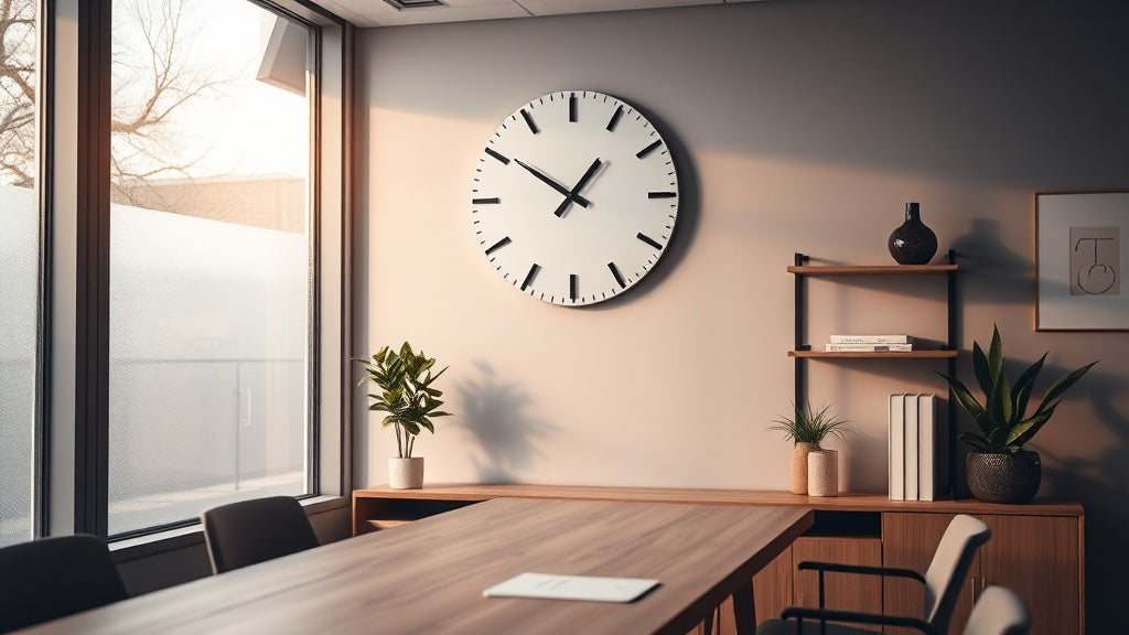
Walk into any office that feels genuinely put-together, and something subtle is usually doing a lot of work on the wall. It's not always art. Sometimes it's a clock with a professional look that pulls the whole room into focus. Clean lines, the right scale, a finish that doesn't fight the furniture. That kind of deliberate detail is what separates a thoughtfully designed workspace from one that just has a desk in it.
The tricky part? Most buying advice treats office clocks like a utility purchase, right alongside paper clips and cable organisers. But a clock is one of the few pieces of decor in an office that carries actual meaning. Clients read it. Employees glance at it. It sits in video call backgrounds. It signals whether you've thought about your space, or whether you haven't.
Here's what actually works, by style, setting, and the specific impression you're trying to make.
⭐ Key takeaways
- An office wall clock projects professionalism even before you speak. Clients notice it.
- Scale matters as much as style: a clock that's too small on a large wall reads as an afterthought.
- Silent quartz movement is non-negotiable in any workspace where concentration matters.
- The most professional clocks share one trait: they don't try too hard. Restraint is the point.
- Your clock should complement your desk and shelving finishes, not just the wall colour.
Why the Office Clock Gets Undersold as a Design Decision
Most people spend weeks choosing a desk, a chair, maybe some shelving. The clock gets added at the end, almost as an afterthought. That's a mistake, because the clock is one of the most-looked-at objects in any room. It occupies prime vertical real estate, usually at or just above eye level, and it gets checked dozens of times a day by everyone in the space.
In a home office, it anchors the wall behind or beside your desk. In a corporate setting, it's often the first thing a visitor's eye catches when they're waiting. Design studios, legal firms, and creative agencies have known this for decades. The clock isn't decoration that supports the work. It's part of the presentation itself.

There's also a psychological dimension worth naming. A well-chosen clock with a professional look communicates that you're someone who thinks about details. Visitors register it, even when they can't articulate exactly why the room feels more credible than the one down the hall. It's not magic; it's just good design doing its quiet job.
The Minimalist Metal Clock: Understated Authority
Why restraint is the most powerful design statement
If there's a single clock style that fits the widest range of professional settings, it's the minimalist metal clock. Think clean circular case, narrow hands, no clutter on the dial. Brushed silver, matte black, or antique-finished gold are the finishes that age best against neutral office palettes.
What makes this style work professionally isn't what it has. It's what it doesn't. No decorative flourishes, no novelty shapes, no bright colour accents competing with your brand colours or wall paint. The dial does one thing well: tells the time at a glance without making you squint or decode anything.
For tech-oriented or contemporary corporate offices, a matte black metal clock with Arabic numerals in a matching tone reads as sharp without being sterile. In finance or law settings, a brushed steel case with Roman numerals leans into the tradition of precision without feeling stuffy. Both work. The choice comes down to which feeling you're reinforcing.
Recommended pick for the minimalist office

💡 Did you know?
The tradition of placing a prominent clock in professional spaces dates to 18th-century London counting houses, where timekeeping was literally tied to contractual obligations and trade. The clock on the wall wasn't decor. It was a statement of accountability. That heritage is still quietly embedded in how we read a well-placed office clock today.
Wood-and-Metal Combinations: Warmth Without Losing Credibility
When a cold-grey office isn't the vibe you're going for
There's a version of the professional office that's cold, grey, and slightly intimidating. That works for some brands. But a lot of modern workspaces, especially home offices and creative studios, need warmth without sacrificing the sense of structure and focus.
Wood-and-metal hybrid clocks solve this well. A walnut or dark oak case paired with black or bronze metal hands gives you the visual warmth of natural material alongside the crispness of metal hardware. The result reads as considered rather than decorative, serious rather than corporate-cold. It's the clock equivalent of a well-tailored blazer worn over a linen shirt.

This style works particularly well above a wooden desk, where the clock picks up the material language already on the floor. It also photographs well, which matters more than it used to. If your desk setup appears in video calls or content, a wood-and-metal clock adds depth to the frame without competing with your face or your screen.
Size and Placement: Getting the Scale Right
The single most common mistake in office clock shopping
This is the step most people skip, and it's where professional offices diverge most sharply from amateur ones. A clock that's too small on a large wall doesn't just look awkward. It signals uncertainty, as if you weren't quite sure what you were doing when you chose it.
Here's a practical framework that actually works:
- Small offices (under 120 sq ft): 25-35 cm diameter is enough. Go larger and the clock overwhelms the room.
- Standard office or home office (120-250 sq ft): 35-50 cm is the sweet spot. Visible from across the room without dominating.
- Conference rooms, boardrooms, open-plan spaces: 50-80 cm. These rooms are built for a visual anchor. Use it.
- Walls with high ceilings (3m+): Scale up by at least one tier. High ceilings absorb visual weight; a standard-size clock reads as tiny.
Placement height also matters. The centre of the clock should sit roughly 150-165 cm from the floor, which is close to average seated eye level plus a little lift. In a conference room where people stand and walk around, bump it up to around 180 cm. The goal is always effortless readability, not a hunting exercise every time someone needs to check the time.
Dial Design and Numerals: Reading the Room
The dial is where the personality of an office wall clock with a professional look actually lives. Two clocks can have identical cases and completely different atmospheres just from how the dial is handled.
For most corporate settings, the principle is the same as it is in typography: legibility first, character second. A clear dial with well-spaced numerals or minimal index markers communicates confidence. An overly busy dial, multiple sub-dials, decorative flourishes across the face, reads as trying too hard.
| Dial Style | Best Setting | Impression It Projects |
|---|---|---|
| Roman numerals, minimal hands | Legal, finance, executive offices | Tradition, reliability, authority |
| Clean Arabic numerals, flat design | Tech companies, creative studios | Clarity, modernity, focus |
| No numerals, index markers only | Architect firms, design agencies | Sophistication, restraint, confidence |
| World map or multi-timezone dial | International businesses, import/export | Global reach, intentional branding |
| Vintage distressed dial | Home offices, consultants, boutique firms | Warmth, personality, longevity |
One detail that separates a genuinely quality clock from a budget option: the hand finish. Hands with a slight bevel or brushed finish catch light differently at different times of day. It's subtle, but it's the kind of detail people register without knowing they've registered it. If you're ever torn between two clocks at similar price points, look at the hands in a side-lit photograph. That's often where the quality gap shows up first.
The Silent Movement Question (It's Not Optional in an Office)
Why 40 decibels of tick can cost you a client
If you're putting a clock in any space where people concentrate, meet clients, or record calls, silent quartz movement isn't a nice-to-have. The tick of a standard quartz clock is roughly 40-45 decibels in a quiet room. That's not loud, but it's the kind of persistent, rhythmic sound that compounds over time. In meetings, it registers as background noise. On calls, it shows up in the audio. In focus sessions, it becomes the thing you can't stop noticing.
Silent sweep movement clocks use a continuous motor rather than a step-and-tick mechanism, which means the second hand moves in a fluid arc with no audible click. The office stays quiet. The clock does its job without announcing itself every second.
If you're browsing and a clock doesn't specify "silent" or "sweep movement," assume it ticks. Ask before buying. This is especially worth verifying with larger, heavier clock mechanisms, where the tick can actually be louder than with a standard quartz unit. A good silent wall clock resolves this entirely and lets the design do the talking.

Home Office Specifics: Where Professional Meets Personal
Balancing taste and credibility when your office is also your home
The home office has its own set of rules. You're not outfitting a corporate suite where everything needs to project institutional trust. You're creating a space that says: this person takes their work seriously, and they also have taste.
That balance opens up more clock styles than the corporate setting allows. A warm-toned wooden clock with a clean face works beautifully against a plaster wall. A vintage-style clock with faded numerals can reference heritage without feeling stiff. An oversized statement clock above a gallery wall reads as intentional design rather than decoration by accident.

The key is coherence with what's already in the room. If your desk is walnut and your shelving is matte black metal, a clock that marries both materials earns its place immediately. If your aesthetic is Scandinavian, white or light grey with minimal markers is the move. If you're going for an industrial feel, exposed gear mechanisms or raw iron finishes bring the space together.
One thing that tends to undermine home office professionalism: clocks that read as bedroom or kitchen accessories. Novelty shapes, pastel palettes, and overly decorative motifs shift the atmosphere away from focused work. Even at home, the office wall clock for a professional look needs to communicate that this room means business, even if it also has a nice plant and a record player in the corner.
Office Clock Collection
Clocks selected specifically for workspaces, from compact home office pieces to bold statement designs for boardrooms.
26 references
Browse the collection →Colour and Finish: Why Neutral Isn't Boring
A professional clock palette is mostly neutral. Matte black, brushed steel, warm brass, natural wood tones, clean white dials. That's not a limitation. It's a feature. Neutral finishes age well, photograph well, and work across the inevitable repaints and refurnishings that offices go through.
The only exception worth making is intentional colour. If your brand has a specific accent colour and the office reflects that consistently in cushions, artwork, or stationery, a clock that picks up one of those tones can tie the space together in a smart way. But it has to be deliberate. A random colour-pop clock in an otherwise neutral office reads as accidental, not brave.
"A well-designed clock should be noticed for the first time, then forgotten. After that, it simply belongs."
A principle from mid-century industrial design that still holds in 2026.
Glossy finishes are worth approaching carefully. A high-gloss white or mirror-finish chrome clock can look crisp in photographs but creates glare at certain times of day and shows fingerprints immediately. In a high-traffic office, matte or satin finishes hold up better over time and maintain their visual integrity longer. They're also far more forgiving when the light shifts, which it will, every single afternoon.
When the Clock Is Also a Conversation Piece
Not every professional setting calls for maximum restraint. Boutique agencies, architecture firms, design consultancies, and creative-led businesses often benefit from a clock that opens conversations, as long as the conversation is about taste rather than novelty.
A large-format designer clock with an unusual case shape, a limited-edition numbered piece, or a handcrafted clock with visible joinery can all work as focal points in these contexts. The bar is simply higher: the clock has to be genuinely beautiful and well-made, not just eye-catching. A statement clock that looks cheap up close undermines exactly the impression it was meant to create.
In these settings, the designer wall clock collection is worth spending more time on. The investment in a genuinely distinctive piece pays back every time a client asks about it. And they will ask.
Three Things to Check Before You Buy Any Office Clock
Before committing, run through this. It takes five minutes and saves a return trip:
- Movement type: Silent sweep or standard tick? If the listing doesn't specify, ask. For any office use, silent sweep is the right call.
- Diameter versus wall space: Measure the wall section where the clock will hang. The clock diameter should be roughly 50-70% of that width for a single-clock installation. For a gallery wall arrangement, this changes, but the proportional read still applies.
- Case depth: Some decorative clocks are 4-6 cm deep and cast visible shadows. In some settings that's a nice effect. In others, it reads as cluttered. Check the depth in the product specs, not just the front-facing photograph.
Also worth checking: battery access. Some otherwise beautiful clock designs have awkward battery compartments hidden behind hardware that requires partial disassembly every year. Minor inconvenience, but over five years in an office, it adds up.
A good silent wall clock handles all three of these criteria without compromises. They exist at every price point. The key is knowing what to look for before the purchase, not after.
Putting It All Together
Choosing a wall clock with a professional look isn't about finding the most expensive option or the trendiest design. It's about choosing something that earns its place on the wall, day after day, meeting after meeting. The right clock works quietly in the background: it tells the time, it anchors the room, and it says something true about whoever chose it. That's a lot of work for one object. But the best ones pull it off effortlessly, which is exactly the point.
Whether you're outfitting a corner home office with Scandinavian minimalist sensibility, a boardroom that needs a commanding 60 cm statement piece in brushed steel, or a creative studio where a walnut-framed clock with bronze hands feels just right, the choice exists. It just takes knowing what you're actually looking for.
FAQ
Which clock style works best in a corporate office?+
For most corporate environments, a minimalist metal or wood-and-metal clock in a neutral finish (matte black, brushed steel, dark walnut) projects the most credibility. Clean dial, clear numerals or index markers, no decorative excess. Size should match the room: at least 40 cm for a standard office, 60+ cm for a conference room or boardroom. Silent quartz movement is non-negotiable in any professional setting.
What separates a quality wall clock from a cheap one?+
Four things: movement quality (silent sweep beats standard quartz every time), case material (solid wood or brushed metal versus plastic that's been painted to look like metal), hand finish (beveled or metallic hands that catch light rather than flat printed ones), and dial clarity (crisp numerals or markers that don't blur at a distance). You can often assess movement quality by checking whether the second hand moves in a fluid arc or a stop-and-start tick.
Where should a wall clock be placed in an office?+
The centre of the clock face should sit around 150-165 cm from the floor for a standard office, and around 180 cm in a larger room where people move around. Horizontally, place it where it's visible from the main seated position and from the entrance. Avoid placing it directly above a monitor (glare risk) or in a corner where it's hard to read at an angle. In a home office, above or beside the desk at a slight angle to your primary line of sight works well.
Do office clocks actually affect how clients perceive you?+
More than most people realise. When a client sits in your office waiting for a meeting to start, their eyes move around the room. A well-chosen clock on an otherwise bare wall registers as deliberate, considered design. A cheap plastic clock or an empty wall both send a signal, just different ones. Clients may not consciously think "that's a beautiful clock," but they do form an impression of the space overall, and the clock is part of that picture.
Can a single wall clock work in both a home office and a corporate setting?+
Yes, if you choose the right style. A designer wall clock with a clean dial, natural wood or metal case, and silent movement works across both contexts. The aesthetic adapts: in a home office it reads as personal taste; in a corporate space it reads as professional consideration. Avoid styles that are too domestic (floral motifs, pastel colours) or too industrial (raw pipe fittings, exposed gears on heavy steel) for maximum versatility.
What size clock do I need for a conference room or boardroom?+
For conference rooms and boardrooms, 50-80 cm diameter is the recommended range. Rooms that seat 10 or more people need a clock that reads clearly from the far end of the table, which means going larger rather than smaller. A 60 cm silent metal clock mounted at 180 cm height hits the right balance between visual authority and practical readability. If the ceiling is above 3 metres, consider 70-80 cm to avoid the clock looking undersized against the vertical space.






