

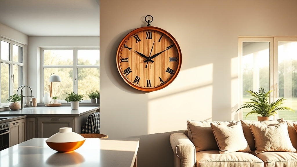
Open plan living sounds like the dream until you actually try to decorate it. The kitchen and living room share one continuous wall plane, two completely different moods, and completely different demands. Now someone asks: where does the clock go? And suddenly you're staring at a blank wall wondering if any single timepiece can do justice to both zones.
Here's the thing: a wall clock for an open plan kitchen living room isn't just a practical object. It becomes one of the few visual anchors that ties the whole space together. Get it right, and it acts like punctuation on the wall. Get it wrong, and it looks like you just grabbed whatever was closest to the checkout.
This guide is about getting it right. We'll walk through sizing, placement, materials, legibility, and the common slip-ups worth avoiding, so your clock earns its spot on the wall rather than just occupying it. And if you want to jump straight to tried-and-tested options, the living room wall clock collection is a good place to start.
⭐ Key things to keep in mind
- In an open plan space, a clock needs to be readable from at least two distinct vantage points, often 15 to 25 feet apart.
- Size matters more here than in any other room: undersized clocks disappear completely; oversized ones can feel chaotic.
- Material and finish should bridge both zones, not belong exclusively to one.
- Silent quartz movement isn't optional in open plan spaces: tick noise travels in ways it never would in a closed room.
- Placement above a transitional element (a beam, a shelf break, the boundary wall) gives the clock the most visual leverage.
Why Open Plan Spaces Make Clock Selection Genuinely Harder
In a conventional room, you're solving for one viewing distance, one lighting condition, and one aesthetic context. An open plan kitchen living room multiplies all three. From the sofa, you might be 20 feet away from the far kitchen wall. From the kitchen island, you're looking in the opposite direction toward the lounge side. The clock has to perform from both.
There's also the aesthetic tension. Kitchen zones tend to favor practicality: hard surfaces, task lighting, materials that wipe clean. Living areas lean toward warmth, texture, softer materials. A clock that reads perfectly in a restaurant-style kitchen can feel cold and clinical when it's also hovering over your reading corner. One that feels perfectly cozy in a *hygge*-inspired lounge can look wildly out of place against subway tile splashbacks.
The answer isn't to compromise on both. It's to find the visual language that both zones already share, and put your clock there.

Getting the Size Right: The Numbers That Actually Matter
Most advice says "go big in open plan spaces." That's mostly true, but vague. Here's what works in practice.
For an open plan room where the clock will be viewed from a maximum distance of around 20 feet (6 meters), a diameter of 40 to 60 cm (roughly 16 to 24 inches) hits the sweet spot. Large enough to read from across the room, proportionate enough not to dominate when you're standing 4 feet away in the kitchen making coffee.
If the space is exceptionally large, say a converted loft or a knocked-through Victorian terrace exceeding 30 feet in length, then a 60 to 80 cm clock starts to make sense. At that scale, anything smaller genuinely vanishes.
- Up to 18 feet viewing distance: 35 to 45 cm diameter works well
- 18 to 25 feet: 45 to 60 cm is the reliable range
- 25 feet and beyond: 60 cm+ or consider a clock with bold, high-contrast numerals to compensate
One thing people consistently underestimate: the height of the ceiling changes the perceived scale of a clock dramatically. A 50 cm clock at standard ceiling height reads as substantial. The same clock in a room with 3.5 meter ceilings can look almost toy-like. If you have high ceilings, size up by 15 to 20 percent from what your gut says. It feels counterintuitive, but you'll thank yourself later.
💡 Did you know?
The Romans used sundials calibrated to be legible from up to 50 Roman feet (roughly 15 meters) in public forums. The principle of designing for viewing distance has been baked into clock design for over two millennia. Nothing about open plan living has actually changed the underlying equation.
Where to Actually Hang It: The Transitional Wall Strategy
Most people default to hanging their clock on whichever wall has the most empty space. That logic works in a single room. In an open plan layout, it often creates a clock that reads as belonging to one zone and being awkward in the other.
The better approach: look for the transitional element. This is the architectural feature that already sits between the kitchen and living zones, even if subtly. It might be:
- A chimney breast or fireplace wall that faces into both zones
- The return wall at the end of a kitchen run, visible from the sofa
- A structural column or beam that marks the visual boundary between zones
- The wall above a kitchen island that also serves as a visual backdrop from the lounge side
Mounting a clock on or adjacent to one of these transitional elements gives it a natural place to belong to both zones simultaneously. It's not a kitchen clock stranded in the living room, and it's not a lounge clock peering over the splashback. It's a spatial anchor.
Height matters too. The center of the clock face should generally sit between 57 and 65 inches from the floor when the space is primarily viewed standing (kitchen side) or between 60 and 68 inches when the primary vantage point is seated (sofa). In an open plan room, a height of 60 to 65 inches tends to work across both.


Style Compatibility: Finding the Visual Language Both Zones Share
So you've got matte black hardware and concrete countertops in the kitchen, and a linen sofa with a warm-toned rug in the living area. Do those two palettes share a clock? Almost always, yes. You just need to look a little more carefully. They almost certainly share at least one or two elements: a recurring neutral tone, a material (wood appearing in both cabinetry and furniture), or a temperature (both spaces might run warm or both might lean cool). Start there, not with the differences.
When the kitchen is industrial and the living room is Scandinavian
This is one of the most common open plan pairings right now. The good news: both aesthetics value simplicity and honest materials. A clock in natural oak or walnut with a clean, uncluttered dial face reads as Scandinavian in the lounge and as a deliberate raw material choice in the kitchen. Avoid anything overly ornate here. Clean lines, minimal numerals, and a warm wood tone do the bridging work without trying too hard. Think Muuto meets SMEG: purposeful, a little warm, never fussy.
When both zones lean contemporary and monochrome
A monochrome open plan space gives you enormous latitude. A bold black clock with Roman numerals or a stark white minimalist design will feel purposeful in both zones, especially if it's large enough to hold its own at scale. Here the clock becomes more of an art piece than a time-telling device, which is exactly what a contemporary minimalist open plan needs. The scale does the talking.
When the space has a warmer, more eclectic feel
Warm eclectic spaces, think terracotta, mixed metals, lots of natural texture, can actually take a more decorative clock than you might expect. A vintage farmhouse-style clock with distressed wood and French lettering, or a celestial design with sun and moon motifs, can feel at home across both zones when the overall palette has that lived-in, layered quality. The trick is that the clock should feel like it was found rather than bought, even if you spent three weeks choosing it.
The Material Question: What Works in a Kitchen AND a Living Room
Some materials feel at home in kitchens. Some belong in living rooms. The best choices for a wall clock for an open plan kitchen living room sit comfortably in both. Here's a quick breakdown of how common clock materials actually perform across the two zones.
| Material | Kitchen suitability | Living room suitability | Open plan verdict |
|---|---|---|---|
| Natural wood (oak, walnut) | Strong - reads as warm, practical | Excellent - universal warmth | Top choice for most spaces |
| Metal (black, brushed brass) | Strong - echoes hardware finishes | Strong - contemporary edge | Excellent if finishes match |
| Wood and metal combined | Good - bridges both materials | Good - adds visual interest | Very strong for transitional zones |
| Plastic / resin | Acceptable for practical spaces | Weak - can feel cheap at scale | Avoid for large open plans |
| Glass with metal frame | Good - clean and wipeable | Good - light and elegant | Works well in contemporary spaces |
The combined wood and metal category deserves a specific mention. When a clock incorporates both an oak or walnut face and a powder-coated or brushed metal frame, it naturally contains visual elements from two distinct decor languages. That's not an accident; it's exactly why this type of clock performs so reliably in open plan settings. If your kitchen runs industrial and your living area runs Scandinavian, a wood-and-metal clock is genuinely the Venn diagram of those two aesthetics.

Silent Movement: Not a Luxury, a Necessity
In a closed bedroom or study, a softly ticking clock can actually feel pleasant, rhythmic, even companionable. Open plan spaces are different. Sound moves freely across the whole footprint of the room. A clock mounted in the kitchen zone will be heard clearly from the sofa. During quiet evenings, a ticking clock in a 40-square-meter open plan room becomes the loudest thing in the space.
Silent quartz movement, which uses a step-motor mechanism that eliminates the tick entirely, is the baseline requirement for any open plan kitchen living room clock. It's not an upgrade; it's the starting point. Look for it explicitly in product specifications, because "quiet" and "silent" are not always the same thing in clock marketing.
Sweep movement is a related but distinct feature. A sweep second hand moves continuously rather than stepping, which also reduces sound and looks more refined. If the clock has a visible second hand, sweep movement is worth prioritizing. It's one of those details that feels small until you're sitting quietly with a book and the second hand is twitching in your peripheral vision every single second.

Dial Legibility at Distance: What the Numbers Are Actually Telling You
Legibility is one of those things that nobody thinks about until they're squinting at their clock from across the room. In a single room, almost any clock is readable from 10 to 12 feet. At 20 feet across an open plan space, the dial design starts to genuinely matter.
Here's what affects legibility at distance:
- Numeral size relative to clock diameter: numerals should occupy at least 15 to 18 percent of the dial's diameter to read clearly at 20 feet
- Contrast ratio between dial and numerals: black on white or white on dark backgrounds are the most readable at distance; gold on cream or gray on light gray are the hardest
- Hand thickness: thin, decorative hands that look beautiful close up can become nearly invisible from across a room; look for hands with a minimum width of 3 to 4 mm
- Marker style: bold Arabic numerals and Roman numerals tend to read better at distance than minimalist tick marks alone
"A clock that you can't read is just a decorative disc. Make sure yours tells the time first, then worries about looking good second."
Elena Rossi, on the one rule that overrides everything else
Lighting Conditions Across Both Zones: An Often-Missed Variable
Open plan spaces typically have varied lighting conditions across the room. The kitchen zone often has bright task lighting (downlights, under-cabinet strips). The living zone tends toward warmer, dimmer ambient lighting, especially in the evenings. The same clock face can look very different under those two conditions.
A clock with a light, reflective dial might glare under kitchen downlights and then look perfectly warm and muted under the living room's ambient lamps. Conversely, a dark-dialed clock might feel dramatic and sophisticated from the sofa but become hard to read under the kitchen's cooler task lighting.
The most reliable performers across lighting zones are clocks with neutral to warm-toned dials (off-white, cream, natural wood grain) and hands in a clearly contrasting dark finish. They adapt to changing light rather than fighting it. If you're unsure, that off-white dial with matte black hands is the open plan equivalent of a white Oxford shirt: it goes with everything and never looks like it's trying.
Living Room Wall Clocks
Curated for scale, legibility, and design quality - every clock here is chosen to hold its own as a visual anchor in larger, open spaces.
154 references
Browse the collection →Common Mistakes Worth Skipping
A few patterns come up again and again when people are choosing a wall clock for an open plan kitchen living room. They're easy to avoid once you know to look for them.
Buying for one zone and ignoring the other. That clock you loved on your kitchen mood board might look entirely wrong when you step back and see it from the sofa. Always evaluate from both vantage points before committing. Walk across the room. Sit on the couch. Does it still feel right?
Going too small "to not overwhelm the space." Open plan rooms are larger than standard rooms. A clock that feels appropriately modest in a single room reads as timid and lost in an open plan layout. When in doubt, size up.
Ignoring finish consistency. If your kitchen hardware is brushed brass and your clock is chrome, that mismatch will catch your eye every single time. Match the clock's metal accents to at least one other metallic finish already present in the shared space.
Placing it too high. People often push clocks toward the ceiling to "fill" tall walls. A clock mounted at picture-rail height in a room with 3-meter ceilings becomes functionally useless from normal standing height. Eye level plus 10 to 15 inches is still the right target, regardless of ceiling height.
Frequently asked questions
Is it okay to put a wall clock in the kitchen?+
Absolutely. Kitchens are one of the most practical places for a clock - timing is genuinely useful when you're cooking. The main consideration is moisture and heat proximity: avoid hanging a clock directly above a hob or immediately next to a steam source. A wall opposite or adjacent to the kitchen run, at normal viewing height, is ideal. In an open plan layout, a clock placed at the kitchen-living room boundary does double duty for both zones.
Do people still put clocks in their kitchen?+
Yes, and the trend is actually growing. As phones move into bags and pockets rather than sitting on worktops, a dedicated wall clock in the kitchen becomes more useful again, not less. Beyond function, a well-chosen kitchen clock is increasingly treated as a design statement in its own right, part of the same considered curation as pendant lighting or cabinetry hardware.
What size wall clock works best for an open plan kitchen living room?+
For most open plan spaces, a clock between 45 and 60 cm in diameter is the practical sweet spot. It's large enough to read from across the room and proportionate enough not to overwhelm the wall when viewed up close from the kitchen side. In very large spaces (over 30 feet long) or rooms with ceilings above 3 meters, moving up to 60 to 80 cm starts to make real visual sense.
What style of wall clock works across both kitchen and living room zones?+
Clocks that combine two materials, most often wood and metal, tend to bridge aesthetic zones most naturally. A natural wood dial with metal hands and case reads as warm and organic in a living space while feeling grounded and purposeful in a kitchen context. The key is finding a clock whose design vocabulary is already present in both zones rather than belonging exclusively to one. If you're pairing an industrial kitchen with a Scandinavian living area, a walnut-face clock with a matte black metal surround is a very safe starting point.
Does a wall clock in an open plan space need to be silent?+
In practice, yes. Sound travels freely across open plan spaces in a way it simply doesn't in closed rooms. A ticking clock that barely registers in a small bedroom becomes noticeably audible from the sofa in a large open plan room, especially during quiet evenings. Silent quartz movement is the minimum standard worth insisting on for this type of space.
Can I use more than one clock in a large open plan space?+
You can, but it's rarely necessary and often creates visual noise. A single well-chosen clock, sized and positioned correctly, will serve a large open plan space far better than two smaller clocks competing with each other. The exception is a genuinely vast space (think knocked-through Victorian terrace or converted commercial unit) where the total length exceeds 40 feet and no single wall is visible from both zones. In that case, two clocks in coordinating but not identical designs can work, as long as they share a common material or finish thread.






