

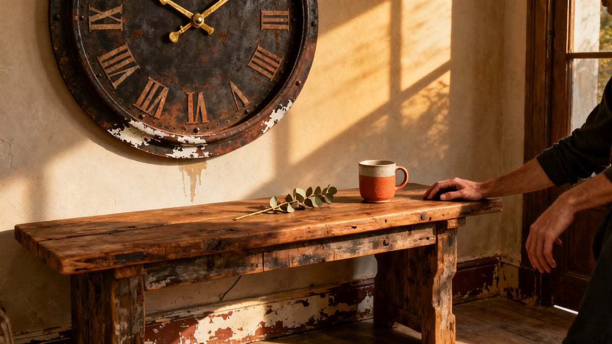
There's a wall clock in my grandmother's hallway that nobody has replaced in forty years. The bezel is a deep, mottled bronze, the face slightly yellowed around the numerals, and the hands carry a faint patina that no amount of polishing has ever touched. That clock, more than anything else in that house, feels like it belongs. A wall clock with a distressed finish vintage look does exactly that: it earns its place on a wall rather than simply occupying it.
Brand-new pieces can be beautiful. But they can also feel like they're still waiting to mean something. A clock with an aged, weathered finish skips that waiting period entirely. The scratches, the oxidized metal, the chalky paint worn back to raw material at the edges - those things read as history. Your room picks up on that, even if you can't quite say why it feels warmer than it did before.
⭐ Key takeaways
- Distressed finishes work because they carry visual weight - they don't need a gallery wall around them to feel intentional.
- Metal, wood, and painted finishes each age differently and suit different rooms.
- Scale matters more than style: a distressed clock that's too small on a large wall just looks timid.
- Roman numerals pair naturally with aged finishes because they reinforce the sense of era.
- The best vintage-look clocks are quartz inside - you get the aesthetic without the maintenance headache of antique movements.
Why a Distressed Finish Reads as "Authentic" (Even When It Isn't)
There's a reason artificially aged clocks sell alongside genuine antiques and hold their own. The brain reads worn surfaces as having survived something. A patinated brass bezel, a face with faint crackling in the paint, a frame where the dark lacquer has rubbed through to show raw iron underneath - these aren't flaws. They're proof of time.
Furniture makers have known this for centuries. The French call it patine, a word that covers everything from natural oxidation on bronze to the warm darkening of old wax on walnut. Applied to a clock, patina signals that the object has a relationship with light, air, and human hands. That's a powerful cue in a room that might otherwise feel assembled rather than lived-in.
The visual effect is also practical. A distressed surface breaks up flat light. Where a shiny, polished piece reflects in one direction, a weathered one scatters light softly across its texture. That's why aged clocks look good in imperfect rooms - old plaster, exposed brick, worn floorboards - but also in quite sleek spaces, where they provide contrast and relief from all that clean geometry.

💡 Did you know?
The French decorating term brocante - which describes flea-market style decorating with aged, found objects - became mainstream in European interior design during the 1980s and 1990s. It's one of the earliest examples of "deliberately imperfect" becoming a deliberate design choice rather than a budget compromise. Distressed wall clocks fit directly within that tradition.
The Main Finish Types: What Each One Actually Looks Like Up Close
Not all distressed finishes are the same. The differences matter when you're trying to match a clock to a specific room, so here's what separates them in practice.
Oxidized and Patinated Metal
This is the most convincing of the aged finishes. The base is usually cast iron, pressed steel, or aluminum, treated with chemicals or left to age naturally to produce a surface that shifts from near-black at the edges to russet brown or olive green in the recesses. Good examples show actual texture variation: a slight powdery quality near the oxidized zones, harder and smoother where the metal was protected.
These clocks carry serious visual weight. They suit brick walls, rough plaster, stone surfaces, and dark painted walls. In a white-and-wood Scandinavian room they can work beautifully as a single strong contrast point, but they need space around them to breathe.
Distressed Painted Wood
Here the technique is deliberate sanding-back: a wooden frame painted in white, grey, or cream, then worked back with sandpaper at the edges, corners, and any raised detail to expose the bare wood or an undercoat in a contrasting tone. The result looks like a clock that spent decades in a farmhouse kitchen, paint slowly retreating in the places hands touch most.
This finish is softer than oxidized metal. It suits whitewashed walls, linen textiles, and rooms that lean toward French country or coastal cottage aesthetics. The warm undertone of bare wood showing through a chalky white paint layer is genuinely hard to fake badly - it tends to look good even on budget pieces.
Aged Brass and Bronze Tones
Brass finishes that are deliberately dulled or brushed to remove their shine sit somewhere between the two above. The colour tends toward deep gold, olive gold, or antique bronze - rich without being flashy. These pair naturally with dark wood furniture, deep wall colours (navy, forest green, charcoal), and leather or velvet fabrics.
One thing worth knowing: true aged brass and a plastic piece coated in brass-coloured paint behave differently in light. The plastic version tends to look flat and slightly cold. Real metal, even when chemically treated, catches warm light in a way that shifts slightly depending on the angle. If you can, check a product photo taken in natural light rather than studio conditions.
Distressed Enamel or Ceramic Face
Less common but very striking: clock faces with intentionally crazed, crackled, or lightly chipped enamel. The effect recalls antique French station clocks or vintage pharmacy signage. The numerals are usually printed or transfer-applied under the crackle, so they remain legible. These work well in kitchens, home offices, and any room that references industrial or early 20th-century aesthetics.
| Finish Type | Best Room Fit | Visual Weight | Pairs With |
|---|---|---|---|
| Oxidized Metal | Living room, entryway, loft | Heavy | Brick, dark plaster, reclaimed wood |
| Distressed Painted Wood | Kitchen, bedroom, cottage | Light to medium | Whitewash, linen, pale timber |
| Aged Brass / Bronze | Study, dining room, library | Medium to heavy | Dark wood, deep wall colours, velvet |
| Crackle Enamel Face | Kitchen, home office, workshop | Medium | Industrial tile, raw plaster, pipe fittings |
Roman Numerals, Arabic Numbers, and the Case for No Numerals at All
The number style on a vintage-look clock isn't a small decision. It affects how strongly the piece reads as aged, and how much visual noise it adds to a wall.
Roman numerals are the most popular choice on distressed finish wall clocks - and there's a real reason for that beyond fashion. Roman numerals look hand-applied even when they're not. The irregular spacing of I, II, III against VIII or XII creates an organic, slightly asymmetric quality that a row of 1, 2, 3 doesn't. Combined with a worn face, they reinforce the sense that the clock predates the digital era by some margin.
Arabic numerals on distressed clocks work well when they're printed in a period-appropriate typeface: heavy sans-serif like early 20th-century industrial signage, or a thin, elegant script that echoes Art Deco station clocks. A generic modern numeral set on a distressed face tends to undercut the effect.
No numerals at all - just hour markers or simple lines - pushes the clock toward minimalism. These read as contemporary even with an aged finish, which can be exactly what you want in a room that blends old and new. A bare, oxidized iron ring with slim brass hands and no numerals is a very modern object wearing very old clothes.

Getting the Size Right: Why Most People Go Too Small
This comes up constantly, and it's worth being direct about. A distressed wall clock that's undersized for its wall looks like an afterthought. The aged finish draws the eye - and then the eye wants a presence to match. When the clock is too small, the effect deflates.
A rough guide that holds up in most rooms:
- A standard living room wall (roughly 3-4 metres wide): a clock with a diameter of at least 50-60 cm feels considered. Smaller than that and it competes poorly with sofas, shelves, and other furniture.
- A kitchen backsplash or narrow hallway: 30-40 cm works, especially if the wall is otherwise sparse.
- Above a fireplace or as the sole feature on a large wall: 60 cm and up. Many people who come back to us after a first purchase say they wish they'd gone bigger from the start.
- A bedroom above a bedhead: 40-50 cm tends to feel right. Large enough to be intentional, not so large it dominates when you're trying to sleep.
The distressed finish itself adds perceived size, because the texture and weathered tones pull the eye across a larger surface area. A 50 cm clock with a richly oxidized frame will read larger than a 50 cm clock in a flat, pale finish. Keep that in mind when comparing sizes between styles.
Room-by-Room: Where Aged Clocks Work Hardest
The Living Room
A large vintage-look wall clock in the living room works best when it anchors a wall rather than competing with other pieces. Over a fireplace, above a console table, or on a long plain wall between two doorways - these positions give the clock room to function as a focal point. Pair it with one or two other objects in complementary materials (a cast iron bookend, a brass-framed mirror, a reclaimed wood shelf) rather than surrounding it with a gallery of smaller frames.
One thing to avoid: placing a heavily distressed clock directly above a very new, shiny sofa. The contrast isn't always the charming kind. If your sofa is sleek and modern, a clock with an aged patinated finish will work better paired with a throw or cushions in warmer, more organic tones to bridge the gap.
The Kitchen
Kitchens are natural homes for distressed finishes because kitchens are already places where time and use leave their marks. Worn handles, used cutting boards, a slightly darkened wall near the hob - these details make an aged clock feel completely at home.
In the kitchen, legibility matters more than elsewhere. A clock you glance at while your hands are covered in flour needs clear hands and a face you can read from a few metres. A clean white or cream face with strong black or dark brass hands, held in a distressed metal or painted wood frame, hits this balance well. Avoid very dark faces in kitchens - they're harder to read at a glance in artificial light.
The Entryway
The entryway is where a clock makes its first statement. A distressed, heavy iron piece at the entrance says something specific: this home has a sense of history, things here have been chosen rather than collected. It also serves a genuinely practical function - it's the last thing you check before leaving.
In narrow entryways, a vertically proportioned clock (one that's taller than it is wide, or an octagonal or oval shape) takes less horizontal wall space while still reading well. A pendulum clock in an aged finish is a strong choice here; the gentle movement catches the eye exactly when it should.
The Bedroom
Bedrooms call for restraint. An aged clock here works best when it's part of a considered grouping rather than the sole decorative element. Above the headboard, flanked by a pair of small prints or a wall-mounted light on each side. Or on a wall opposite the bed, where it can be read from the pillow without being visually overbearing.
If you share the bedroom with someone who finds ticking clocks disruptive at night, the good news is that most modern vintage-look wall clocks run on a silent quartz movement. The aged aesthetic is entirely independent of the mechanism inside.

Mixing Aged Clocks with Contemporary Interiors
The assumption that a distressed or vintage-look clock only belongs in a rustic or traditional room is worth questioning. Some of the most striking uses of aged finishes happen in quite modern spaces, where the weathered surface does exactly the opposite of what it does in a cottage: instead of blending in, it creates a deliberate tension that energizes the room.
A few combinations that hold up well in practice:
- Oxidized iron clock on a white plaster wall with minimal furniture. The clock becomes the room's single strong moment. Everything else recedes.
- Aged brass clock in an all-grey kitchen. The warm bronze tones cut through what can otherwise feel cold, and the vintage look contrasts pleasingly with sleek cabinet hardware.
- Distressed painted wood clock in a room with polished concrete floors. The soft chalk finish of the clock frame and the hard industrial quality of the floor create a productive contrast.
- Large patinated metal clock in a bedroom with linen bedding and raw timber furniture. This is the "new classic" look: natural materials, muted tones, and a clock that ties the organic palette together.
The rule that holds across all these combinations is that aged pieces want company in their own material family. One weathered bronze clock surrounded by glossy chrome and plastic will look abandoned rather than intentional. Give it at least one other element in a natural or aged material, however small - a ceramic vase, a wooden tray, a linen cushion - and the room starts to cohere.

What to Look for When Buying: Finish Quality Signals That Matter
The distressed finish market spans a wide range of quality, and a few indicators separate pieces that will look better over time from those that will just look tired.
Layered vs. Single-Pass Finishes
Good distressed finishes are built in layers. A frame that shows three or four tonal layers as the surface wears through - a deep base coat, a mid tone, and a top layer worn back at the edges - will look genuinely aged. A single coat of dark paint with a few scratches dragged through it looks cheap close up. Check product images at full resolution where possible, and look for tonal variation rather than uniform surface texture.
Weight and Material Density
A distressed iron clock should feel heavy. Lightweight pressed steel or thin aluminum treated to look like cast iron will always betray itself when the frame catches light along an edge and looks thin. This is harder to assess online, but checking the stated weight is a good proxy. A substantial 60 cm metal clock in cast iron or thick pressed steel should weigh several kilograms.
Hand Quality
The hands are the most-scrutinized part of any clock. On a vintage-look piece, the hands should be in a material and finish that complements the frame - not cheaper. Thin plastic hands painted gold on an oxidized metal frame is a mismatch that's immediately visible. Look for metal hands with a brushed, aged, or complementary finish.
Movement Sound
Most vintage-look clocks today run on a quartz battery movement. This is fine - it's accurate and low-maintenance. What varies is whether the movement is a "tick-tock" (stepped) or a "sweep" (continuous) second hand. Stepped movements make the familiar ticking sound; sweep movements are nearly silent. If you're sensitive to ticking, specify a sweep movement when buying.
"A clock is one of the few objects in a home that people interact with several times a day without ever picking it up. It earns its place on the wall."
Interior designer observation, recurring across studio practice
Caring for an Aged Finish Without Destroying the Effect
This is a question that comes up more than you'd think. The instinct is to clean a clock the way you'd clean any decorative object - thoroughly. With a distressed finish, that instinct can strip away exactly what makes the piece look good.
Here's what actually works:
- Dusting: A soft, dry cloth or a very soft brush. Never an abrasive cloth or a damp wipe on painted wood finishes - the moisture softens the paint and accelerates wear in ways you haven't chosen.
- Metal finishes: A very lightly dampened cloth to remove grease marks, then immediately dried. For patinated or oxidized frames, avoid any product that contains oils or waxes unless you specifically want to darken the patina.
- If the finish wears further: On a deliberate distressed piece, a little extra wear from use is rarely a problem. If you want to touch up a painted wood frame, a chalk paint in the original colour, applied lightly and then sanded back, blends in naturally.
- Battery changes: Once a year as a habit, before the battery fully drains. A dead battery left in a quartz movement for months can leak and damage the mechanism.

The Brands and Styles Worth Knowing in 2026
The vintage wall clock market has shifted noticeably in the past few years. Where it was once dominated by mass-produced pieces with thin metal frames and generic finishes, there's now a strong middle tier of clocks that take the aged aesthetic seriously in both material and proportion.
What the Industrial-Farmhouse Style Actually Means
The term gets used loosely, but the core combination is consistent: heavy metal (cast iron or thick pressed steel) in a dark, oxidized or powder-coated finish, with an open face showing the movement or a wire-cage surround, and hands in a contrasting aged brass or matte black. The diameter tends to run large - 50 cm and above. This style suits loft conversions, barn conversions, and modern homes that want one moment of industrial weight in a predominantly soft room.
French Provincial and Country House Styles
Rounder profiles, softer finishes. Creamy or pale grey painted frames, often in a carved or slightly ornate profile that references 18th and 19th-century French provincial furniture. The distressing here is lighter - worn edges rather than heavy patina, a slightly yellowed face, hands in antique gold or aged iron. These sit comfortably in kitchens, reading rooms, and bedrooms.
Vintage Railway and Station Clocks
Inspired by the large institutional clocks that hung in European railway stations through the late 19th and early 20th centuries, this style uses an enamel or enamel-look face (sometimes with intentional crazing), bold Roman or Arabic numerals in black or dark red, and a simple industrial frame. The proportions are generous and the legibility from a distance is excellent. They look particularly good in hallways, utility rooms, and home offices.
Gustav Becker and the German Clock Tradition
If you come across genuine antique pieces while looking, the name Gustav Becker is worth knowing. The Silesian clockmaker produced wall clocks from the 1850s through to the early 20th century that are still found in European flea markets and auction houses. Their characteristic features are a polished brass pendulum, a carved or simple wooden case, and a white enamel face with fine black numerals. Many modern "vintage-look" clocks draw directly on this tradition in their proportions and detail.

The Clock You Live With vs. The Clock You Buy for Effect
A distressed finish clock with a vintage look is a long-term presence in a room. Unlike a cushion or a throw, it doesn't get rotated seasonally. It stays on that wall for years, possibly decades. That changes how you should think about buying it.
The question isn't just "does this look good in the photo?" It's "will I still want to look at this in five years?" Pieces that tend to age well as purchases have a few things in common: they're made from a material that actually changes and improves over time rather than just degrading; their proportions are generous enough to hold the wall at the size you've chosen; and their style is specific enough to feel considered rather than generic, but not so trend-specific that it will feel dated.
The finish should match something the room already has - or something you plan to introduce. A clock bought in isolation as a statement piece often ends up feeling exactly that: isolated. The best distressed clocks work because they pick up on a material or tone that already exists in the room and amplify it. That's the difference between a clock that "works" and one that transforms a wall into something worth noticing.
Frequently asked questions
What is the best type of vintage wall clock for a living room?+
For living rooms, a large oxidized metal or aged brass clock (50 cm diameter or above) tends to work best. It needs to be proportioned to hold the wall on its own, without relying on surrounding artwork. Styles that read as industrial farmhouse or French provincial both suit living rooms well, depending on whether your existing furniture leans warmer and more rustic or cleaner and more contemporary.
What are the different types of vintage wall clock finishes?+
The main categories are oxidized or patinated metal (cast iron, steel, or aluminum treated to develop a russet, olive, or near-black surface), distressed painted wood (a wooden frame with paint worn back to show bare wood or a contrasting undercoat at the edges), aged brass or bronze (metal with dulled, brushed, or chemically treated surface that removes the shine), and crackle or crazed enamel faces (a clock face treated to replicate the crazing seen on very old painted surfaces). Each suits a different room aesthetic and carries a different visual weight.
Do distressed wall clocks only work in rustic or traditional interiors?+
No - and this is a common misconception worth pushing back on. Aged and patinated finishes work very well in contemporary and minimalist rooms precisely because they create contrast. An oxidized iron clock on a plain white wall, or an aged brass frame in an all-grey kitchen, creates a deliberate tension that makes both elements more interesting. The key is giving the clock at least one other element in the room that shares its material family - a wooden tray, a ceramic object, a linen textile - so it reads as intentional rather than out of place.
What are the most popular vintage wall clock styles in 2026?+
Industrial farmhouse (heavy metal frames in dark oxidized or powder-coated finishes, often with open-face or cage surrounds) continues to hold strong. French provincial (soft chalky painted frames in cream, pale grey, or muted sage, with a slightly ornate profile and Roman numerals) has gained ground as a companion to the broader cottagecore and European country-house aesthetic. Vintage railway station clocks - enamel or enamel-look faces, bold numerals, simple industrial frames - are a growing presence in entryways and home offices. All three styles are widely available in quartz silent movements, which removes one of the practical objections to vintage-look pieces in bedrooms.
How do I clean a distressed metal or painted wood wall clock without ruining the finish?+
For metal frames with an oxidized or patinated finish, use a soft dry cloth to dust and a very lightly dampened cloth for grease marks, drying immediately. Avoid oils or waxes unless you want to deliberately darken the patina further. For distressed painted wood frames, use only a dry soft cloth - moisture can soften the paint and accelerate wear in directions you haven't chosen. If the painted finish wears further and you want to touch it up, a chalk paint in the original colour, applied lightly and sanded back, blends in naturally with the existing distressed surface.






