

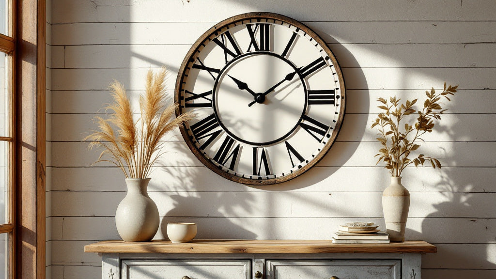
There's something quietly satisfying about walking into a room and seeing a farmhouse style vintage wall clock anchoring the whole space. Not because it tells the time better than your phone, but because it says something about how you live. It slows things down. It adds a layer of warmth that no amount of throw pillows can fake.
The tricky part? Getting it right. Farmhouse vintage wall clocks range from genuinely beautiful pieces with aged metal dials and distressed wood frames to stuff that looks like it fell off a barn wall at a craft fair. This guide walks through what actually separates one from the other, where to hang them, which styles work in which rooms, and how to style around them once they're up.
⭐ Key takeaways
- Size matters more than style: a clock that's too small reads as an afterthought, not decor.
- Distressed finishes work best when they echo at least one other texture in the room.
- Roman numerals aren't just decorative, they shift the entire mood of a wall toward heritage and craft.
- The kitchen and the living room are the two spaces where farmhouse clocks make the biggest visual impact.
- Silence is a legitimate feature: a ticking clock in a bedroom or reading nook can ruin the atmosphere entirely.
Why Farmhouse Clocks Have Lasted This Long (and Show No Signs of Stopping)
Farmhouse style has cycled in and out of mainstream interior design for decades, but the vintage wall clock within that aesthetic has never really left. Why? Because it solves a design problem that very few objects can: it fills vertical space meaningfully without competing with the rest of the room.
A large rustic clock on a shiplap wall doesn't fight for attention the way a piece of art does. It belongs. It has a reason to be there. And when you pair aged wood or oxidized metal with warm neutrals, linen textures, and raw wood furniture, the clock doesn't just decorate the wall. It grounds the whole composition.
There's also the nostalgia factor. Farmhouse design borrows from early American homesteads, French country kitchens, and English cottage interiors. A distressed clock face with Roman numerals calls back to a time when objects were made to last, not to be replaced next season. That resonates with people who are increasingly skeptical of fast furniture and disposable decor. It's also why so many interior designers, when styling a space that needs to feel "collected over time" rather than "ordered online last Tuesday," reach for a farmhouse vintage wall clock as one of their first moves.
💡 Did you know?
The oversized farmhouse clock trend has roots in the clocks that hung in French train stations and market halls during the 19th century. Those clocks, called horloge de gare, were designed to be read from a distance across a crowded space, which is exactly why their large dials, bold numerals, and iron frames translate so well to open-plan living rooms and kitchen walls today.

Distressed Finishes: What to Look For and What to Avoid
Not all distressing is equal. This is where a lot of farmhouse clock purchases go wrong. The finish on a vintage-style clock should look like it aged naturally over time, not like someone went at it with sandpaper for twenty minutes.
Here's what good distressing actually looks like in practice:
- Layered paint or patina: The best distressed finishes show multiple layers, as if the piece was painted more than once and the base coat is showing through at natural wear points (edges, corners, raised details).
- Oxidized metal: A genuine-looking aged metal dial will have tonal variation across the surface, darker in recessed areas, lighter on raised edges. Flat, uniform "aged" sprays look cheap up close.
- Wood grain that shows: For wooden-framed farmhouse clocks, the distressing should follow the actual grain of the wood. Cross-grain scratches break the illusion immediately.
- Intentional imperfection: Small pits, slight color variation, matte rather than satin finish. Anything that catches light uniformly is probably factory-applied and will look it.
What to avoid: clocks where the distressing looks printed rather than applied, pieces with sharp even scratches at regular intervals, and anything with a high-gloss topcoat over a "rustic" base. That combination kills the effect. Also worth mentioning: if the aging looks identical on both sides of the frame, it was almost certainly stamped in a mold rather than applied by hand. Natural aging never mirrors itself perfectly, and the best manufacturers know this.
Roman Numerals vs. Arabic Numerals: It's Not Just Aesthetic
This feels like a small choice, but it genuinely shifts the mood of a room. Roman numerals read as heritage. They reference sundials, church clocks, and estate furniture. On a farmhouse wall, they add a layer of formality that balances out the rougher textures around them: the exposed brick, the raw linen, the chunky wood beams.
Arabic numerals on a vintage-style clock land differently. They're warmer, more casual, more French bistro than English country estate. For a kitchen or a mudroom where the vibe is busy and lived-in, they often feel more natural. For a living room or dining room where you want the clock to feel like a considered object, Roman numerals tend to carry more visual weight.
Neither is wrong. But knowing what each communicates helps you choose rather than guess. One quick shorthand: if your room already has curved or ornate shapes (arch doorways, turned wood chair legs, decorative tile), Roman numerals will feel at home. If the room is more linear and spare, with flat-front cabinetry or clean-lined furniture, Arabic numerals keep the aesthetic coherent without the formality.

Room by Room: Where Farmhouse Vintage Clocks Hit Hardest
The Living Room: Go Bigger Than You Think
The single most common mistake people make with farmhouse living room clocks is choosing one that's too small. On a large wall, a 12-inch clock reads as a decoration. A 24-inch clock reads as a focal point. A 30-inch clock becomes the room's anchor, the thing your eye finds first when you walk in.
For living rooms with shiplap, exposed brick, or paneled walls, the clock needs enough presence to hold its own. Pair it with a distressed wood frame or an aged iron case, and hang it at roughly eye level when standing (not seated). The center of the clock face should sit between 57 and 60 inches from the floor in most standard-height rooms. On walls above a fireplace mantel, the center of the clock can go higher, around 65-70 inches, to clear the mantel and the objects on it.
If you find yourself drawn to something really commanding, 30 inches and above, you're in oversized territory and that's a good thing for a large living room wall. Browse the Large Wall Clock collection to see what that scale actually looks like in context before committing to a size.
The Kitchen: Functional and Beautiful at the Same Time
The kitchen is where farmhouse clock design feels most at home, literally. A vintage clock above open shelving, beside exposed brick backsplash, or centered on a blank wall between upper cabinets pulls the whole aesthetic together. The key here is choosing a size that fits the wall panel you're working with. A 12-14 inch clock works well in tighter kitchens with less wall real estate. Larger kitchens with big blank walls can carry a 20-24 inch piece without it feeling crowded.
Finish-wise, matte black iron, aged copper, and whitewashed wood all work beautifully against warm kitchen tones. A clock with a slightly distressed cream or white dial reads especially well against dark wood cabinets or deep green paint.

The Bedroom: Where Silence Becomes the Point
A ticking clock in a bedroom is a dealbreaker for a lot of people. And honestly, that's completely valid. The good news: most quality farmhouse-style clocks now use silent quartz movements, which means the sweep of the second hand produces no audible tick at all. This is worth checking specifically before buying.
For the bedroom, the visual goal is different than the living room. You want presence without dominance. A clock that reads as warm and considered, not loud and decorative. Smaller vintage cafe-style clocks in bamboo or light wood, around 10-12 inches, do this really well. They bring the farmhouse sensibility to the room without competing with the calm the space is supposed to hold.

The Hallway and Entryway: First Impressions Count
A hallway wall is often an afterthought in home styling, which makes it a genuinely good place to do something interesting. A farmhouse vintage clock hung at entry level, maybe paired with a small console table and a simple mirror, creates a composed moment that greets anyone who walks through the door. The scale here should be moderate: large enough to register, small enough not to crowd the narrow space. Somewhere between 14 and 20 inches tends to hit the right balance.
For an entryway with warm wood floors or a coat rack with natural hooks, a distressed wood-framed clock in a chalet or Scandinavian style fits seamlessly. For a more industrial hallway with concrete floors and steel fixtures, an aged iron case with a cream dial is the move.
How to Style Around a Farmhouse Wall Clock (Without Over-Decorating)
Here's where a lot of well-chosen clocks end up looking wrong: the styling around them. A farmhouse clock is a strong enough object to anchor a wall on its own. It doesn't always need company.
That said, when you do style around one, here's what works:
- Below the clock: A floating shelf, a mantel, or a narrow console table gives the clock a base and lets you bring in smaller objects: a small plant, a candle, a ceramic bowl. Keep the scale small relative to the clock.
- Beside the clock: Blank space is not failure. If the clock is large, let the wall breathe on either side. If you want to add something, think about a single sconce or a small framed print, not a full gallery wall arrangement.
- Materials that echo the clock: If the clock has an iron frame, bring in one or two other iron or matte black elements in the room: cabinet hardware, a lamp base, a picture frame. If it's wood-framed, echo the warmth with rattan, linen, or other natural materials.
- What to avoid: Hanging a farmhouse clock in the middle of a busy gallery wall. It gets lost. The clock needs room to read as a clock, not as one element among twelve.
The broader principle is restraint. A single strong farmhouse style vintage wall clock in a room that's otherwise edited and calm will always outperform the same clock surrounded by competing rustic accessories. Give it the wall. Let it do the talking.
Comparing Farmhouse Clock Frame Materials: Which One Fits Your Space
| Material | Best Room Fit | Visual Character |
|---|---|---|
| Distressed Wood | Living room, bedroom, entryway | Warm, organic, Scandinavian or cottage feel |
| Aged Iron / Matte Black Metal | Kitchen, living room, industrial-farmhouse spaces | Bold, graphic, pairs well with brick or concrete |
| Oxidized Copper | Kitchen, dining room | Rich, warm, works with green cabinetry and terracotta tones |
| Whitewashed Wood | Bedroom, coastal farmhouse, Provence-style rooms | Light, airy, reads as French country rather than American farmhouse |
| Walnut or Dark Wood | Living room, home office, mid-century meets farmhouse | Sophisticated, grounded, bridges rustic and modern aesthetics |

The Vintage Wall Clock as a Starting Point, Not a Finishing Touch
Most people buy a clock last, after the furniture is in place, the paint is dry, and the room feels like it needs something. That approach works fine, but there's a more interesting way to think about it: start with the clock and build around it.
Pick a farmhouse vintage wall clock that has the colors, the finish, and the mood you want the whole room to carry. Then pull the wall color from the clock's dial. Match the curtain hardware to the clock's frame material. Let the clock dictate the warmth level of the lighting. This approach gives rooms a coherence that's harder to achieve when you're buying everything separately and hoping it comes together.
It also makes the clock feel intentional rather than decorative. Which is exactly what a well-chosen timepiece should feel like in a home.
Getting the Hang Right: Practical Notes on Installation
A beautiful clock hung badly looks like a mistake. A few things worth knowing before you put anything on the wall:
- Weight distribution matters: Clocks over 5 lbs (roughly 2.3 kg) should be anchored into a wall stud or with a proper drywall anchor rated for the weight. The decorative hook that comes in the box is often underrated for large metal pieces.
- The height debate: Eye level when standing is the standard rule, but rooms vary. In a kitchen where you spend most of your time moving around at counter height, hang slightly higher. In a sitting room where people are often on the sofa, you can bring it down a few inches to feel more intimate.
- Check the level twice: An off-level clock is one of those things you don't notice immediately but that slowly drives you slightly mad. Use a proper spirit level, not just eyeballing it.
- Battery access: Confirm where the battery compartment sits on your specific clock before hanging. Some have a rear compartment that requires removing the clock completely to change batteries. Knowing this in advance saves frustration.
Frequently asked questions
What size farmhouse wall clock works best for a living room?+
For most living rooms, a clock between 20 and 30 inches (50-76 cm) in diameter reads as a proper focal point rather than an accessory. If your wall is particularly large or you're working with a double-height ceiling, going up to 36 inches can still look proportional. The rule is simple: if the clock feels a little big in the store, it will probably feel just right on the wall.
Are farmhouse wall clocks always loud? What about bedrooms?+
Traditional mechanical clocks tick audibly, but most farmhouse-style clocks sold today use silent quartz movements, sometimes called "sweep" movements, that produce no tick. Always check the product description for the terms "silent," "quiet," or "sweep movement" before buying a clock for a bedroom or reading room. If it's not explicitly listed as silent, assume it ticks.
How do I stop a farmhouse clock from looking overdone or "too themed"?+
The easiest way is to let the clock stand alone rather than surrounding it with other rustic accessories. One strong farmhouse clock in a room that otherwise mixes modern and vintage elements reads as curated. The same clock surrounded by mason jars, barn wood signs, and galvanized metal baskets reads as a theme. Balance is the whole game.
What wall colors pair best with a vintage farmhouse clock?+
Warm whites, soft greige tones, sage green, and deep navy all work beautifully with distressed wood or aged metal clock frames. The key is avoiding cool greys or stark white, which tend to flatten the warmth that a vintage clock brings. If you're working with a dark accent wall, an aged cream or whitewashed clock dial creates the right contrast.
Can I use a farmhouse clock in a more modern or minimalist space?+
Yes, and it often works really well. A single aged metal or dark walnut clock against a minimal white or concrete wall creates a visual tension that feels intentional rather than mismatched. The key is keeping everything else in the room clean and restrained, so the clock becomes the deliberate moment of warmth and character in an otherwise pared-back space.
Where exactly should I hang a farmhouse clock on the wall?+
The standard rule is to center the clock face between 57 and 60 inches from the floor, which puts it at eye level when standing. Above a fireplace mantel, raise that to around 65-70 inches to clear the mantel and any objects on it. In a kitchen or workspace where you're mostly upright, hang slightly higher. In a cozy reading nook or sitting room, slightly lower feels more intimate. Always use a spirit level, not your eye.






