

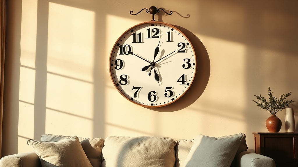
There's a specific frustration that comes from squinting at a clock you chose yourself. You picked it for how it looked on the wall, the finish, the frame, the way it caught the afternoon light. Then you realized the numbers are decorative script at 8pt rendered in pale silver on an off-white dial, and you're across the room trying to figure out if it's 3:40 or 3:10. A wall clock with easy-to-read large numbers solves a genuinely practical problem, but here's the thing most people overlook: size alone isn't the whole story.
What actually makes a clock readable is a combination of numeral size, contrast, spacing, hand design, and dial clutter. Get one of those wrong and a 24-inch clock can be harder to read than a 12-inch one. Here's what works, broken down honestly.
⭐ À retenir
- Large numerals need high contrast to be genuinely readable, pale numbers on a light dial defeat the purpose.
- Arabic numerals (1, 2, 3...) are significantly faster to read at a glance than Roman numerals (I, II, III...).
- Clock diameter matters less than numeral-to-dial ratio: a 14-inch clock with clean large numbers beats a cluttered 24-inch one.
- Hand design is just as important: hands that blend into the dial colour are a common hidden readability killer.
- Silent quartz movement is worth prioritising, especially in bedrooms and home offices.
Why "Large Numbers" Doesn't Always Mean Easy to Read
A large-number wall clock is only as readable as its contrast, numeral style, dial clarity, and hand design allow, diameter is just one of four factors that must work together for genuinely easy time-reading at a glance. Most people shopping for a large-number clock focus on the diameter of the clock itself. Understandable. But the actual readability of a wall clock comes down to four factors working together, and diameter is just one of them.

Contrast is king. Black numerals on a white or cream dial offer the highest contrast ratio, which is why optometrists use that combination in eye charts. Gold numerals on a honey-wood background look beautiful in product photos but can disappear into visual noise from across a room. The same applies to silver on grey, dark grey on black, or any same-tone pairing.
Numeral style matters more than most guides admit. Roman numerals have a timeless aesthetic, no argument there. But "VIII" takes more visual processing time than "8", especially for anyone with even mild visual fatigue. That cognitive extra step, small as it sounds, adds up when you're glancing at a clock dozens of times a day. Arabic numerals win on pure readability every time.
Then there's dial clutter. A clock with a bold 12 but also an inner calendar ring, a second time zone display, decorative sub-dials, and a textured background is fighting against itself. The eye needs a clean path to the number, the hand, and the answer. Every extra element on the dial competes for attention.
Finally, hand design. Hands that share the same colour as the numerals, or worse, the dial background, make time-telling genuinely difficult. The best readable clocks pair dark numerals with hands in a contrasting colour, often black or deep charcoal, with a clear lollipop or arrow tip that points unambiguously.
The Right Size for Each Room (and Why It Varies)
The right clock size depends on viewing distance, not just room size: a bedroom needs 30 to 40 cm, a kitchen 35 to 50 cm, a living room 45 to 70 cm, and an open-plan hallway up to 90 cm for comfortable at-a-glance reading. There's no universal "right size" for a large-number clock. It depends entirely on your viewing distance and the scale of the room. Here's a practical framework that holds up across most residential spaces:
| Room | Typical viewing distance | Recommended clock diameter |
|---|---|---|
| Bedroom | 2 to 4 metres (bed to wall) | 30 to 40 cm (12 to 16 in) |
| Kitchen | 2 to 5 metres | 35 to 50 cm (14 to 20 in) |
| Living room | 3 to 6 metres | 45 to 70 cm (18 to 28 in) |
| Home office | 1.5 to 3 metres | 25 to 40 cm (10 to 16 in) |
| Hallway or open plan | 4 to 8 metres | 55 to 90 cm (22 to 35 in) |
A bedroom clock at 30 cm with clean high-contrast Arabic numerals will be more readable from your pillow than a 50 cm clock with decorative script numerals and a busy textured face. The table above is a starting point, but contrast and clarity close the gap fast.

Styles That Get Readability Right (Without Looking Clinical)
Minimalist Scandinavian, industrial loft, and vintage farmhouse styles all deliver high readability without a clinical look, the key is choosing a version of each that keeps numerals bold, the dial uncluttered, and contrast high. One common worry is that prioritising readability means ending up with something that looks like it belongs in a hospital waiting room. That's genuinely not the case. Some of the most stylish wall clock aesthetics happen to be the most readable ones.
Minimalist Scandinavian
The Scandinavian design tradition prioritises function without sacrificing form, which is exactly why it produces some of the most naturally readable clocks. Think clean dials, restrained colour palettes, bold unadorned numerals, and hands with clear tips. This style works in bedrooms, home offices, and modern kitchens equally well. A white or light grey dial with black numerals fits the brief perfectly.
Industrial and Loft
Industrial-style clocks often feature large open faces with prominent numerals, sometimes in a black-on-aged-iron or white-on-matte-black colourway. The aesthetic leans utilitarian, which means readability was baked into the design brief from the start. A 50 cm industrial clock on a brick or textured plaster wall reads beautifully from across an open-plan living room.
Vintage Farmhouse
Farmhouse clocks walk a fine line. The best ones use oversized Arabic numerals in a clean typeface on a distressed white or cream background, giving you both warmth and legibility. The ones to avoid are those with ornate script numerals, which look gorgeous in an Instagram flat-lay and frustrating on your kitchen wall at 7am.
💡 Did you know?
The Arabic numeral system, the 1-through-12 we use on clock faces today, was introduced to Europe from North Africa and the Middle East around the 10th century. Before that, Roman numerals were standard across all timekeeping instruments. The shift to Arabic numerals on clock faces was partly driven by the need for faster readability on public clocks in town squares, where people needed to tell the time from a distance while moving. The same logic applies to your living room wall.
Large-Number Clocks for Older Adults: What Geriatric Care Specialists Actually Recommend
For older adults, specialists consistently recommend a dial of at least 35 to 40 cm with bold black Arabic numerals on white, strongly contrasting hands, a clutter-free face, and a silent movement, bigger numbers alone are not enough without these supporting factors. There's real nuance here that most clock shopping guides skip over. Older adults, particularly those with age-related macular degeneration or early-stage cataracts, benefit from specific characteristics that go beyond "just make the numbers bigger."
Ophthalmologists and occupational therapists working with older adults typically point to three key factors: high luminance contrast (ideally black on white, or white on black), unambiguous hand design (hands that clearly differentiate hour from minute, with distinct tips), and absence of decorative interference on the dial. A clock face with a printed landscape or floral background, however beautiful, actively competes with the numerals for visual attention.
Backlighting matters too in low-light situations. For bedrooms especially, a clock with a backlit dial or high-contrast phosphorescent hands allows time-telling at night without switching on a full lamp. This is a detail that makes a genuine difference to sleep quality and general comfort.
The size recommendation for older adults with reduced visual acuity tends toward 40 cm (16 in) minimum in a bedroom, and 55 cm (22 in) or more in a living room, with the dial placed at eye level or slightly above when seated.

Placement: Where You Hang It Changes How Readable It Is
Even the best large-number clock underperforms if hung poorly: avoid backlighting from windows, position at seated eye level, ensure the dial contrasts with the wall colour, and keep at least 15 cm clearance from surrounding objects. The best large-number clock in the world underperforms if it's hung in the wrong spot. A few placement principles that genuinely matter:
- Avoid strong backlighting. A clock hung directly in front of a window will be in silhouette for most of the day. Mount it on a wall perpendicular to the main light source instead.
- Eye level from your most-used seated position. In a living room, that's from the sofa. In a bedroom, it's from the bed. Standing eye level is usually too high for comfortable glancing.
- Contrast with the wall colour. A dark clock on a dark feature wall looks striking in photos but disappears in daily use. If your wall is dark, choose a clock with a light dial; if your wall is light, a dark-framed or dark-dialled clock will pop.
- Minimum 15 cm clearance from furniture and shelves. Clocks surrounded by objects lose visual context and become harder to locate at a glance.
For living room wall clocks in particular, hanging height makes a dramatic difference. Most people hang too high, influenced by the instinct to treat it like a picture frame. A clock centred around 155 to 165 cm from the floor (roughly average standing eye level) works well for rooms used both standing and sitting.

What to Look for in a Large-Number Clock for the Kitchen
A kitchen clock needs a matt or satin dial to avoid glare, a moisture-resistant frame, a diameter of 40 to 55 cm, and numerals legible from at least 4 metres, all while working across shifting light conditions from bright morning to dim evening. The kitchen is one of the hardest rooms to clock correctly. You're moving, your hands are often occupied, and you're catching the time in quick glances between tasks. Easy-to-read large number clocks for kitchens need to work under a wider range of lighting conditions than any other room, from bright morning sunlight to dim evening cooking light.
A few things that specifically matter here. First, a matt or satin dial finish rather than a glossy one: gloss dials create reflections and hot spots under kitchen lighting that can wash out numbers completely. Second, a frame material that tolerates humidity: wood frames can warp slightly in rooms with regular steam and temperature shifts, so sealed finishes or metal frames are worth prioritising in heavily used kitchens. Third, a clock that can be read from at least 4 metres, since most kitchens have sightlines across the room to an island, dining area, or living space.
For kitchens, the 40 to 55 cm range tends to hit the sweet spot: large enough to catch at a glance from across the room, compact enough not to overwhelm a typical kitchen wall above cabinets.
Browse the kitchen clock collection if you want to compare styles built specifically for that room's demands.

Silent Movement: The Other Readability Factor Nobody Talks About
A silent sweep quartz movement removes the auditory distraction that makes ticking clocks feel like ambient noise rather than useful tools, and that shift alone makes you more likely to actually glance at the clock instead of reaching for your phone. Here's something worth considering that rarely comes up in clock shopping conversations: cognitive readability isn't only visual. A loudly ticking clock creates a low-level auditory distraction that, over time, makes you less likely to glance at it intentionally. You start relying on your phone because the clock has become ambient noise rather than a useful tool.
A silent sweep quartz movement (sometimes called a "sweep" movement, referring to the continuous rather than step-by-step motion of the second hand) eliminates that tick entirely. In a bedroom, the difference is obvious. But even in a home office or living room, the psychological shift from "ticking reminder of time passing" to "calm, readable timepiece" is real.
If you're looking at silent wall clocks, note that "silent" can refer to two different things: a movement that produces no audible tick, and a movement with a sweep rather than step second hand. Both qualities are worth having, and many modern silent quartz movements offer both.
"A clock that you notice because it ticks is a clock that's already failed at its job."
A recurring observation from interior designers working on bedroom and home office spaces
Choosing Between Analog and Digital for Maximum Readability
For maximum clarity in low light or with significant visual impairment, large-digit digital wins; but a well-chosen analog clock with large high-contrast numerals matches it in daily use while also letting peripheral vision read hand positions without processing any numbers at all. The digital vs. analog question comes up often when readability is the priority, and it's worth addressing directly rather than sidestepping it.
Digital clocks with large LED or LCD displays offer undeniable at-a-glance clarity, particularly in low-light conditions. A display showing "3:42" in 10 cm tall digits is genuinely faster to read than any analog equivalent, full stop. For people with significant visual impairment, or for rooms where lighting is consistently low, a large-digit digital clock may be the right answer.
That said, analog clocks with well-designed large numerals have one practical advantage: you can read the approximate time without reading any numbers at all. Glancing at hand positions and reading "roughly quarter past three" takes less active processing than reading a digital display. That peripheral, subconscious time-reading is one reason analog clocks remain preferred by many people even when visual needs are the starting point.
The honest recommendation: if the priority is maximum clarity in all conditions and lighting doesn't matter, large-digit digital wins. If the priority is a clock that works with your peripheral vision and fits a particular room aesthetic, a well-chosen analog clock with large high-contrast numerals delivers the same functional result with more design flexibility.

Clocks as Considerate Gifts: Getting It Right for Someone Else
When buying a large-number clock as a gift, resist choosing what you find beautiful and instead match the clock to the recipient's room: dial size, wall colour, viewing distance, and silent movement matter far more than style preferences. A large-number wall clock is one of the more thoughtful practical gifts for parents, grandparents, or anyone setting up a new home. The key is to resist the impulse to choose what you find beautiful and instead think about their specific context: which room it's for, what the wall colour is, and how far they typically sit from the wall in question.
For older recipients, a few specific features to prioritise: a dial of at least 35 cm, black Arabic numerals on a white or cream background, hands in a strongly contrasting colour with clearly differentiated lengths, and a silent movement. A noisy clock in a bedroom is a gift that gets moved to a cupboard within a week.
If you're not sure of wall colour or room size, a classic white dial with black numerals in a neutral wood or black metal frame is the safest choice by far. It works against virtually any wall colour, in virtually any room, and reads clearly under any lighting condition.
Frequently asked questions
What size clock with large numbers works best for a bedroom?+
For most bedrooms, a clock between 30 and 40 cm (12 to 16 inches) in diameter with high-contrast Arabic numerals reads clearly from a bed 2 to 4 metres away. The key is contrast, not just size: black numerals on a white or cream dial at 30 cm will outperform pale numerals on a busy dial at 50 cm. A silent movement is worth prioritising so the clock doesn't disrupt sleep.
What kind of clock with large numbers is best for elderly people?+
For older adults, especially those with age-related macular degeneration or early cataracts, the ideal clock combines: a dial of at least 35 to 40 cm, bold black Arabic numerals (not Roman) on a white background, hands in a high-contrast colour with clearly different lengths, no decorative background imagery on the dial, and a silent movement for bedroom use. For nighttime readability, phosphorescent hands or a backlit dial are worth the extra consideration.
Are Roman numerals harder to read than Arabic numerals on a wall clock?+
In practical terms, yes. Arabic numerals (1 through 12) require less visual processing time at a glance, which matters when you're catching the time quickly across a room. Roman numerals are beautiful and historically significant, but "VIII" takes longer to parse than "8", particularly in lower light or with reduced visual acuity. That said, if Roman numerals are important for the aesthetic and the clock has excellent contrast and large numeral size, the difference is manageable for most people.
What is the best oversized wall clock for a living room?+
For a living room, the best oversized clock is one that balances readability at 4 to 6 metres with the visual weight of the space. Look for a diameter of 50 to 70 cm, a clean high-contrast dial, and a frame that complements the room's existing materials (wood tones for warmer spaces, metal for industrial or contemporary rooms). Avoid clocks with busy or decorated dials, as these look striking up close but lose legibility at distance. Silent movement is recommended so the clock doesn't dominate the room acoustically.
Does wall colour affect how readable a large-number clock is?+
Yes, significantly. A clock with a white dial on a white wall loses visual definition from a distance, even if the numerals themselves are bold and dark. The contrast between the clock face and the wall background matters almost as much as the contrast between the numerals and the dial. On light walls, a darker frame or dial perimeter helps the clock stand out. On dark feature walls, a light-dialled clock reads best. This is also one reason wood-framed clocks are versatile: the warm mid-tone of natural wood creates contrast against both light and dark painted walls.






