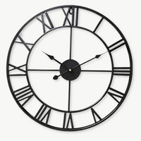


Walk into any restaurant or cafe that feels right, and there's usually a clock on the wall somewhere. Not because the owner needed to know the time, but because that clock does something to the room. Choosing an industrial wall clock for a restaurant or cafe is less about telling time and more about setting a tone that customers feel the moment they sit down. Get it right, and it anchors the whole space. Get it wrong, and it's just a circle on a wall.
Here's what actually works, from the size that reads across a dining room to the finish that won't clash with exposed brick.
⭐ Key takeaways
- Industrial clocks in the 50-60 cm range are the sweet spot for most commercial walls, readable from 6-8 metres away.
- Exposed-gear and Roman numeral designs read as "designed on purpose" rather than an afterthought.
- Silent quartz movements matter in hospitality: a ticking clock in a quiet cafe is a distraction, not ambience.
- Material pairing (metal plus reclaimed wood) bridges the gap between raw industrial and warm hospitality.
- Placement height and wall context (brick, plaster, painted timber) change how a clock reads from across the room.
Why Industrial Style Fits Hospitality Spaces So Well
The industrial aesthetic fits restaurants and cafes because it grew from the same raw materials those buildings already use: exposed brick, timber joinery, bare metal, and pendant lighting that was never meant to be hidden. That origin, in converted factories and warehouses in cities like New York, Manchester, and Berlin, gave it a visual honesty that translates naturally to commercial dining. Exposed pipes and brick are the bones of both the converted loft and the neighbourhood cafe that people return to for years.
That's not a coincidence. When a restaurant or cafe leans into raw materials rather than hiding them, every object on the wall needs to carry its weight. A plastic clock with a thin chrome rim looks lost in that context. A 60 cm iron gear clock with Roman numerals and a distressed finish looks like it was there before the renovation.
There's also a practical element. Industrial-style clocks tend to be large, legible, and bold, which means they work from across a room. In a 40-cover restaurant, customers at the back table need to read the time without squinting. A decorative minimalist clock that works beautifully in a bedroom just disappears at that scale.

Getting the Size Right for a Commercial Wall
For most restaurant and cafe walls, a clock between 50 cm and 60 cm in diameter hits the visual weight you need without overwhelming a single focal point. Anything under 40 cm reads as residential on a commercial wall, especially above head height. Over 70 cm and you're into statement-installation territory, which can work brilliantly in a large open-plan dining room but can feel overbearing in a 20-cover neighbourhood spot.
Matching diameter to room depth
A rough guide that works in practice: for every 2 metres of viewing distance, add 10 cm of clock diameter. A customer sitting 6 metres from the wall should have a clock at least 30 cm across to read it comfortably. In a commercial setting with ambient light variation and movement, 50 cm is the safer minimum at 6 metres viewing distance, a standard aligned with commercial signage legibility guidelines used by interior designers across the hospitality industry. The 50-60 cm sweet spot emerged from exactly this real-world calculation.
Wall height matters too. Most commercial spaces have ceilings between 3 and 4 metres. Mount an industrial clock at roughly 1.8-2 metres from the floor, just above door-frame height, to keep it in the natural sightline while giving it breathing room from the furniture below.
When bigger actually works better
Large open-plan cafes, brewpubs, and converted industrial spaces can handle a clock above 60 cm without it feeling outsized. At that scale, a 60 cm gear wall clock with exposed mechanics stops being a timepiece and becomes the focal point of an entire wall. It does the work of a piece of art at a fraction of the cost, and it never needs rehanging because a new season came in.
💡 Did you know?
The large factory clocks that inspired the industrial aesthetic were originally designed in the late 19th century to coordinate workers across multiple floors. Many had faces over 90 cm across so they could be read through steam and low light. The bold, high-contrast dials still used on industrial-style clocks today trace directly back to that functional requirement.
Industrial Clock Styles That Actually Suit Restaurants and Cafes
Not all industrial designs read the same way in a hospitality context: exposed-gear clocks, Roman numeral iron dials, and wood-metal hybrids each create a different mood depending on whether you run a gastropub, a brunch spot, or a specialty coffee bar.
Exposed-gear and steampunk mechanics
Gear clocks, where the internal mechanics are displayed as part of the design, are the most visually distinctive choice for a restaurant wall. The moving gears give customers something to watch during a slow moment, which is genuinely useful in a hospitality setting. Gear clocks work best against brick or timber-clad walls where the texture conversation between materials feels intentional.
A gear clock in a cafe that serves pour-over coffee and plays Chet Baker is probably too much. The same clock in a craft beer bar with reclaimed wood bar tops is exactly right. Context is everything.

Roman numeral iron dials
Roman numerals on a dark oxidized or distressed metal dial are probably the single most versatile industrial clock choice for hospitality. They read as classic without being stuffy, and they carry enough visual weight to hold a wall. A 40 cm wood-and-metal Roman numeral clock works in a neighbourhood bistro; at 60 cm, it fills a pub dining room without effort.
The key is finish: brushed iron and oil-rubbed bronze age gracefully and don't show fingerprints the way polished chrome does. In a busy restaurant environment where staff occasionally brush past, that matters more than you'd think.

Wood-metal hybrids for cafes that need warmth
Pure metal industrial clocks can feel cold in a cafe that's trying to be a comfortable third place. A wood-and-metal combination, where a solid wooden body carries metal hands and Roman numeral markers, does something useful: it keeps the industrial visual vocabulary while adding the organic warmth that makes people stay for a second cup.
This is the style that bridges specialty coffee bars and brunch restaurants. The wood grain reads as handcrafted; the metal details read as precise. Together, they say "we thought about this room." That's the effect good hospitality design is always chasing.

Why Silent Movement Is Non-Negotiable in a Cafe or Restaurant
A ticking clock in a quiet specialty coffee bar makes customers subtly uncomfortable: the regular beat competes with conversation at a frequency that's hard to tune out. Silent quartz sweep movements, where the second hand moves in a continuous glide rather than a step-tick, solve this completely. The difference between a ticking movement and a sweep movement isn't subtle in an enclosed space. If you've ever sat in a room where the only sound was a clock, you know exactly what that feels like.
Most quality industrial wall clocks today use either a silent quartz or a digital quartz movement. Silent quartz sweep is the standard to specify when ordering for any hospitality environment where ambient noise drops between songs or during lulls in service.
In a loud gastropub, this matters less. But in a cafe where the playlist drops between songs, or a wine bar during a Tuesday evening service, a silent movement is just good hospitality.
| Venue type | Recommended style | Ideal diameter |
|---|---|---|
| Specialty coffee bar | Wood-metal hybrid, minimal dial | 40-50 cm |
| Gastropub / craft beer bar | Exposed-gear or vintage gear wheel | 55-60 cm |
| Neighbourhood bistro | Roman numeral iron dial | 40-55 cm |
| Brunch restaurant | Wood-metal hybrid, warm finish | 40-50 cm |
| Large open-plan dining room | Vintage gear wheel, oversized | 60 cm+ |
Placement: Where on the Wall, and Why It Matters
The most common placement mistake is treating the clock as an afterthought, hung wherever wall space opens up, rather than as a deliberate focal point that anchors the room's visual hierarchy.
The focal wall principle
Every dining room has one wall that customers face more than the others. Usually it's the wall opposite the entrance, or the wall behind the bar. That's where the clock belongs. Not because customers need to see the time from their seat, but because a large industrial clock on the focal wall becomes part of the room's visual identity the same way a bar back or a neon sign does.
Secondary walls work too, especially in L-shaped or split-level spaces where not all customers face the same direction. In that case, consistency of style matters more than position: two industrial clocks of different sizes but the same material finish can anchor two separate zones without looking random.
Height and breathing room
In commercial spaces with 3-4 metre ceilings, the bottom of the clock should sit at roughly 1.9-2.1 metres from the floor. This puts the centre of a 60 cm clock at about 2.2 metres: high enough to clear furniture and movement, low enough to feel like it belongs in the room rather than retreating to the ceiling.
Give the clock 30-40 cm of clear wall on each side if possible. Industrial clocks with strong graphic weight need visual breathing room to read properly. Crowd them with a menu board or a framed print and neither piece works as well as it should.

Matching the Clock to the Wall Material
An industrial clock on the wrong wall material creates friction that guests feel without being able to name: the finish conversation between clock and wall is as important as the clock's own design.
Exposed brick
Exposed brick is the most forgiving backdrop for industrial clocks. Almost every style works: gear clocks, Roman numeral iron dials, vintage distressed finishes. The texture of the brick provides enough visual noise that the clock needs to be bold to hold its own. A 40 cm clock on a full brick wall will look small. At 55 cm or above, it reads correctly against brick. Dark finishes (oxidized iron, oil-rubbed bronze, matte black) sit better against red or yellow brick than polished silver does.
Painted plaster or drywall
On a smooth painted wall, the clock carries the full weight of the wall's visual interest. This is where a single large-scale industrial clock becomes a genuine statement: without competing texture, the detail of the clock's face, hands, and finish is the only thing to look at. Warm off-white and grey walls work particularly well with iron and brass finishes.
Timber cladding and panelling
Warm wood panelling on a restaurant wall calls for metal-heavy industrial clocks rather than wood-on-wood combinations. The contrast between the warmth of timber cladding and the cool precision of an iron dial creates the kind of tension that makes a room feel considered. Roman numeral designs with black or bronze metal frames are the most consistent performers against natural timber.

One Clock or Several: Grouping in Large Commercial Spaces
In most restaurant and cafe settings, one well-chosen large clock does more than three smaller ones grouped together, but specific commercial contexts make a curated grouping of industrial timepieces genuinely interesting.
A world-time arrangement, where three or four industrial-style clocks showing different time zones are grouped on a single wall, works well in hotel dining rooms, airport restaurants, and any venue with an international identity. The key is consistency of style: all clocks should share the same design language (same finish, same numeral style) even if they vary in size.
In a long narrow bar or corridor space, two industrial clocks at equal height but spaced 3-4 metres apart create visual rhythm without competing. Size them identically so the repetition reads as intentional rather than accidental.
Outside of these specific cases, the single large statement clock wins every time in a hospitality context. It's easier to maintain, easier to light, and easier for customers to find at a glance.
"A restaurant is a stage set. Every prop either earns its place or clutters it."
Common wisdom in commercial interior design
The Vintage Gear Wheel: A Specific Recommendation for Larger Venues
For larger commercial spaces, the vintage gear wheel format at 60 cm is the single most versatile industrial clock choice across gastropubs, open-plan restaurants, and converted warehouse cafes. The design references 19th-century factory machinery without feeling like a theme-park version of history. It's specific enough to feel chosen, broad enough to work in multiple contexts.
The large wall clock collection includes several gear-wheel options at 60 cm and above, with finishes ranging from raw iron to bronze-toned metal. For venues with lighter walls and Scandinavian-influenced interiors, the wooden wall clock range offers industrial-adjacent designs that bring organic warmth without abandoning the bold, legible dial that commercial spaces need.

Practical Details Worth Knowing Before You Buy
Commercial spaces have different demands from residential ones: battery life, mounting hardware, and dial legibility under variable artificial light all matter more when a clock is working for a business.
Battery versus hardwired
Almost all decorative industrial wall clocks run on standard AA or AAA batteries, which is ideal for a commercial setting. No electrician needed, no wiring to manage, no proximity to a socket required. A quality quartz movement in a well-made clock will run for 18-24 months on a single set of batteries. Put a battery change on your quarterly maintenance schedule and you'll never think about it again.
Dial legibility under artificial light
Most restaurant and cafe lighting sits between 50 and 200 lux during service, which is comfortable for dining but can soften contrast on a clock face. High-contrast dials perform best under warm amber or tungsten-style LED lighting: black background with white or brass numerals, or white background with deep iron hands. Mid-tone brown dials with brown hands can be difficult to read under amber light from across a room.
For the designer wall clock range, most iron and metal industrial options come with high-contrast dials specifically because they're designed to be statement pieces in large rooms. That design choice happens to serve commercial settings very well.
Mounting in commercial environments
Most industrial clocks in the 40-60 cm range ship with a single hook or keyhole mounting. For a commercial space where a clock might be near a busy kitchen pass or a high-traffic corridor, verify the mounting method before hanging. A double-hook mount or a wall anchor into a stud is worth the extra 15 minutes for a clock that weighs 2-3 kg. A clock that falls during service is a genuine safety issue, not just an inconvenience.
⚠️ Heads up
In commercial kitchens and high-humidity environments (steamier prep areas, dishwashing sections), standard quartz clock movements can degrade faster than in dry dining spaces. Reserve decorative industrial clocks for the dining room, bar, or entrance. If you need a clock visible from the kitchen pass, treat it as a functional utility clock and keep the decorative piece in the dining zone where conditions are stable.
Frequently asked questions
What size industrial wall clock works best in a restaurant?+
For most restaurant walls, 50-60 cm is the functional sweet spot. Smaller than 40 cm tends to disappear in a commercial setting, especially above head height. The reasoning is practical: commercial signage legibility guidelines used by interior designers suggest roughly 10 cm of diameter per 2 metres of viewing distance. At a typical 6-metre sightline in a 40-cover dining room, that puts the minimum at 30 cm and the comfortable commercial minimum at 50 cm. For very large open-plan dining rooms or converted warehouse spaces, 60 cm and above works well as a genuine focal point.
Silent versus ticking clocks: does it really matter in a cafe?+
Yes, more than most people expect. A ticking clock produces a rhythmic sound at roughly 1 Hz (one tick per second) that competes with conversation at close range in an enclosed space. In a busy gastropub with background music running at 70 dB+, you won't notice. In a quiet specialty coffee bar or a wine bar during a slow service, a ticking movement is audible from several metres away. Silent quartz sweep movements eliminate the tick entirely. If you're buying an industrial clock for a hospitality environment where quiet moments happen regularly, silent quartz is the only sensible choice.
Which wall material suits industrial clocks best?+
Exposed brick is the most naturally compatible backdrop for industrial clock styles. Painted plaster or drywall also works well because it lets the clock do all the visual work. Timber-clad walls suit metal-heavy industrial designs (iron, bronze, matte black) better than wood-on-wood combinations, which can blend into the background.
Can I use a residential wall clock in a commercial setting?+
Yes, with some caveats. The clock mechanics are identical. What changes in a commercial context is the visual scale requirement (bigger reads better), the mounting security (use wall anchors for anything over 1.5 kg), and placement away from kitchen humidity. Most decorative industrial wall clocks designed for large residential rooms translate directly to hospitality environments.
Where is the best place to hang a clock in a restaurant?+
On the focal wall, which is usually the wall most customers face from their seats, at a height where the clock centre sits at approximately 2-2.2 metres from the floor. This gives it visibility over furniture and movement while keeping it within a natural sightline. Avoid placing it above or behind the bar where backlit shelving competes with the dial contrast.
How do I choose between an exposed-gear clock and a simpler Roman numeral dial for my cafe?+
Think about the overall energy of the space. Exposed-gear and steampunk designs suit higher-energy venues: craft beer bars, gastropubs, converted warehouse cafes with reclaimed timber and pendant lighting. They reward customer curiosity and spark conversation. Roman numeral iron dials are quieter statements that work across a wider range of settings, from neighbourhood bistros to Scandinavian-influenced coffee bars. If you're unsure, the Roman numeral dial is almost always the safer, more adaptable choice. If you're certain, the gear clock is more memorable.