

There's something about Roman numerals on a clock face that just holds its own. You put one on a bare wall, and the room shifts. Not in an obvious way. More like how good furniture rearranges a conversation. A wall clock with Roman numerals in a modern style does that trick particularly well: it borrows the visual weight of centuries-old timekeeping and drops it into spaces that are clean, spare, even industrial.
The question most people ask is whether it can actually work without feeling like a history museum exhibit. The short answer: absolutely. The longer answer is what this piece is about.
Key takeaways
- Roman numerals read as sophisticated in minimalist, industrial, and Scandinavian interiors - not just traditional ones.
- Material choice (metal vs. wood vs. resin) does most of the work in pulling a Roman numeral dial into the present.
- Scale matters: oversized Roman numerals on a large face hit differently than the same characters crammed on a 10-inch dial.
- Silent quartz movements are the baseline expectation for any modern living space.
- Pairing a classic dial with an open-frame or minimalist surround is the fastest way to modernize the look.
Why Roman Numerals Never Actually Went Out of Style
Roman numerals have appeared on clock faces since at least the 14th century, when the first mechanical tower clocks were built in northern Italy. But calling them "old-fashioned" misreads the design signal they send. What they actually communicate is legibility with intention. Each character takes up more visual space than a standard Arabic digit, which forces a dial to slow down and breathe.
That breathing room is exactly what modern interiors value. Minimalism isn't about emptiness - it's about choosing objects that carry enough visual meaning to justify their presence. A Roman numeral dial earns its place on the wall. Arabic numerals on a plain round clock are just functional. Roman numerals make a choice.
Did you know?
Many medieval clockmakers deliberately used "IIII" instead of "IV" for four o'clock on clock faces. The theory most historians favor: it creates better visual balance on the dial, since the right side (VII, VIII, IX) has more strokes than the left (I, II, III). Most Roman numeral clocks sold today still follow this tradition.
That historical continuity is part of the appeal. When a detail has survived 700 years of design cycles without modification, it's probably doing something right structurally. And if you're wondering whether a modern Roman numeral wall clock can genuinely anchor a 2026 interior, the answer is buried in that longevity: these characters have outlasted every trend that tried to replace them.

The Three Design Languages That Work Best with Roman Numeral Dials
Not every modern aesthetic pairs equally well with Roman numerals. Here's where the combination actually sings.
Industrial: raw materials meet refined characters
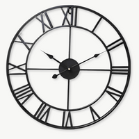
Industrial interiors - exposed brick, poured concrete, dark metal accents - have a built-in tension between rough and refined. Roman numerals on a metal dial resolve that tension beautifully. The characters suggest precision and craft while the material says "nothing here is pretending to be polished." It's a pairing that feels honest rather than decorative.
For this style, look for clocks with an open frame (no glass cover), dark iron or brushed steel finishes, and Roman numerals either embossed directly into the metal or rendered in a bold serif typeface. The industrial wall clock collection covers this territory well, with pieces that range from stripped-back utility to more sculptural interpretations. If you want something with real presence on a concrete or brick wall, I'd go at least 50 cm here - the scale earns respect in a room that's all about honest materials.
Scandinavian minimalism: restraint at its most elegant
Nordic design is built on a simple principle: every object in a room should earn its presence through function and form at the same time. A Roman numeral clock fits this logic because it replaces generic tick-marks with characters that actually mean something visually. The key is keeping everything else minimal: thin hands, no second hand, a neutral dial color (off-white, light oak, warm grey).
Bamboo and light wood frames work particularly well in *Japandi* and Scandinavian-leaning rooms. They bring natural texture without visual weight, and the warmth of the grain softens what can sometimes tip into a cold, over-austere aesthetic. Think pale ash or natural beech rather than dark walnut here - the contrast with the Roman numerals stays gentle rather than dramatic.
Contemporary eclectic: using contrast as the point
If your space mixes mid-century furniture, modern art, and collected objects from different eras, a Roman numeral clock isn't anachronistic - it's the thread that ties the timeline together. Here you have more freedom: large-scale numerals that float off the dial without a surround, mixed metal finishes, even 3D-applied characters that cast their own shadow throughout the day.

Material Makes the Difference: Matching Finish to Interior Palette
The dial characters are just one part of the equation. What surrounds them - frame material, hand color, surface texture - does the heavier lifting in terms of whether a Roman numeral clock reads as contemporary or antique.
| Material | Modern Style Fit | Best Room |
|---|---|---|
| Brushed steel / iron | Industrial, contemporary loft | Living room, open-plan kitchen |
| Natural bamboo / light wood | Scandinavian, Japandi minimalism | Bedroom, home office, dining room |
| Black powder-coated metal | Modern minimalist, high-contrast | Any room with white or grey walls |
| Aged copper / rust patina | Vintage-industrial, eclectic | Kitchen, study, workshop aesthetic |
| Gold-tone metal | Contemporary glam, Art Deco revival | Living room, entryway, master bedroom |
| Resin / 3D sculpted | Eclectic, statement-piece collectors | Living room focal wall |
One pattern worth noting: customers who go for the brushed steel with Roman numerals almost always report that the clock reads "cleaner" than they expected. The characters look sharper on a flat metal surface than on a painted dial because there's no texture underneath competing for attention. Conversely, if you want warmth - say, a Scandinavian bedroom or a *Japandi*-leaning dining room - the light wood or bamboo option does something the metal simply can't: it makes the numerals feel quietly personal rather than architecturally bold.
Sizing Up: How Scale Changes the Entire Conversation
A 10-inch Roman numeral clock on a large wall looks like an afterthought. The characters shrink, the visual impact disappears, and the whole thing reads as decorative filler rather than a deliberate choice. Scale is where most people underinvest when choosing a modern Roman numeral clock for a living room or open-plan space.
Here's a practical framework:
- Up to 12 inches (30 cm): works for bedside walls, kitchen nooks, hallways with limited wall space. Intimate rooms where you're always within 6-8 feet of the clock.
- 14-20 inches (35-50 cm): the sweet spot for most living rooms and dining rooms. Large enough to read from across the room, proportionate to standard 8-9 ft ceilings.
- 24 inches and above (60 cm+): reserved for statement walls in large open-plan rooms, high-ceiling spaces, or when the clock is meant to anchor an entire gallery wall arrangement.
The Roman numeral format rewards going larger. At 60 cm or more, the individual characters become architectural elements in their own right - they stop being "the dial" and start being part of the wall composition. If you're still unsure which size fits your room, browse the full wall clock collection filtered by diameter; it's the fastest way to compare scale across styles.
Placement That Lets the Design Actually Work
Even the right clock in the wrong spot just... sits there. Placement affects how a Roman numeral clock is read, literally and visually.
The focal wall principle
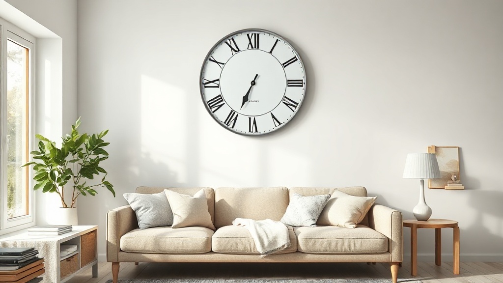
A Roman numeral clock performs best when it anchors a wall rather than sharing it equally with four other objects. If you're placing it in a living room, choose the wall that draws your eye first when you enter the room. This is usually the wall facing the main seating - and it's typically bare because nothing else quite fits it. A well-sized wall clock with Roman numerals in a modern style fills that space with intention rather than compromise.
Height: the eye-level myth
Conventional advice says to hang art at eye level, usually around 57-60 inches to the center. Clocks are read differently - you glance up at them. Mounting a clock slightly higher than standard eye level (64-68 inches to center) makes it easier to check the time from a seated position without craning. For rooms with 10-foot ceilings, going even higher creates an architectural moment rather than a floating object.
Gallery wall integration
Roman numeral clocks integrate into gallery walls better than almost any other clock style. Because the numerals carry visual detail, they hold their own against framed prints and photographs without requiring elaborate framing of their own. The key is giving the clock about 20-25% of the total gallery wall composition - not so dominant it flattens everything around it, not so small it gets lost. Pair it with two or three prints that share the same tonal palette (warm neutrals, cool greys, or high-contrast black and white) and the arrangement will feel curated rather than assembled.

Open-Frame vs. Closed-Case: a Detail That Changes Everything
This distinction is underrated in most buying guides. Closed-case clocks (with a glass front and solid surround) read as traditional, even when the dial is modern. Open-frame clocks - where the hands float against the wall and the mechanism is visible from the side - immediately shift the aesthetic toward contemporary sculpture.
For a Roman numeral wall clock with a contemporary feel, the open-frame format is almost always the better choice. Here's why it works:
- The wall becomes part of the design - whatever color or texture is behind the clock reads as the "dial background."
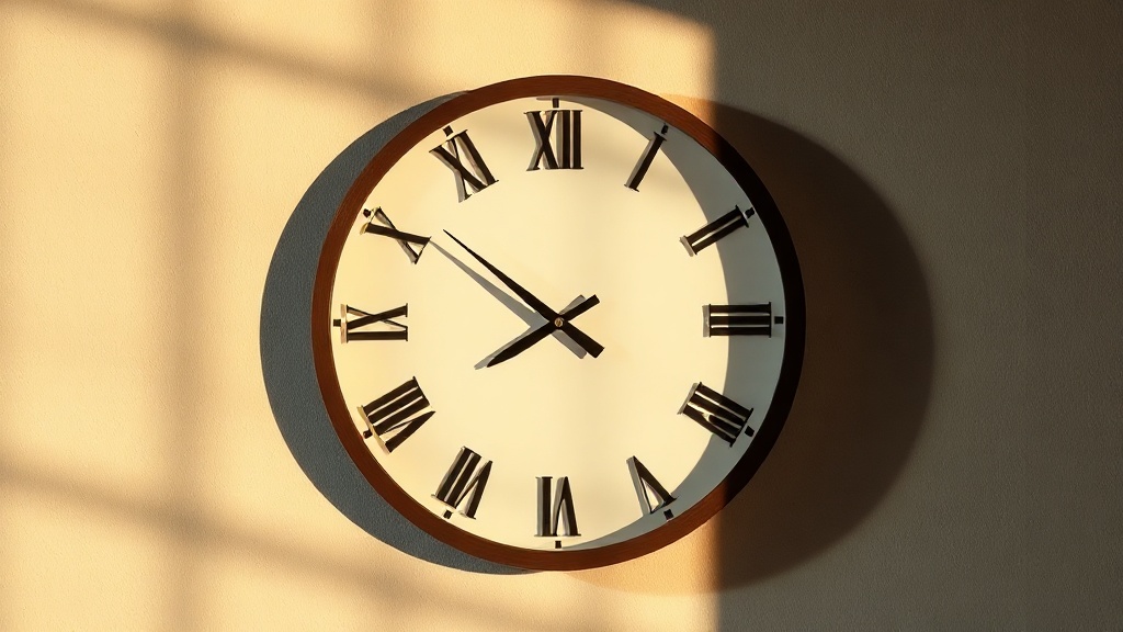
- Shadows cast by the hands and numerals shift through the day, making the clock a subtly living object rather than a static decoration.
- The minimalist structure matches current interior trends without requiring the room to change around the clock.
The tradeoff is dust accumulation on exposed surfaces and the absence of the satisfying glass-over-dial quality feel. Worth knowing before you commit. If you're in a high-traffic or high-humidity room (an open-plan kitchen, for instance), a sealed case keeps the movement protected and the dial clean without sacrificing style - especially if you choose a frame with clean, geometric lines rather than an ornate surround.
Silent Movement: the Feature That's Non-Negotiable in 2026
A Roman numeral clock can be the most beautifully designed object in your room, and a loud tick-tock will make it feel like a mistake. This is one area where customer feedback is remarkably consistent: silent quartz movement is the baseline expectation for any modern living space, bedroom, or home office.
The mechanism to look for is a sweep second-hand motor (sometimes called "continuous sweep"), which moves the hand in a fluid rotation rather than the step-by-step motion that produces the tick. Paired with a sealed, vibration-dampened case mounting, these movements are genuinely inaudible at normal room distances.
Rooms where silence matters most: bedrooms, nurseries, home offices, reading rooms, and any open-plan space where ambient sound already accumulates. In kitchens with background noise or entryways, standard quartz is fine. But when in doubt, silent is always the right call.
You can explore options across styles and sizes in the full wall clock collection, where most modern pieces now ship with silent quartz as standard. For a curated shortlist of the most popular designs regardless of style, the best-selling clocks page reflects real purchase data rather than editorial opinion.
Vintage Roman Numerals vs. Modern Roman Numerals: Spotting the Difference
Not every Roman numeral clock is the same visual register. There's a meaningful difference between a clock that uses Roman numerals to look old and one that uses them as a contemporary typographic choice.
Vintage-style Roman numeral clocks tend to use: heavily seriffed numerals, warm cream or sepia dial backgrounds, ornate hands (often in a "cathedral" or "spade" shape), visible aging or patina on the case, and Roman numerals set in a traditional XII-at-top arrangement with minimal spacing.
Modern-style Roman numeral clocks instead favor: clean geometric numeral forms (often sans-serif or simplified serif), high-contrast color combinations (black on white, brass on black, white on dark metal), minimal or absent hour markers between numerals, straight "baton" hands, and sometimes an asymmetric layout or floating numerals without a dial backing.
"The numerals themselves haven't changed in 2,000 years. What's changed is everything around them."
On why Roman numerals read differently across design eras
If you're buying online, the fastest shortcut is to look at the hands. Ornate hands signal vintage intention. Thin, geometric, uniform-width hands signal contemporary intent - even when the numerals are identical. Baton hands in matte black or brushed brass on a Roman numeral dial is probably the single most reliable visual shorthand for "this is a modern piece."
For rooms that specifically lean into vintage character, the vintage wall clock collection covers both traditional interpretations and the newer "vintage-modern hybrid" pieces that use classic numerals with cleaner surrounding design.

Room-by-Room: What Actually Works Where
Generic placement advice ("hang it where you can see it") isn't particularly useful. Here's what actually works, room by room.
Living room
The living room is where Roman numeral clocks earn their keep most visibly. Aim for 50 cm or larger, positioned above a sofa or fireplace mantel. The height of the mantel naturally puts the clock at the right viewing angle, and the horizontal mass of the seating below balances the circular form above. Metal finishes hold up best here because living rooms tend to have more mixed materials than bedrooms. If your space leans industrial with raw concrete or exposed steel, a brushed iron open-frame piece is a stronger choice than anything with a painted surround.
Kitchen
Kitchens need a clock that reads quickly at a glance - Roman numerals pass this test as long as the typeface is bold rather than delicate. A 30-35 cm piece works in most kitchens. Avoid open-frame designs near cooking areas (grease and steam are not kind to exposed mechanisms). Sealed metal or quality acrylic is the practical choice here.
Bedroom
This is where silent movement stops being a preference and becomes a requirement. Roman numerals in a bedroom work beautifully in lighter materials: natural bamboo, white-painted wood, or a minimal metal ring without a dial backing. Keep the color palette soft. A stark black-and-white Roman numeral clock in a bedroom designed for rest can tip from "sophisticated" to "tense" - the visual contrast is too activating. In a Scandinavian or *wabi-sabi*-leaning bedroom, a natural bamboo frame with off-white numerals is genuinely one of the most calming choices you can make.
Home office
A Roman numeral clock in a home office signals something specific: you're not just working, you're working in a considered space. The numerals bring a sense of historical gravity that feels appropriate for a room associated with focus. Medium-scale (35-45 cm) pieces with clean lines work best on the peripheral walls rather than directly behind a screen. A matte black powder-coated frame with white Roman numerals against a light wall keeps the visual hierarchy clear without demanding your attention every time you look up.
Entryway or hallway
Narrow entryways favor smaller-diameter clocks (25-30 cm) because wall space is limited and the viewing distance is short. Roman numerals here serve as a welcoming design signal: "this home pays attention to details." A brass or aged-bronze finish reads well against the typical neutral tones of entryway walls, and it sets a tone that the rest of the home can build on. Pair it with a matching hook rail or a small shelf in the same metal finish and the entryway coheres without looking designed-by-committee.
FAQ
Do Roman numeral clocks only suit traditional interiors?+
Not at all. The numerals themselves are style-neutral; what makes a clock feel traditional or modern is the material, frame design, hand shape, and overall color palette. A Roman numeral dial on a brushed steel open-frame clock reads as distinctly contemporary. The key is treating the numerals as a typographic choice rather than a historical one.
What size Roman numeral wall clock works best for a living room?+
For a standard living room with 8-9 ft ceilings, 40-55 cm is the practical sweet spot. Rooms with higher ceilings or longer accent walls benefit from 60 cm and above. Roman numerals specifically reward larger scales because the characters gain visual presence and the dial reads as intentional rather than incidental.
Why do some Roman numeral clocks use "IIII" instead of "IV"?+
This is a clockmaker tradition dating back to medieval Europe, and most historians attribute it to visual balance. The right side of a clock face (VII, VIII, IX) contains more vertical strokes than the left (I, II, III), so using "IIII" rather than "IV" at the four-o'clock position balances the weight of strokes across the dial. It also avoids any potential confusion between "IV" and "VI" at a glance.
Are silent quartz movements as accurate as standard tick movements?+
Yes. The accuracy of a quartz movement (typically within 15-30 seconds per month) depends on the oscillator crystal, not the hand-drive mechanism. Silent sweep motors use the same quartz oscillation as standard step-tick motors. You're getting equivalent timekeeping accuracy with the hand rotating in a continuous smooth sweep rather than in discrete steps.
Can I use a Roman numeral clock in a gallery wall arrangement?+
Roman numeral clocks are actually one of the stronger choices for gallery wall integration because the characters carry intrinsic visual detail that holds up against framed prints and photographs. Give the clock roughly 20-25% of the total gallery composition, position it slightly off-center (rather than dead-center), and pair it with pieces that have a complementary but not identical tonal palette.
Can Roman numerals work in modern minimalist or Scandinavian homes?+
Absolutely, and this is probably the pairing that surprises people most. A wall clock with Roman numerals in a modern style fits Scandinavian and minimalist interiors precisely because the characters replace generic tick-marks with something visually deliberate. Choose a light wood or bamboo frame, keep the dial color neutral (off-white or pale grey), use thin baton hands, and skip the second hand. The result is a clock that feels considered rather than decorative.
Whether you're starting from scratch with a bare accent wall or reworking a room that's been living with generic decor, a wall clock with Roman numerals in a modern style is one of the rare choices that gets more interesting the longer you live with it. The numerals age with you rather than dating the room. That's a harder thing to find than it sounds.