

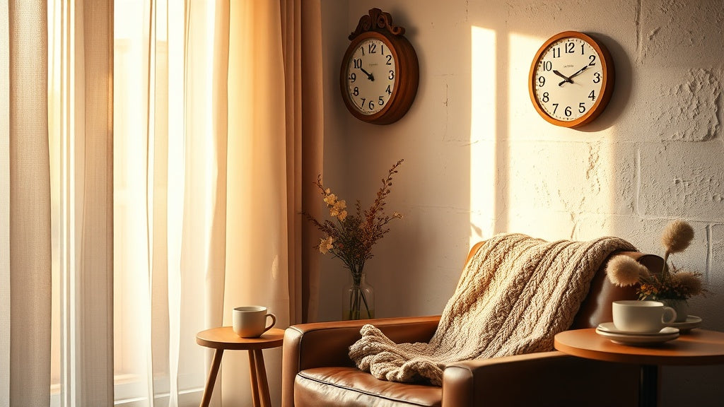
You've got the armchair sorted. Maybe a sheepskin throw draped over the arm, a small side table with just enough room for a mug and a bookmark. The light is right. The books are stacked. And then your eye drifts to the wall, and something's missing.
A wall clock for a reading nook or cosy corner isn't a given. Most people either skip it entirely or grab something off a superstore shelf without thinking twice. But a clock in this kind of space has a real job to do: it has to feel like it belongs there, like it grew out of the wall itself. Not a distraction. Not a statement that shouts. Just a quiet presence that completes the picture.
What actually works, and why it matters more than you'd think? Let's get into it.
⭐ Key points to keep in mind
- A silent (sweep) movement is non-negotiable in a reading nook - ticking is more disruptive than most people expect until they notice it.
- Warm, natural materials (walnut, oak, bamboo) anchor a cosy corner far better than metal or plastic.
- Scale matters: a 30 cm (12 in) clock works for a tight nook; a 40 cm (16 in) piece suits a larger alcove or bay window corner.
- The clock's tone should echo, not fight, your existing textiles and shelving.
- Placement at eye level when seated changes how the whole corner reads visually.
Why a Reading Nook Actually Needs a Clock (and Not Just Any Clock)
Think about what you do in a reading nook. You lose track of time. That's partly the point. But there's a difference between losing track pleasantly and suddenly realising you've missed a meeting or let dinner burn. A clock in this space isn't about pressure. It's about that occasional, unhurried glance - the kind that doesn't yank you out of the story.
That's why a ticking clock is genuinely wrong here. A loud second hand in a quiet corner is a rhythmic intrusion, like someone tapping a spoon against a mug right next to your ear. You might not notice for the first few minutes, but once your brain clocks it (no pun intended), it's hard to un-hear. A sweep quartz movement solves this completely. The second hand moves in one continuous, silent arc. No tick. No tock. Just time, quietly passing.
Beyond function, there's an aesthetic argument. A reading nook is one of the few spaces in a home where you have full creative latitude. It's personal. It's yours. The wall clock for a reading nook or cosy corner you choose signals something about what you value: a handmade walnut piece says something different from a sleek acrylic dial, which says something different again from a vintage French station clock. None of those is wrong. But all of them are choices worth making deliberately.

The One Feature You Can't Compromise On: Silent Movement
Let's be direct about this. If you're looking at clocks for a reading space and the product description doesn't mention a silent or sweep movement, keep scrolling. A standard quartz movement tick belongs in a hallway, not beside your armchair.
Standard quartz movements produce a tick somewhere between 30 and 50 decibels depending on the mechanism. That's roughly comparable to a quiet library or a soft conversation. In an open kitchen or hallway, you'd never notice. In a nook where you're specifically seeking quiet? It's relentless.
Sweep movements (sometimes called "silent quartz") use a different gear train that advances the second hand in one fluid motion rather than in 60 individual steps. The result is near-total silence. Some higher-end versions produce less than 20 decibels - quieter than a whisper at two metres. For a wall clock for a reading nook or cosy corner, that's exactly what you need. It's also worth noting that sweep movements tend to last longer, since the gear train takes far less mechanical stress over time.
💡 Did you know?
The sweep movement was first developed for high-precision marine chronometers in the 18th century, where interrupted ticking could interfere with delicate measurements at sea. Today's silent quartz clocks borrow that same principle of continuous motion, just miniaturised into a battery-powered mechanism that fits in a 30 cm wooden frame.
Choosing the Right Material: Wood, Glass, or Something Else?
Material does a lot of the heavy lifting in a cosy corner. It's what makes a clock feel warm and lived-in, or cold and clinical. For most reading nooks, natural materials win almost every time.
Wood: The Default Choice for Good Reason
Wood works in a reading nook because it shares the same visual language as books, shelves, and natural fibre textiles. Oak and walnut have an inherent warmth - the tight grain of walnut in particular reads as rich and considered, while oak's slightly lighter tone stays versatile across more decorating schemes. Bamboo reads as lighter and more contemporary. A crackled wood dial - where the finish shows hairline texture like aged paper - adds a quality that feels genuinely antique without being precious about it. These textures catch soft, directional light in a way that painted MDF simply doesn't.
If your nook leans Scandinavian or minimalist, a Scandinavian-style wall clock in pale birch or whitened oak keeps the space feeling airy. If it's more rustic, a darker walnut or a rough-grain finish ties into exposed brickwork or reclaimed wood shelving beautifully.
Glass and Acrylic: When You Want Lightness
A glass-faced or partially acrylic clock can work beautifully in a reading nook that uses a lot of colour. The transparency doesn't compete with a busy bookshelf behind it. Japanese-style designs often use a combination of wood and acrylic to create a layered, almost floating effect - the hands appear to move through the clock face rather than on top of it. That's a real design conversation piece without being noisy about it.
Metal: Use Carefully
Metal wall clocks are bold. In an industrial loft reading corner with exposed pipes and concrete, a black iron frame with Roman numerals makes total sense. But in a softer, textile-heavy nook, a cold metal finish can jar. The exception is brushed brass or aged copper, which has enough warmth to bridge the gap between a cosy armchair corner and a more structured design scheme.

| Material | Best Nook Style | Things to Watch |
|---|---|---|
| Walnut / Oak Wood | Rustic, traditional, warm minimalist | Avoid if walls are already very dark wood |
| Bamboo / Light Wood | Scandinavian, boho, coastal | Can look light if room tones are very warm |
| Glass / Acrylic | Contemporary, colourful shelving backdrop | Fragile; check mounting weight limits |
| Black Metal | Industrial, masculine, loft-style | Too cold for soft, textile-heavy nooks |
| Aged Brass / Copper | Eclectic, vintage, warm modern | Strong statement; keep other metals minimal |
Getting the Scale Right: Size Is a Bigger Decision Than You Think
Most people default to buying too small. A 20 cm clock on a broad wall disappears. It looks like an afterthought pinned to a bulletin board. But scale works both ways: a 60 cm statement clock in a tight under-stairs nook will dominate everything around it and make the space feel cluttered.
A practical way to figure it out: sit in your reading chair and look at the wall where the clock would go. Note roughly how much visual space you have between the top of the chair back, any shelving, and the edges of the nook. A good rule of thumb is that the clock diameter should occupy between 15% and 25% of the visible wall width at that viewing distance. For most standard nooks, that puts you in the 30-40 cm (12-16 inch) range.
A 30 cm clock reads clearly from about 2-3 metres. A 40 cm piece is visible from further away and carries a bit more authority. If you're working with a larger bay window corner or a converted fireplace alcove, you can push to 45 cm without losing the intimacy of the space.
Placement: Eye Level When Seated Changes Everything
Wall clocks almost always get hung too high. It's a natural instinct - we're standing when we install things, so we hang at standing eye level. But in a reading nook, you're seated. A clock mounted at 180 cm off the floor forces you to tilt your head back every time you check the time. That slight awkwardness breaks the mood more than the clock adds to it.
When seated, average eye level is around 115-125 cm from the floor. Aim to centre your clock at roughly 130-145 cm - high enough to clear furniture and lamps, low enough to feel like it's part of your personal corner rather than hovering above it. In an alcove or under-stairs nook, the ceiling height will constrain you anyway; just make sure the clock face clears any shelving by at least 15 cm so it reads cleanly without visual competition.
One more thing: don't mount it directly above a reading lamp. The contrast between the bright lamp halo and the wall behind the clock will make the dial hard to read at a glance. Off to the side, slightly above the lamp, is the sweet spot.

Clock Styles That Work Specifically Well in a Reading Corner
Reading nooks tend to be spaces with strong personalities. They're the rooms (or corners of rooms) that collectors, dreamers, and people who take their leisure seriously tend to inhabit. The clock style you choose should match that energy. Here are the ones that consistently deliver.
Warm Minimalist Wood Dials
A clean wooden dial with simple numerals or index markers is the most forgiving option. It pairs with almost any bookshelf aesthetic: whether your shelves are arranged by colour, spine-out, or in beautiful organised chaos, a quietly handsome wooden wall clock won't compete. The key is the dial finish: a natural grain or crackled wood texture reads as artisanal. A flat-painted wooden face reads cheaper. Worth paying attention to in product photos.
Vintage French and Farmhouse Styles
If your reading corner leans into the "grandmother's library" aesthetic - linen chairs, mismatched frames, a small lamp with a fabric shade - a vintage-style clock with Roman numerals or aged typography fits like it was inherited rather than purchased. Vintage reading nook clocks with worn patina finishes have a particular magic: they suggest continuity, as if the corner has always been there.
Nature-Inspired and Celestial Designs
Sun and moon motifs, tree-of-life carvings, botanical patterns: these designs carry a gentle symbolism that sits very naturally in a personal, intimate space. They're not for every taste, but if your bookshelves include folklore, fantasy, or nature writing, a clock with those visual references becomes part of a coherent story the room tells about you.
Scandinavian Minimalism
Clean geometry, minimal or absent numerals, white or pale grey dials on a light wood frame. If your nook is bright, white-walled, and leans into that Nordic *hygge* quality, a Scandinavian-style clock keeps the visual weight low. It says "calm" rather than "curated." That distinction matters in a space designed for rest. The best examples use a matte lacquer on pale birch or ash, with slim black or natural wood hands that are visible without demanding attention.


The Layering Trick: Making the Clock Part of a Vignette
A clock alone on a wall can feel lonely. In a reading nook, you have the opportunity to integrate it into a small visual composition. This is what interior designers call a "vignette" - a curated grouping of objects that reads as a considered scene rather than a collection of separate purchases.
A few combinations that work particularly well around a reading nook clock:
- A small shelf or ledge directly below the clock - holding a few paperbacks, a plant cutting, or a small ceramic piece. The clock anchors the top of the vignette and the shelf provides ground.
- A framed print or botanical illustration at the same height - slightly to the side of the clock, not directly competing with it. Keeps the eye moving without creating visual noise.
- A trailing plant (pothos, string of pearls) - if you have a shelf below or a ledge nearby, greenery softens the geometry of a round clock dial beautifully.
- Warm ambient lighting directed slightly away from the clock - a wall-mounted reading light or a small arc lamp that illuminates the chair rather than the clock lets the timepiece catch ambient light rather than direct light, which reads more naturally.
What doesn't work: multiple clocks in the same corner (the eye doesn't know where to settle), very busy printed wallpaper directly behind a patterned clock face (they compete), and floating shelves crammed with objects directly below a clock (too much visual density).
"A reading nook is where a house starts to feel like a home. It's the corner that collects your personality."
Common sentiment among interior designers who specialise in residential spaces
What Customers Actually Say: Real Feedback on Clocks in Cosy Spaces
Two patterns come up again and again when people talk about clocks in intimate corners. First, the ones who switched from a standard ticking clock to a silent sweep version almost universally describe it as a revelation. "I didn't realise how much the ticking was breaking my concentration until it stopped" is a phrase that comes up in different forms consistently. The brain apparently doesn't fully habituate to regular auditory patterns - it keeps processing them at a low level, which is exactly the kind of background mental load you don't want while reading.
Second, people consistently mention that a cosy corner wall clock in a natural material makes the whole space feel more intentional. "It made my reading corner feel finished" is something customers say about wooden clocks in particular. That makes sense: a wood dial echoes the material language of a bookshelf, and the eye registers the coherence even if the person hasn't consciously articulated why it works.
Silent Wall Clocks
Every clock in this range uses a sweep movement - perfect for a reading corner where silence is part of the whole point.
179 references
Browse the collection →Five Cosy Corner Details That Work Alongside Any Clock
While the clock anchors the wall, the rest of the nook carries equal weight in how the space feels. These are the details that consistently separate a reading corner that people actually use from one that just looks good in photos.
- Layered lighting. A single overhead light makes a reading nook feel like a homework station. An adjustable reading lamp plus a warm ambient source (a small table lamp or wall sconce) creates depth. The clock should be visible in ambient light without needing a spotlight.
- Textural variety in textiles. A linen chair cover, a knitted throw, a velvet cushion - three different textures stop the corner from feeling flat. None of them need to match exactly; they need to share a temperature (warm or cool).
- A small side table with actual surface area. This sounds obvious, but undersized nook tables are everywhere. You need room for a drink, a bookmark, glasses, and whatever you're currently reading. A table with a lower shelf handles overflow without cluttering the primary surface.
- At least one living thing. A plant, a small vase with a few stems, even a bowl of pinecones or river stones. The organic element is what keeps a designed space from feeling staged.
- Books you're actually reading, not just displaying. A reading nook with perfectly arranged coffee table books and no dog-eared paperbacks looks like a showroom. Let the space be used. The lived-in quality is the entire point.
🕰 Elena's tip
One thing I've noticed in the nooks that feel genuinely cosy versus the ones that just look like reading nooks: the clock is always slightly unexpected. Not weird, not loud, just one small thing you wouldn't have predicted from the rest of the room. A sun-and-moon dial in an otherwise clean Scandi corner. A vintage French station clock in a modern white apartment. That small tension is what gives a personal corner its character.
When Vintage Is the Right Answer for a Reading Nook
There's a specific type of reading corner that almost calls for a vintage clock: the one built around older books. If your shelves hold hardbacks from the 1930s, worn Penguins from the 1960s, or leather-bound editions of any era, a clock with contemporary clean design can feel like a category error. It's not wrong, exactly, but it doesn't deepen the atmosphere the books have already created.
A vintage wall clock with Roman numerals and an aged patina does something different in this context: it suggests the corner has always existed. That the chair, the books, the lamp, and the clock are all part of the same continuous story. That's a quality worth pursuing deliberately. It doesn't require genuine antiques - a well-made reproduction with authentic-looking aging achieves the same visual and emotional effect at a fraction of the cost and without the maintenance.
The key with vintage styles: avoid anything that looks too pristine. A perfectly uniform "distressed" finish that looks machine-applied reads as fake immediately. Look for genuine variation in the patina, slight imperfections in the dial printing, and hands with a little visual weight. Those are the details that make something feel old rather than old-looking. If you can find a piece where the hand finish differs slightly from the case finish, that tonal inconsistency is almost always a sign of genuine craft rather than production-line aging.
FAQ
How do you make a reading corner feel genuinely cosy?+
Layered lighting is the biggest single factor - swap one overhead source for two warmer ones at different heights. After that: textural variety in fabrics (mix linen, knit, and a heavier weave), a small side table with real surface area, at least one living plant, and a clock mounted at seated eye level rather than standing eye level. The last one sounds minor but changes how the whole corner feels to sit in.
What are the items a reading nook really needs?+
A comfortable seat with proper back support, adjustable task lighting, a surface for a drink and a bookmark, easy access to books (a small shelf, a basket, or a side table stack), and something on the wall that makes the space feel finished. That last point is where a silent wall clock for a reading nook or cosy corner earns its place - not as decoration, but as a quiet anchor that makes the corner feel complete and intentional.
Does a clock need to be silent to work in a reading nook?+
In practice, yes. A standard ticking quartz movement produces a consistent auditory pulse that most readers find distracting once they notice it - and in a quiet corner, they will notice it. A sweep quartz (sometimes called a silent movement) advances the second hand continuously with no audible tick. The difference in reading comfort is more significant than most people expect before they experience it.
What are some smart storage ideas for a small reading nook?+
Built-in shelving on either side of the nook is the classic approach and uses otherwise dead wall space. If building isn't an option, a narrow floating shelf above the seating area handles overflow books without eating floor space. A lidded ottoman or a storage bench beneath a window seat gives you a hidden compartment for throws, magazines, and reading accessories. Wall-mounted magazine holders between shelves keep current reads accessible without piling up on the side table.
What size clock works best in a reading nook?+
For most reading nooks, 30-40 cm (12-16 inches) is the right range. A 30 cm clock reads clearly from 2-3 metres and suits tight corners without dominating. A 40 cm piece has more presence and works well in larger alcoves or bay window corners. The clock diameter should occupy roughly 15-25% of the visible wall width at your seated viewing distance - anything outside that range tends to look either lost or overwhelming.
Which clock style suits a Scandinavian or minimalist reading nook?+
A minimalist dial on a pale birch or ash frame is the most harmonious choice for a Nordic-style space. Look for clocks with few or no numerals, a matte lacquer finish rather than a gloss, and slim hands in black or natural wood. The goal is a clock that feels like part of the wall composition rather than an item hung on it. Pair it with a Scandinavian wall clock collection to find pieces designed specifically for that airy, low-visual-weight aesthetic.






