

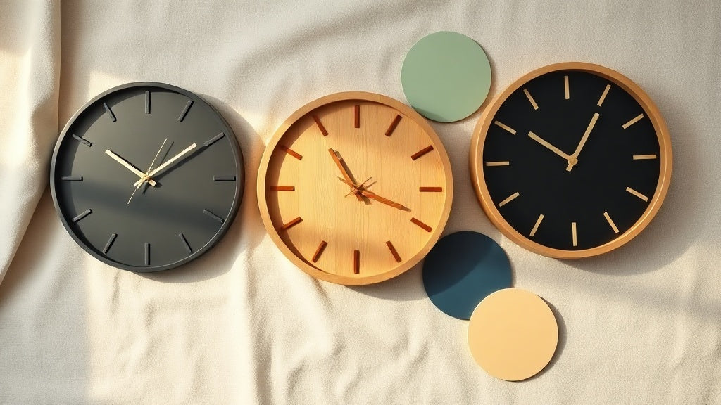
You've found the clock. The shape is right, the size feels good on paper, and the style fits what you had in mind. Then you hang it up and something's off. Not wrong exactly, just... flat. Nine times out of ten, the culprit is colour. Not the clock's colour in isolation, but how it talks to the wall behind it, the furniture around it, and the overall mood of the space.
Choosing the right wall clock colour for your room isn't a matter of picking your favourite shade and hoping for the best. It's about reading light, tone relationships, and the atmosphere you actually want to live in. Here's what works, room by room and palette by palette.
Key takeaways
- Contrast is your best friend on light walls; a clock that blends in disappears.
- Warm-toned clocks (gold, brass, wood) read beautifully on cool or neutral backgrounds.
- Dark walls need light or metallic clock faces to avoid visual absorption.
- Match the clock's finish to one existing element in the room, not necessarily the wall.
- Room mood matters as much as paint colour: industrial, Scandinavian, and vintage aesthetics each have their own colour logic.
Why Colour Contrast Makes or Breaks a Wall Clock
Colour contrast is the single factor that determines whether a wall clock reads as intentional or disappears: too little and it merges with the wall, too much and it jars, and the sweet spot is what designers call considered contrast. A wall clock serves two purposes simultaneously: it tells the time and it shapes the wall it lives on. For it to do both well, it needs enough visual contrast against its background to register as an object of intention, not an afterthought. Too little contrast and the clock disappears. Too much and it can feel jarring, like a shout in a quiet room.
The sweet spot is what designers call "considered contrast." Think of a warm walnut clock against a soft sage green wall. Both are mid-toned, but the warmth of the wood pulls clearly against the cool green. Neither screams. Both make sense together. That's the relationship you're aiming for when you're choosing the right wall clock colour for your room.
Here's a practical way to test it before you commit: take a photo of your wall on your phone and adjust it to black and white. If the clock colour you're considering would look almost identical in greyscale to the wall behind it, you need more contrast. Different value levels (light versus dark) read even before colour relationships do.

Matching Clock Colour to White, Cream, and Light Walls
On light walls the biggest trap is choosing a pale clock that simply vanishes, so matte black works best on cool white, while natural wood and warm metallic finishes suit cream and greige backgrounds far better. Light walls are the most forgiving backdrop, which also makes them the easiest to get wrong. When everything is pale, a pale clock simply vanishes. The instinct to match tones can work against you here.
On bright white or cool white walls, matte black or charcoal wall clocks are the single most reliable choice. The contrast is clean, graphic, and works across almost every style from minimalist to industrial to classic. It's no coincidence that black-on-white is the combination customers mention most when they say "exactly what I was looking for."
For cream or warm white walls, pure black can feel slightly cold. A dark bronze, deep walnut, or aged iron finish sits better: the warmth in both the wall and the clock keeps the combination cohesive. Natural wood clocks also shine here, particularly bamboo or lighter oak tones that feel organic rather than stark. If you want a more layered look, a vintage wall clock in aged bronze or antique brass picks up the warmth of cream walls beautifully.
On soft greige or warm linen walls, gold and brass finishes do something almost magical. The wall's underlying yellow undertone picks up the metal's warmth, and the whole combination feels intentional and editorial without being overdressed.
Elena's pick
Black Nordic Wooden Wall Clock - Scandinavian Bamboo Design
The matte black bamboo face gives you all that clean contrast on light walls, without the coldness of metal. This is the classic Scandinavian minimalist trick: one material doing two jobs at once, and doing both quietly well.
67.00 USD
View product →Dark Walls: Where Most People Get the Colour Wrong
On dark walls the most common mistake is hanging a dark or natural wood clock that gets absorbed by the background, so gold, brass, copper, and white faces are the finishes that dark walls actually demand. Dark walls (navy, forest green, charcoal, terracotta, deep plum) are having a serious moment in interior design, and rightly so. They create depth, warmth, and a sense of intimacy that light walls rarely achieve. But they make clock colour selection genuinely tricky.
The most common mistake is hanging a dark or natural wood clock on a dark wall. Both disappear into each other. The clock becomes a texture rather than a feature, and you lose the whole reason you put it there. Getting the wall clock colour for your room right on dark walls is honestly more critical than on light ones, because there's less visual margin for error.
On deep navy or charcoal walls, the clearest wins come from:
- Gold and brass finishes - the contrast between cool dark and warm metallic is striking without being aggressive
- White or cream clock faces - classic and clean, particularly strong with Roman numerals on very dark backgrounds
- Copper or rose-gold tones - slightly softer than yellow gold, beautiful on navy or dark teal
- Aged silver or polished chrome - cooler than gold but still reflective enough to stand out
On warmer dark walls like terracotta or burnt sienna, natural materials such as light bamboo or pale wood work well because they share the earthiness without competing in tone. A cream or ivory clock face on a terracotta wall feels almost Mediterranean in the best possible way.

Did you know?
The navy-and-brass pairing became a staple of European interior design during the mid-19th century, when naval officers decorated their quarters with dark painted walls and brass instrument fittings. What started as functional contrast became a design language that's still used in premium interiors today.
Reading Your Furniture: How to Anchor a Clock Colour to an Existing Room Palette
The most reliable approach is not matching the wall but echoing one existing element in the room, because repeating a metal finish or wood tone at least three times creates a palette the eye reads as designed rather than accidental. Here's a principle that saves a lot of indecision: you don't have to match the wall. You have to match something in the room. A clock that echoes one element already present (a metal lamp base, a picture frame finish, the tone of a timber floor) feels like it belongs. A clock that matches nothing looks placed rather than chosen.
This is called "tonal repetition," and it's one of the quieter tricks professional stylists use consistently. When you repeat a metal finish or wood tone at least three times in a room (floor, a furniture piece, the clock), the eye reads it as a deliberate material palette. Two repetitions feel like coincidence. Three feels like design.
Practical examples:
- Room with warm oak furniture and honey-toned floors: choose a natural wood or light bamboo clock, or a brass/gold metal frame to echo the warmth
- Room with black iron furniture legs and matte black fixtures: a matte black clock reinforces the palette without adding a new material to manage
- Room with brushed silver appliances or chrome fixtures: a silver or gunmetal clock face ties in without doubling up on a finish that's already doing a lot of work
- Room with rattan, jute, or wicker pieces: natural bamboo or light wood clocks speak the same material language
Clock Colour by Room Mood and Interior Style
The finish and texture of a clock's colour matter just as much as the hue itself: matte black grounds an industrial space, natural birch suits Scandinavian restraint, and warm gold or aged brass belongs in classic and traditional rooms. Colour is only half the picture. The finish, texture, and weight of a clock's colour matters just as much as the hue itself. A glossy red in a minimalist room reads as chaotic. A matte black in an industrial space reads as grounded. Here's how colour logic shifts across the main interior styles.
Scandinavian and Minimalist Spaces
These rooms work through restraint: pale neutrals, clean lines, and natural materials like birch, ash, and bamboo. Scandinavian wall clocks in white, matte black, or natural birch/bamboo are the natural fit. The goal is a clock that adds structure without visual noise. Avoid metallic finishes that feel decorative. The hygge approach is functional beauty, not ornamentation, and a brushed metal or raw wood face honours that philosophy better than anything gilt or glossy.
Industrial and Loft Interiors
Exposed brick, concrete, dark steel. These rooms already carry a lot of visual texture, which means a delicate clock will simply vanish. A clock here needs weight to read against that backdrop. Dark iron, antique bronze, or copper finishes work because they share the raw, patinated quality of industrial materials. Industrial wall clocks in aged metal or copper-red tones feel native to this environment rather than decorative additions. Think of a clock face that looks like it could have hung in a Victorian factory and you're on the right track.
Classic and Traditional Rooms
Warm wood panelling, upholstered furniture, layered textiles. Colours with heritage credentials earn their place here: antique gold, dark mahogany, aged brass, cream with gilt details. The vintage wall clock category naturally aligns with this aesthetic, where patina signals quality rather than wear. A patinated brass finish against deep-toned walls or caramel leather furniture is one of those combinations that feels genuinely considered.
Contemporary and Transitional Spaces
The most flexible category. Transitional rooms blend warm and cool elements, which means almost any colour can work as long as it picks up an existing note. The risk is doing too much: a contemporary room with a statement sofa, bold artwork, and a loud clock can become visually exhausting. In these spaces, a quieter clock colour lets the other pieces breathe. A simple round face in brushed gunmetal or natural oak tends to anchor rather than compete.

Elena's pick
Gold Circle Design Wall Clock - 60 cm Metal Dial
At 60 cm, this gold metal face does exactly what the tonal repetition rule asks for: it anchors warm-toned rooms with authority. If you've got a navy accent wall, a dark forest green, or deep charcoal, this is the clock that makes the wall look like a deliberate choice rather than a paint experiment.
209.00 USD
View product →A Quick Colour-Matching Reference by Wall Tone
The fastest way to choose is to match clock finish directly to wall tone: matte black on cool white, gold or brass on deep navy, light bamboo on terracotta, and silver or white on charcoal or dark grey.
| Wall Colour | Best Clock Finishes | What to Avoid |
|---|---|---|
| Bright or cool white | Matte black, charcoal, dark walnut | White or very pale clocks (too little contrast) |
| Warm white / cream | Natural wood, bronze, dark iron, gold | Pure black (slightly cold contrast) |
| Greige / warm neutral | Brass, gold, warm wood tones | Silver or cold grey (clashes with warm undertone) |
| Sage or soft green | Warm wood, gold, cream dial | Green-toned or similarly mid-toned clocks |
| Deep navy or teal | Gold, brass, copper, white face | Dark wood or dark metal (absorbed by background) |
| Charcoal or dark grey | Silver, white, gold, copper | Matte black (visually lost) |
| Terracotta or rust | Light bamboo, cream, aged brass | Copper or orange-toned metal (merges with wall) |
| Forest green or olive | Black, gold, aged bronze | Natural wood (low contrast on green) |
Light, Time of Day, and Why Colour Looks Different on Your Wall
A clock's colour shifts significantly depending on the direction and quality of light in your room: warm finishes like gold counteract the coolness of north-facing rooms, while silver, white, or matte black suit south-facing rooms already flooded with warm afternoon sun. Paint chip regret is real, and the same principle applies to wall clocks. A clock's colour shifts meaningfully depending on the quality and direction of light in your room. A brass clock in a north-facing room with flat, cool daylight reads entirely differently from the same clock in a south-facing room flooded with warm afternoon sun.
A few things worth knowing before you decide:
- North-facing rooms get cool, indirect light all day. Warm finishes like gold and wood actively counteract that coolness and make the space feel less austere.
- South-facing rooms are bathed in warm light, which can intensify warm finishes. Gold can tip into overpowering. Silver, white, or matte black become more interesting choices here.
- East-facing rooms glow in the morning. If the clock is on the east wall, it catches direct morning light. Metallic finishes can create beautiful glare or distracting reflections depending on whether the finish is matte or polished.
- Artificial lighting shifts the balance further. Tungsten bulbs warm every colour. Cool LED strips read almost like daylight. A chrome clock under warm tungsten lighting starts to pick up amber tones.
The practical answer: wherever possible, hold a colour swatch or a similarly toned object against the wall at the time of day you spend the most time in that room. Morning light and evening lamp light can make a colour look like two completely different choices.
Elena's pick
Industrial Copper Red Wall Clock - Metal Quartz Silent
Copper is one of the most light-sensitive finishes you can own. It shifts from warm rose to burnished amber across different times of day, which makes it a genuinely dynamic colour choice. In a south-facing industrial loft, it catches afternoon light in a way that no other metal finish quite replicates.
From 105.00 USD
View product →When to Break the Rules: Statement Clocks and Accent Colour Logic
A contrasting clock colour works as a deliberate statement only when it connects to at least one other accent already in the room; without that visual anchor, a bold colour reads as a mistake rather than a considered design choice. Everything above assumes you're choosing a clock colour to harmonise with the room. But sometimes the right move is contrast as a deliberate statement. A deep burgundy or forest green clock on a neutral wall. A matte white sculptural face on a busy gallery wall where the clean colour creates breathing room. These choices work when they're intentional, not accidental.
The way to tell the difference: if the contrasting clock colour relates to at least one other accent in the room (a cushion, a plant, a piece of artwork), it reads as part of the palette. If it shares no visual connection with anything else in the space, it reads as a mistake.
Accent colour clocks work best in rooms that are otherwise fairly neutral. A room already carrying three strong colours doesn't need a fourth from the clock. A room that's deliberately calm in its palette can handle a single considered punch of colour from a timepiece that's chosen to do that job. Browse the full wall clock collection if you want to see how different finishes read side by side before committing.
"A clock should feel chosen, not settled for. The colour is where that choice becomes visible."
Interior styling principle, frequently cited in Scandinavian design education
Colour, Finish, and Size: Why All Three Work Together
Colour alone does not determine how a clock lands on a wall: the finish amplifies or quiets the hue, and the clock's size determines how much visual weight that colour carries across the entire space. One last thing worth flagging, because it's easy to think about colour in isolation. The finish of a clock's colour (matte, satin, polished, patinated) and the size of the clock both affect how that colour lands on the wall. A large polished gold clock at 60 cm reads very differently from a small polished gold clock at 25 cm, even if the colour is identical. Scale amplifies colour. A bold colour on a large diameter clock commands the wall; the same colour on a small clock becomes a detail.
Similarly, matte finishes absorb light and feel quieter. Polished or glossy finishes reflect it and feel more assertive. If you're working with a dramatic or saturated colour, a matte finish tends to keep it from feeling overwhelming. If you want a subtle colour to register clearly, a reflective finish helps it catch the eye.
The most satisfying wall clock choices tend to consider all three together: the right wall clock colour for your room, the right finish for the light conditions, and the right size for the wall it lives on. Get those three aligned and the clock stops being something you "chose" and starts being something that looks like it was always meant to be there.
Frequently Asked Questions
Should a wall clock match the wall colour or contrast with it?+
Contrast almost always serves you better on light or mid-toned walls. A clock that blends into the wall becomes invisible as a design element. The exception is very dark walls, where a slightly lighter clock in the same tonal family can create a more moody, layered look. When in doubt, lean toward contrast: it gives the clock a reason to be there.
What colour clock works best on a dark wall?+
Gold, brass, and copper are the standout choices on dark walls because the warm metallic tone creates natural contrast against cool navy, charcoal, or forest green. White or cream dial faces work just as well for a cleaner, more classic look. The one combination to avoid is a dark or natural wood clock on a dark wall: both tones merge and the clock disappears entirely.
What clock colour works in every room?+
Matte black is the closest thing to a universal clock colour because it works against almost any light wall and reads as intentional in nearly every interior style, from minimalist to industrial to classic. Natural wood tones are the second most versatile option, particularly in warm-palette rooms. Neither is guaranteed to work everywhere, but both are low-risk starting points.
Does the clock colour need to match my furniture?+
Not exactly match, but relate to at least one existing element. A clock that echoes the finish of a lamp base, a picture frame, or a metal hardware detail feels cohesive. Repeating a finish or material tone three times in a room is the rule of thumb designers use: at that point it reads as a deliberate palette rather than a coincidence.
Can I use a gold clock in a modern or minimalist room?+
Yes, with two caveats. The gold finish should be brushed or matte rather than high-gloss (which reads as ornate), and the clock's shape should be clean and geometric rather than decorative. A simple circular gold frame in a minimalist room works precisely because it's restrained everywhere else. Pair it with one other brushed gold element in the space to anchor it.
What wall clock colour suits a bedroom?+
Bedrooms benefit from calm, lower-contrast colour choices unless you want a strong focal point above the bed. Natural wood, warm white, or soft grey clock faces tend to work well because they feel restful rather than stimulating. If the room has a dark feature wall behind the bed, a lighter clock face placed on that wall adds structure without visual tension. Avoid very high-gloss finishes that catch light and create distraction in a space meant for rest.






