

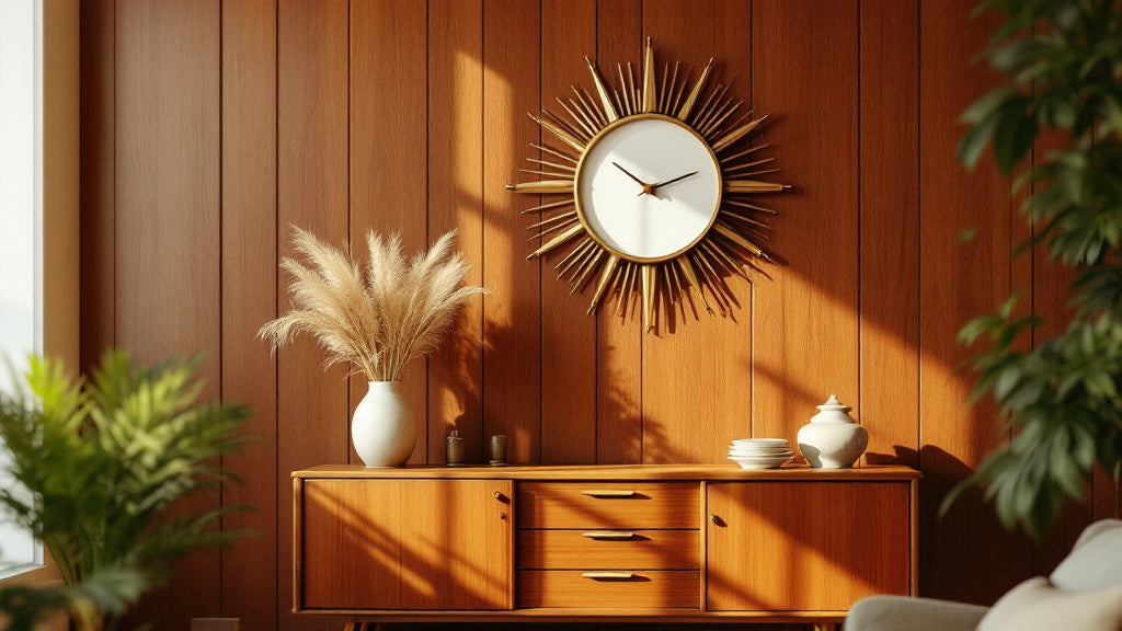
There's a moment when you step into a room and a clock on the wall just clicks. Not because it's the loudest piece in the space, but because it feels like it belongs. That's the thing about retro wall clocks for mid-century modern decor: when the right one lands on the right wall, the whole room snaps into focus. When the wrong one does, it sticks out like a plastic flower in a ceramic vase.
Mid-century modern interiors have an unapologetic personality: clean geometric lines, warm organic materials, a colour palette that sits somewhere between earthy and optimistic. A clock in this context isn't just functional hardware. It's part of the visual language of the room. Getting it right means understanding why certain shapes, finishes, and proportions feel at home here, and why others don't.
Let's get into it, room by room, style by style, with specific picks at different price points so you can find the clock that genuinely fits your space.
⭐ À retenir
- The starburst, atomic, and ball-clock silhouettes are the three signatures of authentic mid-century clock design.
- Warm metals (brass, copper, gold) and natural wood are the most forgiving finishes for MCM interiors.
- Size matters more than most buyers expect: a 40-60 cm diameter is the sweet spot for living room focal walls.
- Silent quartz movements are non-negotiable for bedrooms and open-plan living spaces.
- The best retro wall clock for mid-century modern decor isn't necessarily the most expensive one: proportion and colour harmony matter far more.
Why Mid-Century Modern and Retro Clocks Are Such a Natural Pair
The mid-century modern movement, roughly spanning 1945 to 1969, was obsessed with the idea that everyday objects could be both beautiful and functional. Furniture designers like **George Nelson**, **Charles and Ray Eames**, and **Arne Jacobsen** weren't making "art for art's sake." They were arguing that a chair, a lamp, or a clock could carry aesthetic ambition without losing its usefulness.
Clocks were actually a proving ground for this philosophy. Nelson's Ball Clock (1949) is probably the most recognisable example: twelve balls on wire spokes radiating from a central hub, no numerals, no fuss. It told the time. It also looked like nothing anyone had seen before. That tension between playfulness and precision is exactly what makes retro wall clocks for mid-century modern decor feel so alive on a wall today.

💡 Did you know?
George Nelson didn't actually design the Ball Clock himself: the credit is disputed between his studio, Irving Harper, and a group of creatives who reportedly sketched it during a single late-night session in 1948. It went into production through Howard Miller Clock Company the following year and has been in continuous production ever since.
The Three Silhouettes That Define the Style
Walk into any well-executed MCM-inspired interior and you'll spot one of three clock shapes. Understanding what each one brings to a room makes the buying decision a lot simpler.
The Starburst (Atomic) Clock
This is the one most people picture when they think "retro clock." Pointed metal rays, usually in brass or gold, shoot outward from a central face. The name "atomic" comes from the post-war fascination with atomic energy and space-age aesthetics that characterised the 1950s. The rays can be uniform (clean, more Scandinavian) or varied in length and shape (more expressive, more American *kitsch*). On a white or off-white wall, a brass starburst clock creates instant drama without competing with furniture. It's a statement piece that reads boldly from across the room.
The Ball Clock
Twelve spheres on thin wire spokes replacing the hour markers. The face itself is minimal, often without hands in some reproductions, or with thin metal hands that barely interrupt the composition. Ball clocks work particularly well in rooms with organic curves: a tulip table, a kidney-shaped coffee table, rounded armchairs. The spheres echo those shapes and create a visual rhythm across the space. They're conversational, too. Guests always notice them first.
The Sunburst with a Solid Face
A middle ground between the starburst and a conventional round clock. The face is a full disc, often in walnut veneer or brushed metal, ringed by a flat or three-dimensional ray pattern. This version is more versatile: it reads as a proper clock first, a decorative object second. People who want the MCM reference without committing to full atomic drama tend to gravitate here. It holds its own in rooms with busier wallpaper or richer colour palettes, and it's usually the most accessible entry point price-wise too.
| Silhouette | Best Room | Ideal Wall Colour | Finish to Prioritise |
|---|---|---|---|
| Starburst / Atomic | Living room, hallway | White, off-white, sage green | Brass, antique gold |
| Ball Clock | Living room, dining room | Warm white, terracotta, mustard | Natural wood, chrome |
| Sunburst with Solid Face | Kitchen, home office, bedroom | Any neutral, dark accent walls | Walnut veneer, brushed gold |
Colour and Material: Getting the MCM Palette Right
Mid-century modern interiors aren't afraid of colour, but they use it deliberately. The palette tends to cluster around warm neutrals (camel, cream, warm grey), earthy accents (terracotta, olive, mustard yellow), and occasional bold pops (teal, burnt orange, cobalt). A retro clock that fights against these tones will read as a mistake, even if it's beautifully made on its own terms.
Here's how to think about it practically:
- Brass and antique gold finishes are the most universally compatible. They warm up cooler grey walls and complement the teak or walnut wood tones that anchor most MCM furniture.
- Walnut and dark wood clock faces create a cohesive visual line with wood-legged furniture and flooring. They're quieter than metal options but feel genuinely of the era.
- Copper brings a richer, slightly warmer tone than brass. It works brilliantly against white or pale linen walls but can clash if the room already has a lot of warm red or orange tones.
- Black metal is technically MCM-adjacent, but it reads more industrial than mid-century if used without contrast. Pair it with a warm-toned wall rather than a cold grey one.
- Avoid bright chrome or stainless steel as a primary finish: it pulls the room toward contemporary minimalism rather than vintage warmth.


Size and Placement: The Details Most Buyers Skip
Buying the right style only gets you halfway there. Where you hang it, and how large it is relative to the wall, determines whether it anchors the room or disappears into it.
Living Room Focal Walls
A clock on a living room feature wall needs enough presence to hold its own against furniture and art. For a standard wall between 2.5 m and 3 m wide, a diameter of 45-60 cm is usually the minimum to avoid looking like you picked the wrong size. If the wall is empty except for the clock, you can go larger. If it's competing with shelving or artwork, scale down to 35-45 cm and let the grouping do the work.
The Gallery Wall Approach
A retro clock works beautifully as the anchor of a gallery wall. Hang it first, slightly left or right of centre (perfect symmetry feels rigid in an MCM context), then build out prints, mirrors, and smaller objects around it. The key is keeping a consistent metal finish between the clock and at least one other element in the grouping: same brass, same wood tone.
Above the Credenza or Console
This is the classic MCM placement, and for good reason. A starburst or sunburst clock hung 20-25 cm above a low teak credenza creates the visual stack that defines the era. Leave breathing room: the clock should float above the furniture, not sit on top of it visually.
Kitchen and Dining Rooms
In the kitchen, a retro clock with a solid face and clean Arabic or Roman numerals is more practical than a ball clock with hard-to-read markers. Aim for 25-35 cm in smaller kitchens, 35-45 cm in open-plan spaces. The kitchen clock is one of the few pieces you genuinely look at repeatedly throughout the day, so legibility matters as much as aesthetics. A brushed gold or copper finish on a circular face integrates beautifully into kitchen schemes that already carry brass hardware on cabinets or pendant lights.

The Retro Clock Styles That Work in 2026 (and Why)
Not every vintage-inspired clock on the market actually reads as mid-century. Some lean too far into farmhouse territory. Others hit a contemporary minimalist note that erases the retro warmth entirely. The ones that genuinely complement an MCM interior in 2026 tend to share a few specific characteristics.
Open-Dial Designs with Exposed Hands
No glass cover, or a very thin, nearly invisible one. The MCM aesthetic was about honest materiality: you could see how things worked. An open dial where the hands move in full view feels authentic to the era in a way that a thick domed glass face does not. It also creates a lighter visual footprint on the wall, which matters in rooms where you're trying to balance multiple elements.
Minimalist Roman and Arabic Numerals
Numerals in mid-century clocks are either absent entirely or rendered in the thinnest possible weight. Think thin sans-serif Arabic numerals or slender Roman numerals pressed into a metal ring rather than printed on a paper face. The face should feel like a design element, not a label.
3D Relief and Raised Hour Markers
One of the quietly distinctive features of MCM-influenced clock design is the use of dimensional markers instead of printed ones. Small raised discs, short metal rods, or faceted jewel-like markers catch light differently as the day moves, creating a subtle animation on the wall. It's a small detail, but it's the kind of thing that makes a room feel considered rather than assembled.

Room-by-Room: Which Retro Clock Type Fits Where
The Living Room: Go Bold or Go Subtle, Not In Between
The living room wall clock is the one guests notice. If you're going for a focal-wall statement, a large starburst in antique brass (50 cm or wider) mounted on a plain wall above a credenza is hard to beat. If the room is already busy with artwork or shelving, a solid-face sunburst in walnut or a clean metal ring with raised markers gives you the MCM reference without overwhelming the composition. The one thing to avoid: a medium-sized clock that's too small to read as intentional but too large to disappear. Commit to the size.
The Kitchen: Legibility First, Style a Close Second
Kitchen clocks get real use. You're checking the time while cooking, timing a roast, counting minutes on a simmer. A mid-century style kitchen wall clock with clear Arabic numerals on a clean circular face, finished in brushed metal or a warm painted tone, hits the right balance. The 30 cm format works well for most kitchens. Anything smaller starts to feel like an accessory rather than a functional piece. If your kitchen already has brass cabinet hardware or copper pendant lights, a clock that echoes those finishes will tie the whole scheme together far more effectively than any other single change you could make.
The Bedroom: Silent, Always
A ticking clock in a bedroom is one of those things that seems fine in the shop and becomes unbearable at 2 a.m. Every clock recommended for a bedroom context should run on a silent quartz movement. In terms of style, smaller and quieter suits the bedroom better: a 25-35 cm solid-face clock in walnut or a muted metal finish keeps the retro character without making the room feel like a showroom. Browse the full silent wall clock collection if this is a priority for you.

The Home Office
An office clock needs to be readable at a glance from a desk. A clean MCM-inspired design with Arabic numerals and a high-contrast face does the job. If the office has a more industrial or mixed-material feel, a copper or dark metal finish ties the clock into the broader scheme. The home office is also the one room where a slightly larger diameter (40-50 cm) works even in compact spaces, because you're relying on it functionally throughout the day. Check the office clock range for options sized and styled for workspace walls.
"The clock on the wall should feel like it grew there, not like it was installed."
A principle shared by many mid-century designers when discussing integrated interior design.
What to Watch Out For When Shopping Retro Clocks
The market for vintage-inspired clocks is enormous, and the range in quality is equally vast. A few things consistently separate the pieces that age well from the ones that look tired within a year:
- Metal weight: thin, lightweight metal rays on a starburst clock will bend and warp over time. Look for pieces where the spokes feel substantial in hand.
- Movement quality: a quartz movement from a reputable supplier (Seiko mechanisms are widely considered the benchmark in the mid-price range) runs accurately for years. Cheap mechanisms drift noticeably within months.
- Finish durability: brass-plated finishes will tarnish if the coating is thin. Look for descriptions that mention lacquered or powder-coated finishes rather than raw plating.
- Hanger hardware: a good wall clock comes with a proper hanging system, not a single central hook that lets the clock swing. Two-point hanging systems keep starburst clocks level far more reliably.
The designer wall clock collection is a good starting point if you want pieces where these quality markers have already been filtered in. For the widest range of retro and vintage-inspired options across all formats, the full wall clock collection covers everything from compact 25 cm pieces to large 60 cm statement dials.
Mixing a Retro Clock with a Non-MCM Interior
Not everyone lives in a perfectly curated teak-and-linen apartment, and that's fine. A retro wall clock with mid-century character can work in interiors that aren't strictly MCM, as long as a few anchor points create the right context.
In a Scandinavian-leaning interior, a walnut-face clock with minimal hands and no numerals bridges the two aesthetics comfortably. Both traditions share a preference for honest materials and functional simplicity. In a transitional space that mixes antique pieces with contemporary furniture, a starburst clock provides the retro accent that makes the mix feel curated rather than accidental. In an industrial loft, a copper or dark metal sunburst with visible quartz movement adds warmth to what can otherwise be a cold palette.
The one combination that rarely works: a bold starburst clock in a heavily maximalist, pattern-heavy interior. Both are fighting for attention and neither wins. When in doubt, lean toward a solid-face sunburst in a neutral finish. It's the most forgiving option across the widest range of interior styles, and it still reads unmistakably as a retro wall clock for mid-century modern decor.
FAQ
What size retro wall clock works best in a small living room?+
In a smaller living room, 35-45 cm is the practical sweet spot. Go below 35 cm and a starburst or sunburst risks looking accidental rather than intentional. Go above 50 cm and it can overpower compact walls. The key is keeping the wall behind the clock as clear as possible so the clock reads on its own terms rather than competing with surrounding objects. A single clock on a clean wall always looks more confident than a large clock surrounded by clutter.
Do retro wall clocks work with modern decor?+
Yes, absolutely. A clean sunburst design in brushed gold or walnut sits comfortably in a modern minimalist space, adding warmth and a single point of decorative interest without disrupting the room's calm. The trick is choosing a clock with a simple silhouette and restrained detail: skip the ornate multi-ray starburst and reach for a cleaner, more geometric form. The MCM design tradition and modern minimalism share enough DNA that the right clock feels right at home in both.
Is brass or copper the better finish for a mid-century modern clock?+
Both work, but they suit different rooms. Brass is warmer and slightly more golden, making it the more versatile choice across the widest range of MCM interiors. Copper has a richer, redder tone that looks particularly strong against white, cream, or sage walls. If the room already has terracotta or burnt orange accents, copper can tip into too-much-warmth territory, so brass is safer there.
How do you hang a wall clock properly so it stays level?+
For round clocks, a single hook at the top centre works for most solid-face designs. For starburst and atomic clocks, a two-point hanging system is much more reliable: it stops the clock from rotating or tilting when someone brushes past. Mark your wall with a small pencil cross at the intended centre point, use a spirit level, and fix into a wall stud or use appropriate hollow-wall anchors for heavier pieces. The centre of the face should sit at eye level (roughly 155-170 cm from the floor) or 20-25 cm above any furniture below it.
Do mid-century style clocks always need to be silent?+
Not always, but silence is strongly advisable for bedrooms, home offices, and any open-plan space where a ticking sound carries. In a hallway or a kitchen with ambient noise from appliances, a conventional tick isn't disruptive. That said, most quality retro wall clocks produced today use silent quartz movements as standard, so it's rarely a trade-off you need to make.
How high should a retro wall clock be hung?+
The centre of the clock face should sit at or just above eye level, typically 155-170 cm from the floor, depending on ceiling height and the people in the room. Above a piece of furniture like a credenza or console, hang the clock 20-30 cm above the top surface so it floats rather than sitting directly on it visually. In hallways or above doorframes, slightly higher placement (175-185 cm) works better for proportion.






