

You've found the perfect spot on your wall. You know roughly what size you want. But then you open a browser tab and suddenly you're staring at twenty different clock faces, wondering why some use Roman numerals, some use Arabic digits, some use nothing at all, and whether any of that actually matters. It does. Clock face design styles shape the entire personality of a timepiece, and picking the wrong one for your space is a bit like hanging a baroque oil painting in a mid-century modern living room. Technically fine. Visually, a little uncomfortable.
Here's what works, why it works, and how to figure out which style belongs in your home.
⭐ À retenir
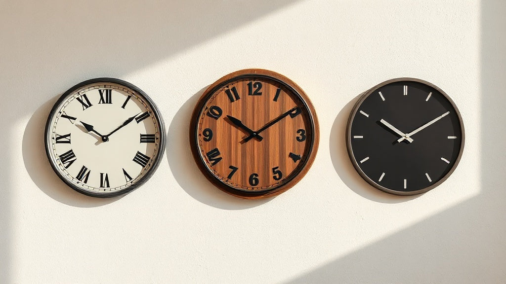
- Roman numeral faces read as traditional, European, and formal - perfect for living rooms and studies.
- Arabic numeral dials are the most legible and versatile, working across almost any interior style.
- Marker-only and open-dial designs skew contemporary and artistic; they prioritize aesthetics over instant readability.
- The dial style you choose signals a design language to anyone who enters the room.
- Material and finish matter as much as numeral choice when matching a clock to your decor.
Why the Clock Face Is the Real Design Decision
Most people spend energy choosing a clock's frame, color, or size. Those things matter, but the face is what your eye lands on first. It's the part that communicates the clock's era, mood, and cultural reference in about half a second. A Roman numeral dial on a dark wood case reads "19th-century European parlor." The same case with clean Arabic digits reads "mid-century atelier." Strip out the numerals entirely and suddenly it's sculpture.
Think of the clock face as the grammar of the piece. The frame and hands are words; the face decides whether you're reading a poem or a technical manual. Neither is wrong, but they're not interchangeable.
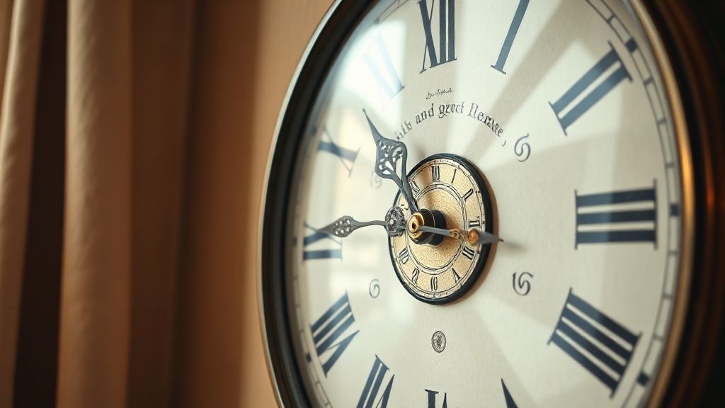
Roman Numeral Faces: The Language of Tradition
Roman numerals on a clock face are one of the oldest typographic conventions in Western decorative arts. Clockmakers in 14th-century Europe used them partly because they were familiar and partly because chiseling I, V, and X into iron was considerably easier than carving curved Arabic digits. That practical origin produced an aesthetic that stuck for centuries.
One quirk worth knowing: most traditional clocks write 4 as IIII rather than IV. Historians debate why. The most credible explanation is symmetry. IIII balances VIII visually across the dial, creating an even weight on both sides. Some watchmakers also say that IV, read quickly, can be confused with VI in low light. Whatever the reason, if you see IIII on a clock, that's authenticity, not a typo.
💡 Did you know?
The convention of writing 4 as "IIII" instead of "IV" on clock faces dates back to at least the 14th century. King Louis XIV of France reportedly preferred IIII, and royal taste had a way of becoming industry standard. Even today, watchmakers like Cartier maintain this tradition on their most storied timepieces.
Roman numeral clock faces pair naturally with materials that have warmth and age to them: aged brass, dark walnut, cream enamel, distressed iron. They feel right in traditional dining rooms, home offices lined with bookshelves, and entryways that lean classical. They also work beautifully in kitchens with a French country or Provençal sensibility.
Where they struggle: very clean, white-on-white Scandinavian interiors, or rooms built around industrial raw concrete. The visual vocabulary clashes. You can work around it with the right finish (a matte black Roman numeral dial can bridge traditional type and modern materials), but it takes intention.

🏠 Elena's pick
Large Roman Numeral Wall Clock - Metal, Silent Quartz
A full-scale metal Roman numeral dial that shows exactly why this style commands a wall rather than just filling it.
219.00 USD
Voir le produit →Arabic Numeral Faces: The Versatile Workhorse
Arabic numerals (the 1-12 we use in everyday writing) are the most legible option on a clock face at any size. Clean, familiar, and culturally neutral, they adapt across more interior styles than any other numeral system. That's not a compromise; it's a genuine strength.
The key variable with Arabic numeral dials is typeface. A sans-serif numeral in flat black on a white dial is pure minimalism, at home in any Japandi or contemporary loft setting. The same digits set in a slightly distressed serif feel vintage and warm. Bold, oversized Arabic numerals on an industrial metal background read urban and graphic. The number itself is the same; the execution changes everything.
Arabic numeral faces are also the practical choice for rooms where you actually need to read the time quickly: kitchens, home offices, mudrooms, children's rooms. Roman numerals require a half-second of decoding. Arabic digits don't. If function is as important as form in a particular room, that half-second matters more than you'd think.
| Feature | Roman Numerals | Arabic Numerals | Markers Only |
|---|---|---|---|
| Legibility | Good (requires decoding) | Excellent | Moderate (hand-reading only) |
| Design era | Classical, traditional, European | Universal, mid-century to modern | Contemporary, Scandinavian, minimal |
| Best rooms | Living room, study, dining room | Kitchen, office, any room | Bedroom, gallery wall, lounge |
| Interior pairings | Victorian, French country, rustic | Mid-century, industrial, eclectic | Japandi, Scandinavian, loft |
| Statement level | High (heritage quality) | Medium (depends on execution) | High (artistic, sculptural) |
Marker-Only Faces: Minimalism as a Design Statement
A marker-only dial replaces numerals entirely with geometric indicators: dots, batons, lines, or small circles at each hour position. The design philosophy behind this choice is that anyone who reads a clock already knows where 12 is. The numerals are redundant. What remains is pure form.
This approach traces its roots through the Bauhaus movement of the 1920s and the Nordic design tradition that followed. Both valued stripping objects down to what they actually need to function. A marker-only clock is the design equivalent of that thinking. It's not about removing information; it's about trusting the user not to need spoon-feeding.
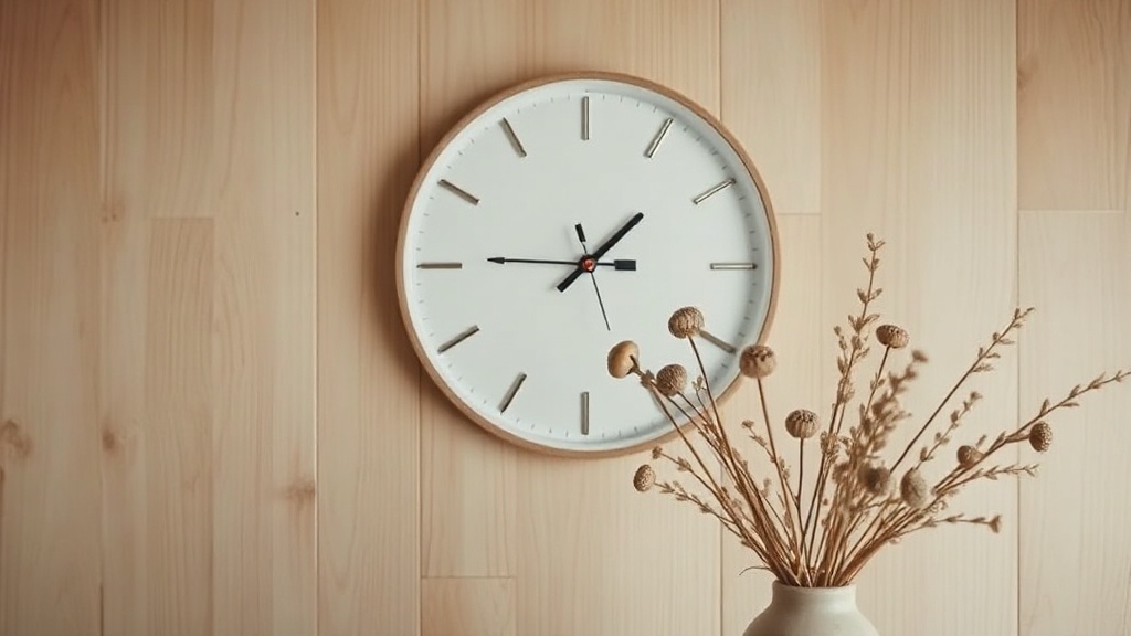
Marker-only clock faces work best in rooms with a strong design identity already in place. A bare white wall with no other visual anchors can make a marker-only dial feel unfinished. But in a thoughtfully curated living room or bedroom, it reads as quiet confidence. The clock becomes part of the composition rather than its centerpiece.
The material of the markers matters enormously here. Thin brass batons on a slate dial feel luxurious and restrained. Chunky painted wood markers on a natural bamboo face feel warm and organic. Chrome studs on a smoked glass dial feel unambiguously contemporary. Same structure, completely different atmosphere.

🏠 Elena's pick
Black Nordic Wooden Wall Clock - Scandinavian Bamboo Design
A clean marker-only Nordic face in matte black bamboo that proves restraint is its own kind of statement.
67.00 USD
Voir le produit →Open-Dial and Skeleton Faces: When the Mechanism Is the Design
Open-dial clocks remove the face plate entirely or cut away most of it, exposing the gears, springs, and movement behind. Skeleton dials do the same through a transparent surface, usually glass or acrylic. In both cases, the point is the same: the mechanism itself is too interesting to hide.
This style emerged prominently in the 18th century among French and English clockmakers who wanted to display their horological skill. A clock that shows its own workings is a clock that's saying "look what we can do." In a contemporary home, that same energy reads as industrial-chic or steampunk, depending on the finish.
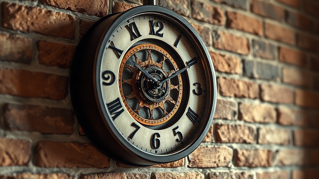
Copper gears on a dark iron frame pair naturally with exposed brick, reclaimed wood furniture, and Edison bulb lighting. A cleaner skeleton dial in brushed steel suits a more polished industrial or loft aesthetic. What both share is a theatrical quality: these clocks hold attention in a way that conventional dials don't. They reward close looking.
One practical note: open and skeleton dials are typically harder to read at a glance, especially in low light. If you're hanging one in a kitchen where you check the time ten times an hour, that friction adds up. But in a lounge, a library, or a dining room where the clock is as much art as instrument, it's not a problem at all.

🏠 Elena's pick
Steampunk Gear Wall Clock - 3D Wooden Gears Vintage Industrial
Three-dimensional wooden gears that turn the clock face itself into the focal point, ideal for industrial or eclectic spaces where walls are meant to tell stories.
À partir de 77.00 USD
Voir le produit →Abstract and 3D Faces: Artistic Dials That Break the Rules
Some clock faces take liberties that would give a traditional horologist a headache. Numbers scattered at odd angles. Indices replaced by geometric shapes. Hands that float over an open field of negative space. These designs exist in the overlap between timekeeping and wall art, and they're unapologetic about it.
Abstract dials tend to attract buyers who already have a strong visual identity in their home and want the clock to participate in that identity rather than simply hang on the wall. They're common in gallery-style apartments, creative studios, and any room where the owner has deliberately collected rather than simply decorated.
The functional trade-off is real. An abstract dial is often harder to read at speed. But the people who choose them have generally made peace with that. They're checking the time on their phone when precision matters; the clock on the wall is doing something else entirely.
Dial Color and Background: The Variable Everyone Underestimates
The numeral style gets most of the attention, but the background color of the dial is doing at least as much work. A cream or ivory dial background adds warmth and age to almost any face style. White dials feel crisp and modern. Black backgrounds push contrast up dramatically, making the hands and markers feel almost graphic. Slate, charcoal, and dark navy backgrounds have that moody, sophisticated quality that works well in rooms lit primarily by lamps rather than overhead lights.
There's also the question of what's printed versus what's applied. Painted or printed numerals have a flat, modern finish. Applied metal indices (physical pieces attached to the dial surface) catch light differently throughout the day, creating subtle movement in the clock's appearance. If you've ever noticed a clock that seems to look slightly different depending on the time of day and the angle of natural light, this is usually why.
Transparent dials, whether glass or acrylic, do something else again: they reflect their environment. A glass-faced clock on a white wall reads differently from the same clock on a terracotta wall. The designer glass wall clock format leans into this quality deliberately, making the clock genuinely responsive to its surroundings.
Matching Clock Face Styles to Interior Design Languages
This is where it gets practical. Rather than picking a face style in isolation, it helps to start from the design language of the room and work backward.
- Scandinavian and Japandi interiors: Marker-only dials in natural materials (bamboo, light oak, walnut). Restrained color palette, no ornate detail. The Scandinavian wall clock collection covers this territory well.
- Industrial loft: Open-dial, skeleton, or large Arabic numeral faces in dark metal, iron, or copper. Visible hardware is a feature, not a flaw.
- French country and rustic: Roman numeral faces on distressed wood or aged metal. Warm tones, imperfect finishes.
- Mid-century modern: Clean Arabic numerals in sans-serif, often on a two-tone dial. Thin hands, no clutter.
- Maximalist or eclectic: Abstract dials, sculptural forms, mixed materials. The clock is one more layer of intention in a room full of them.
- Contemporary minimalist: Either a very clean marker-only dial, or a skeleton dial that adds visual interest without visual noise.
One thing that trips people up: assuming a "neutral" clock face exists. It doesn't. Every style makes a choice. The question is whether that choice aligns with the choices already made in the room.
"A clock is the only object in a room that moves. That means it has more presence than anything else on the wall, whether you notice it or not."
A comment heard from a long-time interior decorator, and one that stuck.
How Hand Style Interacts with the Face Design
The hands are inseparable from the face they live on. A Breguet-style hand (with a hollow circle near the tip, borrowed from fine watchmaking) signals classical precision, and it belongs on Roman numeral or ornate Arabic dials. Straight, tapered hands in flat black read modern and graphic, pairing cleanly with marker-only dials. Spade or cathedral hands with ornate cutouts are formal and decorative, classic Victorian territory.
Mismatch here is jarring in ways that are hard to articulate but easy to feel. A heavily decorative hand set on a stark minimalist marker dial creates visual friction. A plain flat hand on an elaborate classical face feels underdressed. When you're evaluating a clock, check whether the hands and the face share the same design decade, so to speak.
Hand color matters too. Gold hands on a dark dial create a warm, library-esque quality. Silver or chrome hands on a white or pale dial feel contemporary and precise. Matte black on any background reads graphic and current.
Sizing the Face Relative to Your Wall
Face design doesn't exist independently of size. A Roman numeral dial at 20 cm feels intimate and decorative. The same face at 60 cm becomes architectural, a feature of the room rather than an accent. Marker-only designs at large scale often work better than large Roman numeral faces in contemporary spaces, because the markers occupy space without visual density.
A useful benchmark: the clock face should occupy roughly 60-75% of the visual "frame" you're mentally allocating to it on the wall. If you're hanging it above a console table, the clock shouldn't be wider than two-thirds of the table's width. If it's the sole piece on a large wall, it can afford to be considerably larger than instinct suggests. The most common mistake is choosing a clock that's too small for the wall, which makes it look timid regardless of how well it's designed.
For rooms with high ceilings, large-format wall clocks in the 50-60 cm range anchor the space in a way that smaller pieces simply can't. The face design choice becomes even more important at that scale, because every detail is magnified.
Questions about clock face design styles
What is the most legible clock face style for everyday use?+
Arabic numerals are the most legible across all ages and lighting conditions. The digits 1-12 are instantly recognizable without any translation step. If the clock is in a room where you check the time frequently (kitchen, office, hallway), Arabic numerals in a clean, high-contrast design will always outperform Roman numerals or marker-only dials for pure readability.
Why do some clocks use IIII instead of IV for the number four?+
This is a centuries-old convention in clockmaking. The most widely accepted explanations are visual symmetry (IIII balances VIII across the dial), easier casting in metal foundries, and the avoidance of any potential confusion between IV and VI at a glance. It's not a mistake; seeing IIII on a clock actually indicates traditional craftsmanship.
Do marker-only clock faces work in every interior style?+
Marker-only dials work best in rooms with a clear, contemporary design language: Scandinavian, Japandi, minimalist, or modern loft aesthetics. They tend to feel underpowered in heavily traditional rooms (French country, Victorian, rustic farmhouse), where the absence of numerals reads as incompleteness rather than restraint. The material of the markers, baton vs. dot vs. line, also shapes how traditional or modern the face reads.
What clock face style suits an industrial interior?+
Industrial interiors work well with open-dial or skeleton faces (exposed gears, visible mechanisms), oversized Arabic numerals in dark metal, or Roman numeral dials on raw iron frames. Copper, gunmetal, and oxidized finishes reinforce the aesthetic. Avoid light wood or porcelain finishes, which read as too domestic and soft for the industrial vocabulary.
Can I mix clock face styles in the same home?+
Yes, as long as each room has its own internal coherence. A Roman numeral clock in the study and a marker-only Scandinavian piece in the bedroom isn't a contradiction; those are different rooms with different purposes and moods. What doesn't work is mixing two clashing face styles in the same visual field, like a baroque Roman numeral dial next to a stark skeleton clock on the same gallery wall. Within a single room, keep the design language consistent.