

You've rearranged the furniture, found the right rug, and the room is almost there. Then you look at the wall and realize the clock you hung three apartments ago is doing the space no favors. Too small, wrong finish, wrong era. It happens to everyone. Matching a wall clock to room furniture isn't complicated once you know what to actually look at, but it does require more than just grabbing something round off a shelf.
Here's what works, broken down by the variables that actually matter: style, material finish, scale, and placement. No vague aesthetics talk. Real decisions you can make today.
⭐ Key takeaways
- Style coherence matters more than color matching. A clock in the wrong design language disrupts a room even if the color is right.
- Finish should echo at least one metal or material already present in the room.
- Scale is the most underestimated factor: a clock that's too small on a large wall looks like an afterthought.
- Placement relative to furniture height and wall anchors shapes how the clock reads visually.
- One bold statement clock beats three forgettable ones.
Start with the Design Language of Your Furniture
Before you think about color or size, ask yourself what design language your furniture speaks. A mid-century teak credenza, a raw-steel industrial shelving unit, and a carved farmhouse dining table all need a completely different clock hanging above them. Putting a sleek minimalist acrylic clock over a heavily carved Victorian console is a mismatch that no color trick can fix.
Here's a practical way to read your furniture's language. Look at the lines first. Clean, straight edges with tapered legs? That's mid-century or Scandinavian territory. Heavy, ornate profiles with dark staining? Traditional or vintage. Visible bolts, raw metal, reclaimed wood? Industrial. Light, natural materials with almost no decoration? Scandinavian minimalism or Japanese-inspired (wabi-sabi). Each of these families has a corresponding clock vocabulary.
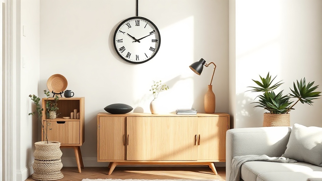
- Scandinavian and minimalist furniture: look for clocks with clean circular faces, minimal markers, natural materials like bamboo or light wood, or flat matte metal in black or white. The Scandinavian wall clock collection is a good starting reference for this family.
- Mid-century modern: sunburst shapes, walnut wood tones, brass or gold accents, and analog faces with no-fuss numerals. Round or starburst silhouettes both work well.
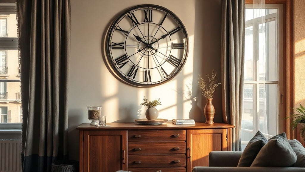
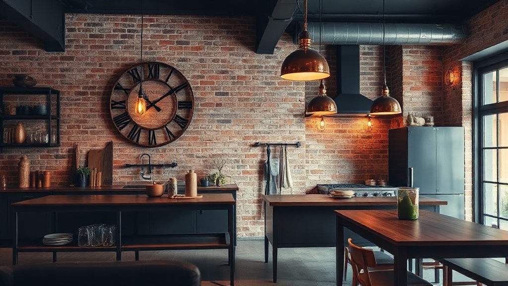
- Industrial and loft-style: exposed metal, oversized Roman numerals, gear details, dark iron or copper finishes. The rawer the furniture, the bolder the clock can be.
- Traditional and vintage: pendulum-style cases, Roman numeral dials, polished wood or antique brass, ornate frames. Vintage wall clocks carry the visual weight these rooms expect.
- Contemporary glam: gold or black metal, geometric shapes, mirrored accents. Drama is the point.
💡 Did you know?
The Scandinavian design movement, rooted in the 1950s functionalism of Denmark, Sweden, and Finland, established that household objects should be both useful and beautiful without excess. That's exactly why a bamboo clock with clean lines feels so at home in a Nordic-inspired room: it was designed with the same philosophy as the furniture around it.
Match the Finish, Not Just the Color
This is where most people go wrong. They try to match the clock's color to the wall paint and ignore the finish of the furniture. The finish is actually what ties things together.
Walk around your room and take note of every material and finish already present. Brushed brass drawer pulls? Matte black light fixture? Warm walnut veneer? Raw oak? These are your reference points. The clock's finish should echo at least one of them. Not copy exactly, echo. A clock in the same brushed brass as your cabinet handles reads as deliberate. A clock in shiny gold in a room full of matte hardware reads as an accident.
| Furniture Finish | Clock Finish That Works | Clock Finish to Avoid |
|---|---|---|
| Light oak / pale wood | Matte black, natural bamboo, white | Shiny chrome, dark mahogany |
| Dark walnut / ebony | Brushed gold, antique brass, warm copper | Bright white plastic, pale birch |
| Raw steel / dark iron | Copper, matte black metal, aged bronze | Gloss white, pastel tones |
| Painted white / lacquer | Gold, black metal, glass | Heavy rustic wood, raw unfinished metal |
| Mixed metals (eclectic) | Pick the dominant metal and match it | Adding a fourth competing metal |
One useful trick: hold a phone photo of your room next to a clock you're considering. Your eye will immediately flag whether it fits or fights. Trust that first reaction.

🏠 Elena's pick
Industrial Copper Red Wall Clock - Metal Quartz Silent
If your room carries dark metal fixtures or warm-toned hardware, this copper finish bridges furniture and wall in one move.
From $105.00
See the product →Getting the Scale Right for Your Wall and Furniture
Scale is the factor people underestimate most. A 10-inch clock on a wide living room wall above a large sofa looks like a postage stamp. It's not charming. It reads as timid. Conversely, a 60 cm statement clock in a tiny hallway can overwhelm if there's nothing else on the walls to absorb it.
Here's a reliable starting point. Measure the width of the furniture piece the clock will hang above, whether that's a sofa, a sideboard, or a dining table. Your clock diameter should be roughly one-third to half that width. So if your sofa is 220 cm wide, a clock between 70 and 100 cm fits proportionally. For narrower pieces like a 90 cm console, a 30 to 45 cm clock hits the right note.
Wall height matters too. Standard 2.4 m ceilings call for clocks up to about 50 cm in diameter. Higher ceilings, especially in loft or open-plan spaces, can carry 60 to 80 cm pieces with ease. Oversized wall clocks on high walls are one of the most effective tools for making a room feel intentionally designed rather than randomly furnished.
Room-by-Room: How Furniture Context Changes Everything
Living Room
The living room tends to have the most furniture to contend with: sofa, coffee table, shelving, TV unit, accent chairs. The clock needs to hold its own without competing with everything else. Position it above the sofa or on a feature wall where it can anchor the space. If your sofa has dark upholstery and wooden legs in a warm tone, a clock in a similar wood or warm metal picks up that thread without being matchy-matchy.
Rooms with mixed furniture styles, say a mid-century sofa paired with a more contemporary coffee table, actually benefit from a clock that leans toward one style deliberately. It becomes the tiebreaker, the piece that declares what the room is actually about.

🏠 Elena's pick
Large Roman Numeral Wall Clock - Metal, Silent Quartz
A strong anchor for living rooms with traditional or transitional furniture, the Roman numerals add gravitas without visual fussiness.
$219.00
See the product →Kitchen and Dining Room
Kitchens tend to have strong material stories: marble countertops, butcher block, tile backsplashes, cabinetry in painted or stained wood. A clock here needs to be legible at a distance (you're checking it while cooking) and resilient-looking in a room that's all about function. Metal clocks in industrial finishes perform well in kitchens with dark cabinetry. A warm bamboo or wood clock suits a farmhouse or cottage kitchen with natural materials.
In dining rooms, the clock often shares a wall with art or a sideboard. Here, proportion is critical. Match the visual weight of the clock to the furniture below it. A heavy antique oak sideboard can carry a 50 cm statement piece. A slim, modern console calls for something more restrained.
Bedroom
Bedrooms call for quiet coherence. The furniture is usually a unified set, bed frame, nightstands, dresser, and the clock should feel like it belongs to the same family. Avoid anything with a ticking mechanism in a bedroom (silent quartz movements are non-negotiable here). Natural materials like bamboo and wood read as calm and restorative, which matches the purpose of the room.
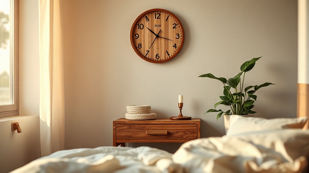
Placement matters more in bedrooms than elsewhere. A clock hung too high above the headboard loses its connection to the furniture. Keep it within 20 to 30 cm above the top of the bed frame or headboard so it reads as intentionally placed, not floating.

🏠 Elena's pick
Bamboo Wall Clock - Silent Quartz with Leaf Design
The leaf motif and natural bamboo finish pair seamlessly with wood-heavy bedroom furniture while keeping the mood calm and organic.
$110.00
See the product →When the Clock Is the Statement Piece
Sometimes the goal isn't to blend in, it's to lead. If your furniture is neutral or minimal, a clock can do the heavy lifting as a decorative wall clock that anchors the whole room. This works especially well in rooms where the furniture is intentionally understated: white walls, linen sofas, pale wood floors. A bold 60 cm gold circle clock or a sculptural gear clock becomes the room's focal point and gives everything else something to orbit.
"A room needs at least one thing that stops you when you walk in. It doesn't have to be expensive. It has to be considered."
Interior styling principle, widely attributed to studio design practice
The key rule when going bold: limit the competition. If the clock is the statement, keep the surrounding wall clear. No gallery wall, no floating shelves crowding the same space. Give it room to breathe and it will reward you every time you walk past.
Placement Habits That Change How Furniture and Clock Read Together
Where you hang a clock relative to the furniture below it shapes how both are perceived. A clock hung too high disconnects from the furniture and reads as decoration for the ceiling, not the room. Too low and it feels crowded. The standard sweet spot: hang the center of the clock at roughly eye level, which is around 150 to 160 cm from the floor in most homes, or 20 to 30 cm above the top edge of the furniture piece it's meant to accompany.
When hanging above a sofa, keep the bottom of the clock at least 25 cm above the sofa back. This prevents the visual weight from pressing down on the seating. Above a fireplace mantel, place the clock so it sits within the mantel's visual frame rather than floating above it.
⚠️ Watch out
Avoid hanging a clock directly above a heat source like a radiator or a working fireplace. Sustained heat affects quartz movements and can warp wooden cases over time. Keep at least 60 cm of clearance, or move to a side wall instead.
In open-plan spaces where the living and dining areas share a wall, a single large clock can serve both zones. Position it on the wall between the two areas and hang it so it's readable from both seating and dining height. This is where a larger wall clock in the 50 to 70 cm range earns its keep: it reads well across distance and creates visual continuity between two distinct furniture groupings.
The Three-Piece Rule for Cohesive Styling
Here's a practical framework borrowed from professional stylists. When placing a clock in relation to furniture, aim for three materials or finishes that connect across the room, and the clock should carry at least one of them. For example: walnut furniture, brass drawer pulls, cream linen upholstery. A clock in brushed brass or warm wood picks up two of those three threads. That repetition is what makes a room feel curated rather than assembled.
This works in the other direction too. If your room is heavily uniform, a clock in a contrasting material adds the tension that keeps it from feeling flat. Dark room, light clock. Very natural and organic space, a clean matte black metal clock. The contrast is intentional and readable.
Browse the wooden wall clock collection if your room leans into natural materials, or explore industrial wall clocks for spaces with metal-forward furniture. The key is always working from what's already in the room outward, not picking a clock in isolation and hoping it fits.
Frequently asked questions
Should a wall clock match the furniture style exactly?+
It doesn't need to be an exact match, and honestly an exact match can feel rigid. The goal is design language alignment. A clock in the same family as your furniture (Scandinavian, industrial, traditional) will always feel cohesive, even if the materials differ slightly. What creates friction is a clock from a completely different aesthetic vocabulary than the furniture around it.
What size wall clock works in a living room?+
For most living rooms, aim for a clock between 40 and 70 cm in diameter. If your sofa or feature wall is wider than 200 cm, you can go up to 80 cm without it feeling overwhelming. A good rule: the clock diameter should be roughly one-third to one-half the width of the furniture piece it hangs above.
Can I mix metal finishes between my clock and furniture?+
Yes, mixing metals works when there's a logic to it. The key is to echo a finish already present in the room. If your furniture has brushed brass handles and you choose a clock in antique gold, those two warm metallic tones read as intentional. What doesn't work is introducing a brand-new metal family (say, bright chrome) into a room that has zero chrome anywhere else.
How high should a wall clock be hung above furniture?+
The standard approach is to hang the clock so its center sits at eye level, around 150 to 160 cm from the floor. When hanging above a specific piece of furniture, keep the bottom edge of the clock 20 to 30 cm above the top of that piece. Above sofas, a minimum of 25 cm clearance between sofa back and clock bottom prevents the wall from looking crowded.
What clock style works with eclectic or mixed-style rooms?+
In eclectic rooms, the clock can act as an editorial choice that signals which direction the room leans. Pick one dominant style in the room and let the clock reinforce it. Alternatively, a sculptural or artistic clock (think a gear design or a 3D sticker clock) can stand as its own decorative category, one that doesn't need to match anything because it's clearly art first, timekeeper second.