

There's a persistent myth in home decor that a beautiful, well-made wall clock has to cost a small fortune. Walk into any high-end design boutique and sure, you'll find gorgeous pieces with triple-digit price tags. But here's what I've learned from obsessing over timepieces: some of the most character-rich, design-forward wall clocks sit comfortably under the $100 mark, and nobody will ever know the difference.
The key is knowing what to look for. Material quality, movement type, dial design, and proportions relative to your wall space, these are the details that separate a clock that elevates a room from one that just tells the time. Getting all of those right without blowing your budget? That's exactly what this is about.
À retenir
- Movement type (quartz silent sweep vs. tick) has a bigger impact on daily comfort than most people realize
- Diameter matters more than price, a well-proportioned clock on the right wall looks expensive automatically
- Materials like solid wood, brushed metal, and matte finishes read "quality" far more than glossy plastics
- Under $100, Scandinavian minimalist and industrial styles consistently deliver the best design-per-dollar ratio
- Customer reviews revealing real-world wall color pairings are often more useful than any style guide
Why the $100 Sweet Spot Actually Makes Sense
It's easy to assume that budget automatically means compromise. But the wall clock market under $100 has become genuinely competitive, and that's good news for anyone who cares about their walls. Manufacturers in this range have responded to design-conscious buyers by investing in better materials, cleaner dials, and more reliable movements.
What you're giving up at this price point is largely hand-finishing, custom craftsmanship, or the prestige of a heritage clockmaker's name. What you're keeping? Solid quartz movements that keep accurate time for years, dials made from real wood or powder-coated steel, and proportions that work in real homes, not just showrooms.
The sweet spot tends to be $40, $90. Below $40, you're often dealing with thin plastic frames and loud ticking movements that will drive you quietly mad. Above $90, you're edging toward the lower tier of premium, where a little more investment unlocks considerably better build quality. But that middle range? It's genuinely rich territory.
Style Breakdown: Which Aesthetic Gets the Most for Your Money
Not all clock styles are created equal when it comes to value. Some aesthetics are naturally forgiving in terms of materials, others depend on premium finishes to look their best. Here's what actually holds up under the $100 ceiling:
Scandinavian Minimalist
This is probably the strongest value category under $100. Why? Because the design language itself does the heavy lifting. Clean lines, restrained color palettes (think warm white, birch, soft gray), and the deliberate absence of excess ornamentation mean the clock lives or dies by proportion and material, and both are very achievable at this price. A beechwood frame with a simple printed dial and slender hands looks genuinely elegant in a kitchen, hallway, or home office.
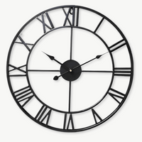
Industrial
Industrial clocks, exposed metal frames, Roman numeral dials, aged or brushed finishes, translate beautifully under $100 because raw materials are part of the aesthetic. A powder-coated steel frame isn't a compromise; it's the point. These clocks work especially well in living rooms with exposed brick, darker walls, or leather furniture where a more delicate Scandinavian piece might get lost.
Vintage & Farmhouse
This style is trickier under $100. Genuinely distressed wood and hand-applied finishes cost money. What you'll find in this range is mostly simulated aging, printed grain effects, faux patina. It can work, but inspect the product photos closely: you want to see actual material texture, not a printed effect on smooth plastic.
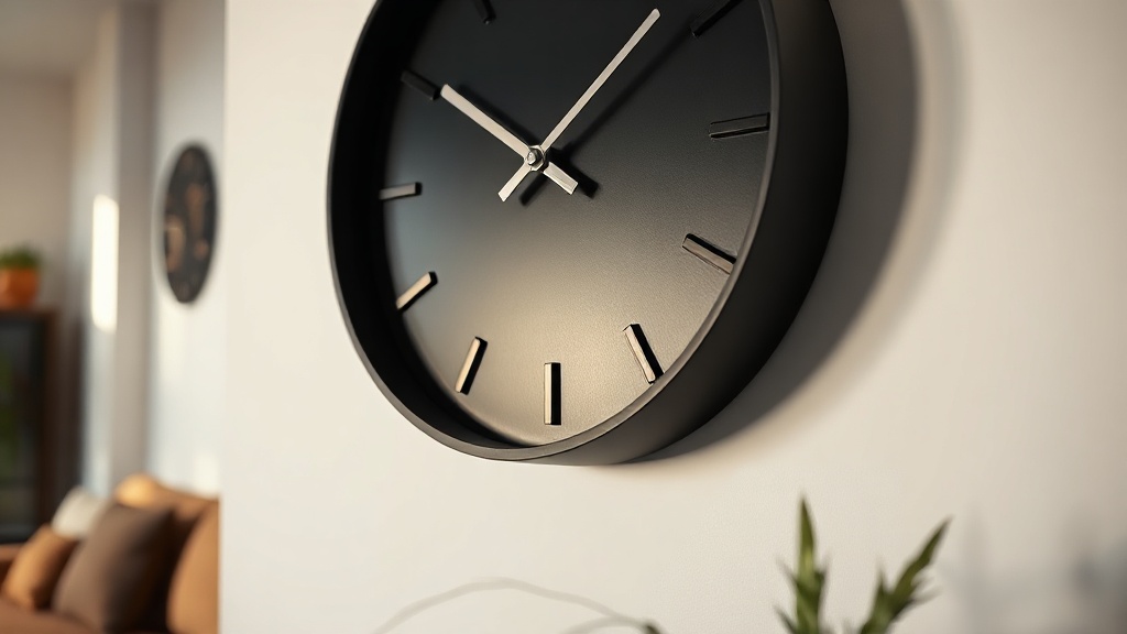
Modern Minimalist / Black Dial
A black-framed clock with a white or dark dial is one of the most versatile, failsafe choices in this price range. The geometry is simple, which means production costs are lower and quality is easier to maintain. Customers consistently report that a well-proportioned matte black wall clock looks far more expensive than it is, and it coordinates with almost anything.
| Style | Best Room Fit | Value Under $100 |
|---|---|---|
| Scandinavian Minimalist | Kitchen, home office, bedroom | Excellent |
| Industrial | Living room, dining, loft spaces | Excellent |
| Vintage / Farmhouse | Living room, entryway, kitchen | Moderate, inspect materials |
| Modern Black Dial | Any room, especially modern spaces | Excellent |
| Wooden Artisan | Living room, study, bedroom | Very good in natural wood |
The Movement Question: Silent Sweep vs. Traditional Tick
If there's one spec that genuinely affects your quality of life with a wall clock, it's the movement. And it's almost never discussed in product titles or marketing copy, which is frustrating, because it matters enormously depending on where you hang your clock.
Traditional quartz movements tick audibly once per second. In a busy kitchen or open hallway, you'll never notice it. In a bedroom, home office, or reading nook? That tick can become the loudest thing in the room once the house goes quiet. A sweep movement, also called a silent or continuous movement, advances the second hand in a smooth, uninterrupted motion with virtually no sound.
Did you know?
Silent sweep movements were originally developed for broadcast studios and hospitals in the mid-20th century, where any audible ticking would disrupt recordings or disturb patients. The technology has since trickled down into consumer clocks, and today, many wall clocks under $100 include it as standard.
The good news: silent sweep mechanisms are no longer a premium-only feature. Many well-reviewed clocks in the $40, $80 range now include them as standard. Always check the product description, it'll say "silent," "sweep," or "non-ticking" movement. If it doesn't say anything, assume it ticks.

Size & Placement: Getting the Proportions Right
A beautiful clock hung on the wrong wall, or at the wrong size, will always look like an afterthought. This is where a lot of people go wrong, and it has nothing to do with budget. Here's what actually works.
Living Room & Dining Room
These are your statement-clock walls. Go bigger than you think: a 12, 16 inch diameter minimum, ideally 18, 24 inches if the wall allows. The clock should be visible from across the room without being the only thing you see. Center it on a wall that isn't competing with a TV or large artwork, or use it deliberately as an anchor for a gallery wall arrangement.
Kitchen
Kitchens are functional spaces, so a 10, 14 inch clock works well. Look for simple numerals or clear markers, you want to read the time at a glance while your hands are full. Avoid overly ornate designs that will look cluttered among kitchen accessories.
Bedroom
Bedrooms call for restraint. An 8, 12 inch clock, hung above a dresser or on the wall facing your bed, adds warmth without visual noise. This is where the silent sweep movement is non-negotiable, a ticking clock at 2am is not the vibe.
Hallway & Entryway
Often overlooked, the entryway is actually a perfect spot for a clock with personality. You glance at it every time you leave the house, so it should be something that makes you smile. A vintage-style or industrial design works well here, where the exposed look feels intentional rather than spare.
What Real Buyers Say: The Details That Seal the Deal
Customer reviews for clocks in this price range reveal some surprisingly consistent patterns. The things that delight people most aren't necessarily what the marketing copy emphasizes.
Weight comes up constantly. A clock that feels substantial when you take it out of the box creates immediate confidence. It doesn't need to be heavy, it needs to feel intentional. Thin, hollow frames that flex slightly when you hold them are a reliable indicator that the finish will look cheap on the wall too.
Hand design is another underrated detail. Dauphine hands, those tapered, slightly three-dimensional hands with a raised ridge, read as premium at any price point. Flat, stamped metal hands that are simply painted look cheaper than they need to. When a product photo shows hands with visible depth and form, that's a good sign.
And then there's the dial surface. Printed paper dials behind glass will always look slightly less resolved than directly printed or embossed metal dials. Under $100, glass-covered printed dials are common and perfectly acceptable, just make sure the glass is real glass (not plastic) to avoid the subtle warping and reflection issues that cheap acrylic covers create.

Voir la collection
Wall Clocks
From minimalist Scandinavian to bold industrial, 166 wall clocks curated for every room and every budget.
166 références
Découvrir la catégorie →Wooden Clocks Under $100: A Category Worth Singling Out
If there's one material that consistently punches above its price in the wall clock market, it's wood. Real wood, even relatively affordable pine, rubber wood, or MDF with genuine veneer, brings a warmth to a room that no metal or plastic finish can replicate. It's tactile, it ages gracefully, and it connects to the Scandinavian and natural-materials trend that's still very much driving interior design decisions in 2026.
Wooden wall clocks under $100 are more accessible than people assume. The category has expanded significantly, with solid and veneer options available across minimalist, bohemian, and even industrial hybrid styles. A clock with a genuine walnut or oak veneer frame, hung against a white or warm-gray wall, will draw compliments that would embarrass a clock three times its price.

Voir la collection
Wooden Wall Clocks
Natural warmth, timeless grain, wooden wall clocks that make a room feel genuinely lived-in and intentional.
73 références
Découvrir la catégorie →The Best Value Checklist Before You Buy
When you're shopping for a wall clock under $100 that genuinely delivers on design and durability, here's the framework that separates a great find from a regrettable purchase:
- Frame material: Look for solid wood, MDF with real veneer, powder-coated steel, or cast resin. Avoid thin injection-molded plastic.
- Movement type: If the clock will be in a quiet room, confirm it has a silent sweep movement. Non-negotiable for bedrooms.
- Glass vs. acrylic cover: Real glass feels premium and doesn't scratch or warp. Acrylic is fine for larger clocks where a glass cover would be impractically heavy, but check for reviews mentioning reflection or distortion.
- Hand design: Dauphine or spade hands with visible form > flat stamped metal. Look for the shadow in product photos.
- Dial clarity: Can you read it at a glance from 10 feet? Simple, high-contrast dials age better and work in more spaces than overly busy designs.
- Mounting hardware: A single D-ring or sawtooth bracket is fine for clocks up to 12 inches. Larger clocks (16"+) should include proper keyhole brackets or dual mounting points for stability.
- Battery type: AA-powered movements outlast AAA in longevity between replacements. Sounds minor, but you'll appreciate it when you're not changing batteries every few weeks.
Attention
If you're hanging a clock above a bed, sofa, or anywhere someone regularly sits or sleeps beneath it, make sure the mounting hardware, not just the wall anchor, is rated for the clock's weight. A falling clock is a real safety hazard. When in doubt, use a wall stud or a proper toggle anchor rather than a single adhesive hook.
"A clock on the wall isn't decoration, it's a daily ritual. Every time someone walks into the room, they glance at it. Make sure what they see is something worth looking at."
A sentiment shared by nearly every thoughtful interior designer working with real-world budgets
How to Make a $60 Clock Look Like a $300 One
Placement and context do more work than the clock itself. A well-chosen, modestly priced clock hung thoughtfully will always outperform an expensive one placed carelessly. Here's what actually moves the needle:
Hang it at the right height. The center of the clock face should sit at approximately eye level, which for most spaces means 57, 65 inches from the floor. Most people hang clocks too high. Lower than you think, almost always.
Give it breathing room. A clock surrounded by too many competing elements (photos, art, shelves) loses its presence. Even a small clock with a few inches of clear wall around it reads more intentionally than a large clock buried in visual noise.
Pair the finish to the room's metals. If your room has brass hardware, a gold-toned clock frame creates cohesion. Brushed nickel fixtures call for silver or matte black. This single principle, matching your clock's finish to the dominant metal in the room, is the easiest way to make any clock look like it belongs.
Let the wall color work for you. A warm wood clock against a sage green or terracotta wall? Genuinely stunning. A matte black clock against warm white or a deep charcoal? Effortlessly sharp. The best under-$100 wall clocks, the ones that consistently earn "where did you get that?", aren't necessarily the most expensive ones. They're the ones whose owners understood the wall they were buying for.
Questions fréquentes
What's the best wall clock style under $100 for a minimalist home?+
Scandinavian-style wall clocks are the strongest choice for minimalist interiors under $100. Look for a beechwood or light wood frame, a clean white dial with simple markers (no elaborate numerals), and slender hands. The design restraint that defines Scandinavian aesthetics means there's less that can go wrong with cheaper production, and these clocks tend to age beautifully.
Is a silent sweep movement really worth it?+
Absolutely, for any clock going in a bedroom, home office, or living room where quiet moments are common. The difference between a ticking and a silent sweep movement is dramatic in a quiet room, once you've lived with a silent one, a ticking clock in a bedroom feels almost intrusive. In busy, noisy spaces like kitchens, it matters less.
What size wall clock works best in a living room?+
For most living rooms, a clock with a diameter between 14 and 24 inches creates the right visual weight. Go smaller and the clock tends to get lost; go larger and you may need to balance it with other elements. The classic mistake is choosing a clock that looks perfect on the website but feels too small once it's on the wall, which is why the paper-template trick before buying is so useful.
Can I find a genuinely good wall clock under $50?+
Yes, but you need to be more selective. Under $50, focus on styles where simple materials are intentional: black steel industrial frames, natural pine Scandinavian designs, or clean white modern dials. Avoid anything claiming "distressed wood" or "hand-finished" aesthetics in this range, as those finishes rarely look authentic at that price. Stick to styles where honest, simple materials are the point.
How do I choose between a wooden and a metal wall clock?+
Think about the dominant materials already in the room. If your space has warm textiles, natural fibers, or light wood furniture, a wooden clock will feel cohesive and grounded. If the room leans toward darker tones, concrete, leather, or a more urban aesthetic, a metal frame, especially in matte black, gunmetal, or brushed bronze, will feel right at home. When in doubt, a matte black metal clock is the most versatile choice in any room.